Social media posts
I meant what I said and I said what I meant. An elephant's faithful one-hundred percent!
Dr. Seuss, Horton Hatches the Egg
Table of Contents
KNN sleepwalk and related
A lot of my social media content has revolved around a tool I build called KNN sleepwalk, which allows you to look at the difference between K-nearest neighbors (KNN) of a given data point in the embedding space versus the original high-dimensional space. This kind of intuition is important especially in high-dimensional flow/CyTOF data, where there is sometimes temptation to gate directly on the embedding itself. These posts show you that one should exercise caution when doing such a thing. You can use the method here.
KNN Sleepwalk Dash app
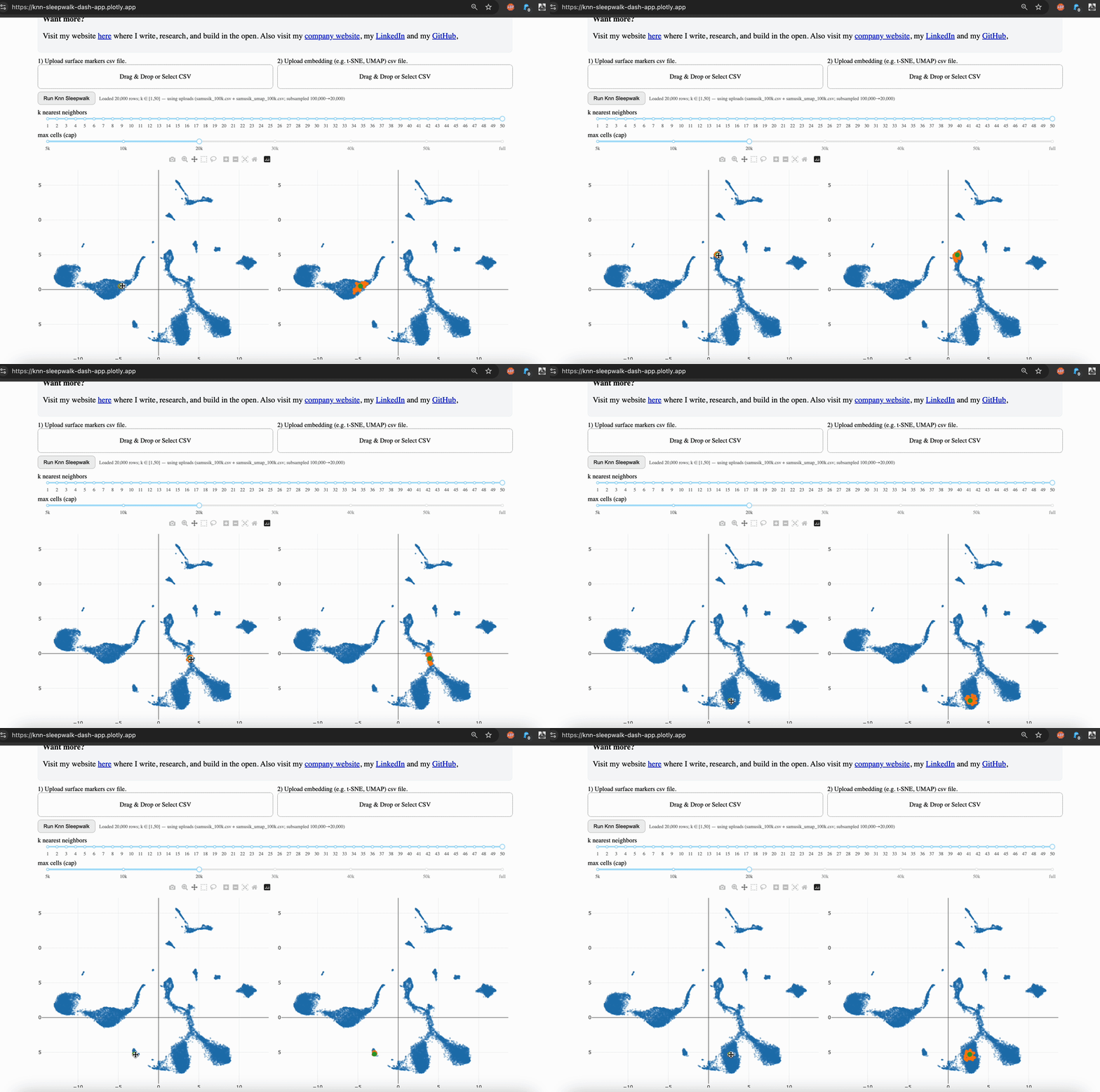
Hi friends, I finally (after several years) turned my KnnSleepwalk package into a web app that anyone can use with a single click. This will give you intuition as to what "resolution" your embeddings (e.g. UMAP) are for each region of each dataset.
Backstory:
KnnSleepwalk was an answer I had to a question posed to me in the fall of 2017: "yes, but how precise are those (t-SNE at the time) maps actually?" Since the All Of Us dataset issues in early 2024, this question has become mainstream, and has led to many shouting matches online.
How I solved it:
My solution was to visualize the K-nearest neighborhoods (KNN) of the embedding space (gif, left side) and compare them to the KNN of the original feature space, as visualized on the embedding (gif, right side). You can see that the resolution is often not that great, and this differs depending on where you are on the map.
What's new here:
The package was originally a "hack" of the distance matrix and coloring scheme of the brilliant "sleepwalk" app developed by Anders Biostat that I became aware of in the late 2010s.
Here, I re-wrote the whole thing from scratch in python and JavaScript, which allowed me to turn it into a Dash app. This in turn allowed me to host it on Plotly Cloud, which gives all of you access in a single click.
How to use:
The local version is available via GitHub, which I link in the comments. This allows you to scale up to large (100k+ cells) datasets. The online version is good to 50k cells, and you will have the option to subsample your dataset accordingly. While this is not ideal, it does give you the intuition that my program is intended to do.
What you need: csv files of your original feature space (e.g. surface markers for flow/CyTOF, top n PCs if single-cell sequencing). Upload them to the app and run it. If you press the "run" button without any dataset uploaded, it will run it on an example 1000 cell CyTOF dataset.
This is a version 0. I am probably posting this too early, but I am so excited that this actually works that I'm just giving it out now (there were tons of revisions to make it functional beyond a few thousand cells). So if you run into any issues, just send me a DM. Or a pull request.
I have a very talented bioengineering intern (Arianna Aalami) till the end of the month, so the more iterations we can do now, the better.
Questions, comments, or feature requests? Just comment below or send a DM.
Thanks, and I hope you all have a great day.
comment
Web app is here: https://knn-sleepwalk-dash-app.plotly.app/ GitHub repo is here: https://github.com/tjburns08/knn_sleepwalk_dash_app
If you want to talk further, book a call (see link under my profile tab).
KNN Sleepwalk for spatial: Xenium
Below is a quick way to get hover-linked interaction between UMAP coordinates (or similar) and XY coordinates for your spatial data to see patterns that you may have missed.
What this is:
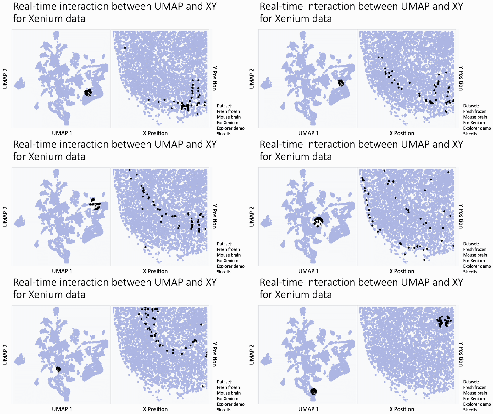
The image below is a 10x Xenium brain dataset. The left side is a UMAP from the expression data. The right side is the XY coordinates.
With this tool, you hover your cursor over the UMAP and it lights up the corresponding XY coordinates for those cells, changing in real time. This allows you to find subtleties that you might otherwise miss at the cluster level.
You can use this today. Just go to my KnnSleepwalk package (GitHub link in comments) and run the BiaxialSleepwalk function.
The bigger picture:
Based on recent conversations with spatial experts, we need more hover-based interactive data analysis in our pipelines. The Vitessce package shows what's possible, but it does one-to-one linking rather than neighborhood-to-neighborhood linking, which makes it harder to see patterns (example in comments).
DM me or comment if:
- You're good with interactive data frameworks (e.g. d3.js) especially those which allow for GPU acceleration (anything involving WebGL, like regl-scatterplot).
- You have ideas/feature requests.
- You want help implementing this type of infrastructure into your workflows.
Thank you and I hope you all have a great day.
comment
My KnnSleepwalk package is here: https://github.com/tjburns08/KnnSleepwalk. You'll want to use the function BiaxialSleepwalk for this one.
Vitessce example of umap-to-image correspondance without nearest neighbor functionality: https://vitessce.io/#?dataset=marshall-2022
KNN Sleepwalk for spatial: IMC
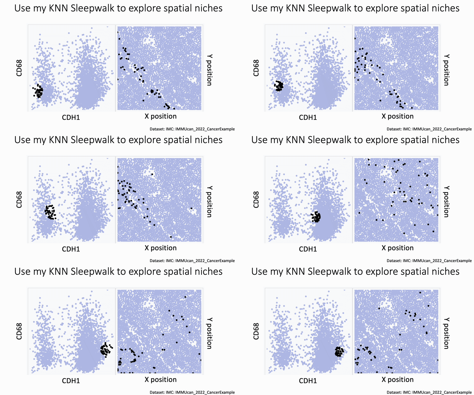
You can now use my KnnSleepwalk package to interrogate your spatial data. KnnSleepwalk allows you to interact with your data simply by hovering your cursor over the visualizations. The gif below shows an Imaging Mass Cytometry cancer dataset.
Left: a biaxial with CDH1 (E-Cadherin) on the x axis and CD68 on the y axis. Right: the spatial coordinates of each cell.
Simply dragging the cursor shows you spatial differences that you might have missed if you were simply manually gating on the left, or relying on a color palette on the right.
If you work with spatial data: what UI/UX features would you want to see? The feedback I've already gotten is that this needs to work with very, very large datasets.
If you are leading a team: let's talk strategy. Tools like this could save you lots of time and provide more clarity in each decision cycle.
The big picture: based on the reception this tool and similar of mine have gotten in the past few years, there is an unmet need around interactive hover-and-see tools in single-cell and spatial. We need to add this kind of functionality to our UI/UX's.
The link to the package is in the comments. Thank you and I hope you all have a great day.
comment
Link to KnnSleepwalk: https://github.com/tjburns08/KnnSleepwalk Link to virtual office hours: https://calendly.com/burnslsc-info/30min
Also: I'm collecting public spatial datasets, and it's not straightforward. Any help here would be appreciated.
KNN Sleepwalk colored by ranks
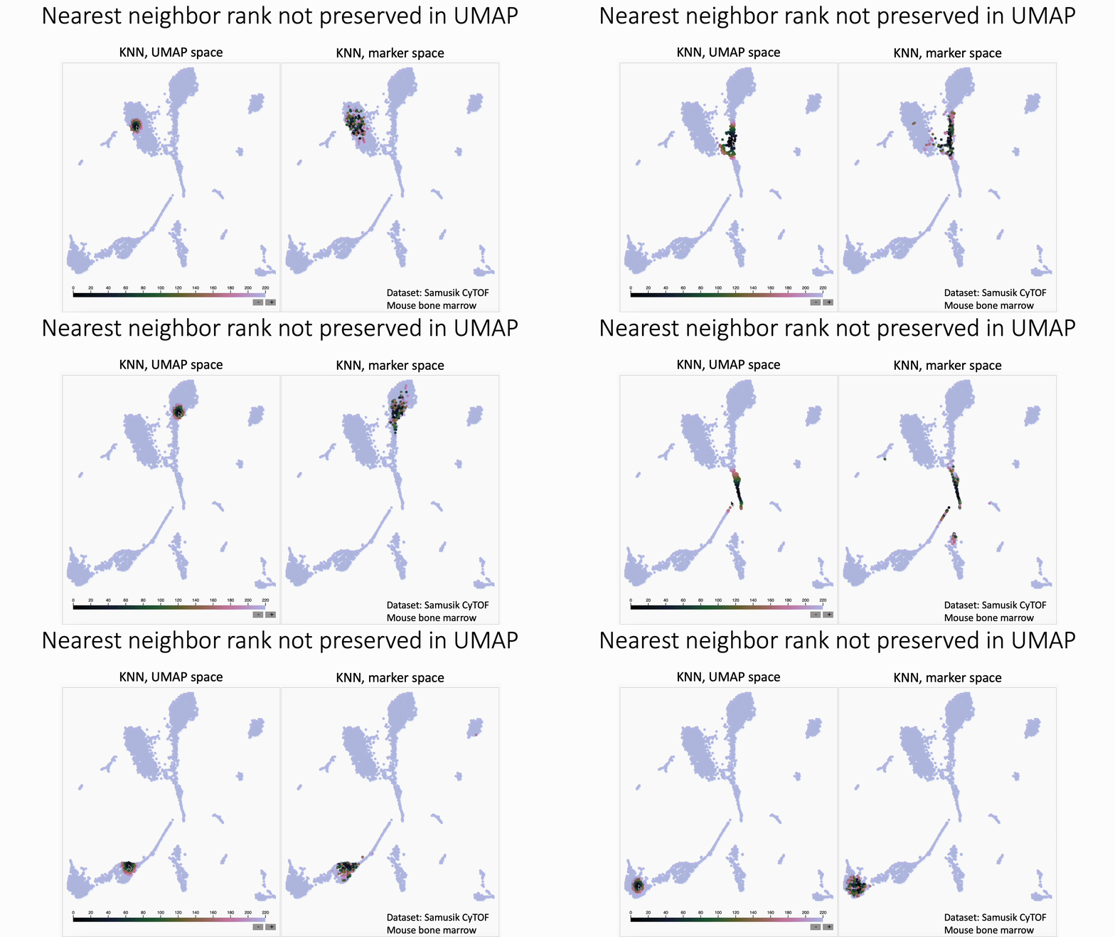
UMAP shuffles nearest neighbor rank. Check out David Novak's update to my KNN Sleepwalk package, which shows this.
Quick review of KNN Sleepwalk:
- Purpose: determine how well nonlinear dimensionality reduction tools preserve a cell's nearest neighbors from the original feature space, cell by cell.
- Inputs: original feature matrix (markers if flow/CyTOF, top n PCs if single-cell sequencing).
- Output: an interactive map that runs in the browser. Hover your cursor over a cell and it highlights its neighbors in embedding space, and neighbors in original feature space (often quite different).
What we see in this version:
- The rank of nearest neighbors (closest, second closest, etc) is not preserved, at least in this example of UMAP with CyTOF data.
What this means for users:
- In general, I would discourage subsetting/gating directly in UMAP space
- If you have to do this, I would not trust any distinctions made within islands, unless they are made in the original feature space (e.g. Naive vs Memory CD4 in the PBMC 3k dataset, if you know what I'm talking about).
What I am pushing for:
- Native plugins in FlowJo, Cytobank, OMIQ, Seurat, and whichever other tools people are using to analyze their flow/CyTOF/single-cell data.
- More "interpretability" work for the tools that we regularly use. For inspiration, look at what Anthropic is doing to try to understand its LLMs (link in comments).
Next step:
If you do single-cell analysis, use my package (link in comments). If you are a bioinformatics tool builder or researcher, look into interpretability work. If you have any feedback, comment, DM me, or sign up for my online office hours.
comment
KNN Sleepwalk can be found here: https://github.com/tjburns08/KnnSleepwalk Anthropic's interpretability work can be found here: https://www.anthropic.com/research/tracing-thoughts-language-model My office hours: https://calendly.com/burnslsc-info/30min
Original KNN sleepwalk reveal
Do you need quick and easy intuition around how exact your single-cell embeddings are? Check out knn_sleepwalk, a wrapper I wrote around the sleepwalk R package. Hover the cursor over any cell in your embedding, and it will show you the cell's k-nearest neighbors computed from the original feature space (as opposed to the embedding space). Below is a UMAP of 10,000 cells in CyTOF data with a k of 100. Note that the neighbors are not always nearby. Be careful if you want to gate/cluster on the embedding! https://lnkd.in/eeqRBdSn
KNN sleepwalk: Biaxial-UMAP interface
Flow/CyTOF users and leaders: have you ever wanted to know exactly where a cell on a biaxial plot is on a corresponding UMAP and vice versa? I built a tool just for you:
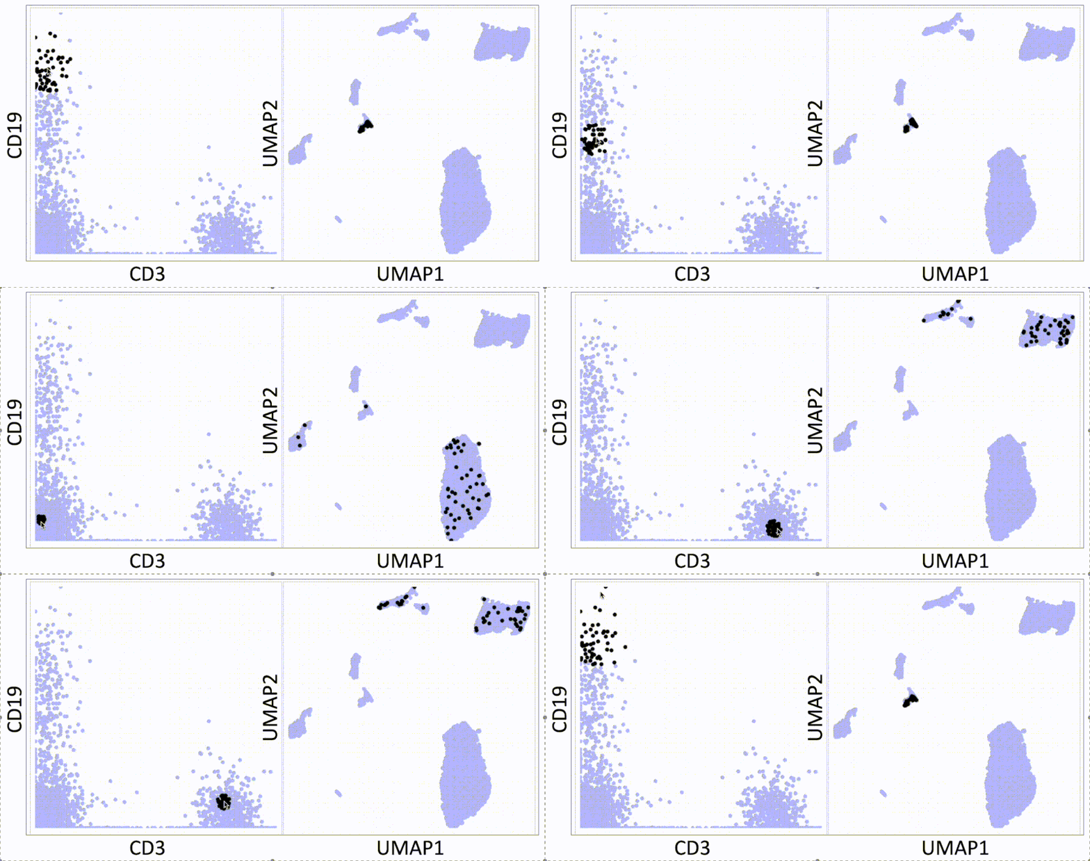
Below is my KNN Sleepwalk tool adapted to compare any plot with any plot. The k-nearest neighbors (KNN) of a given cell are computed in the plot on the left, and the corresponding cells are visualized in the plot on the right.
Here, we have a CyTOF whole blood dataset. A CD3 x CD19 biaxial plot is the "root" plot, from which the KNN are computed. The plot on the right is a UMAP, and the corresponding cells are being visualized directly on it.
Having an interface like this is one way (of many) to prevent biologists from over-interpreting their dimensionality reduction plots. Thus, I hope that down the line, this biaxial-UMAP real time functionality is available for anyone doing any sort of high-dimensional flow analysis, whether you're doing manual gating or exploratory data analysis.
Note that we are just looking at a biaxial vs UMAP. We can do anything vs anything. This includes biaxial vs biaxial. Note also that we can compare a "root" plot to multiple plots in real time.
Credit to S. Ovchinnikova and S. Anders for developing Sleepwalk (link in comments), from which I have built these additional functionalities and use cases.
I am still building this thing out, so if you have any particular feature requests, please comment or DM me. This tool is for you. Bioinformaticians who are interested in helping out, please DM me. I hope you have a great day.
KNN sleepwalk: Two UMAPs in light of All of Us research program controversy
In light of recent scrutiny around UMAP, coming from its controversial use in the All of Us Research Program, I refactored my KNN Sleepwalk project (which I started a year ago) to better reflect the limits of UMAP. Let me explain:
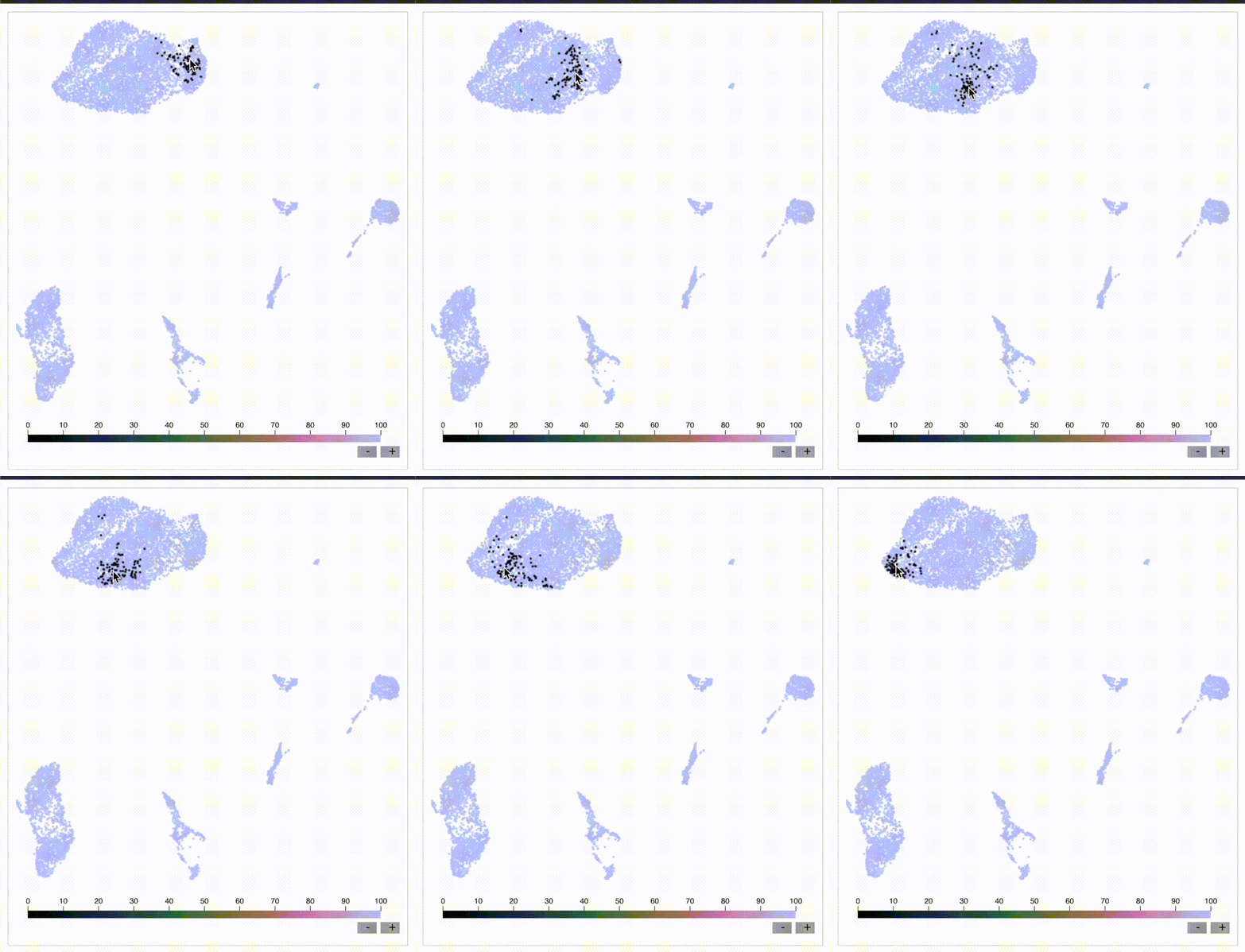
This is the PBMC 3k dataset (2700 cells), which is a flagship single-cell sequencing dataset. To the left, hovering the cursor over each cell gives you the top 1% nearest neighbors (27) of that cell in UMAP space. To the right, you can see the 27 nearest neighbors of that same cell calculated from the first 10 principal components, from which you do the clustering and dimension reduction in single-cell sequencing (you can think of it as making the data flow/CyTOF-like, and then doing flow/CyTOF-like analysis on it).
You will notice that the nearest neighbors in high-dimensional space are often quite far from the cell in question, speaking to the precision of the map itself. This is worth thinking about when you're looking at the clusters you've made on the map, or thinking about gating on the map directly.
The bigger picture here is that I'm getting UMAP to talk about itself…to tell me its own limits. This is one way you can better understand what a model can and cannot do. I encourage everyone using UMAP or any complex visualization to do similar things with it. Scientists, PIs, and leaders: please make sure you have a healthy dose of skepticism around tools like these. They can be useful, but they can also be misinterpreted or over-interpreted.
Kudos to Svetlana Ovchinnikova and Simon Anders of Center for Molecular Biology of the University of Heidelberg for developing Sleepwalk, which I re-purposed here to visualize the K-nearest neighbors (they developed it to visualize distances). Link in the comments, along with my re-working of it so you can do this on your own work.
If you have questions about UMAP or similar tools, or just want to vent, please feel free to comment or DM me.

KFN sleepwalk, two UMAPs
One way to understand how much global information UMAP can (and cannot) preserve: look at the K-farthest neighbors (KFN) of cells in UMAP space versus high-dimensional space. Here is what I mean:
Below is a UMAP from the flagship "PBMC 3k" single-cell RNA sequencing dataset, with 2700 cells. I am using my modification of Sleepwalk (by S. Ovchinnikova and S. Anders, link in comments) to highlight the top 10% farthest neighbors (270) for each cell the cursor is on. This is what is meant by KFN. Left side is the KFN of UMAP space, right side is the KFN of the first 10 principal components, from which you do the clustering and dimension reduction in single-cell sequencing.
The first thing to notice is that the KFN in UMAP space and high-dimensional space look nothing like each other, pointing to limitations in UMAP's ability to preserve global information.
The second thing to notice is that there is information that is just hard to capture in 2 dimensions. In particular, there is a region to the middle right of the UMAP that seems to be the farthest away from the majority of the dataset, including cells that are quite nearby in UMAP space. One way to make sense of this is to imagine a third dimension where the cells are pointing outward and far away from the rest of the data. But note that in reality we're dealing with 8 extra dimensions here, not 1 extra dimension. Thus, there will be all kinds of complexity at the global level that is hard to capture in 2 dimensions.
UMAP claims to capture global structure better than t-SNE, and this topic is a rabbit hole once you start looking at initialization steps for the respective tools. But the point is that global structure is very complex, so even if a tool does a better job than another tool at capturing global structure in 2 dimensions, it doesn't mean that it's perfect. Or anywhere near perfect. Don't let claims like these bias you, as they initially biased me.
This post is a followup to my previous "KNN sleepwalk" post, where I compare the K-nearest neighbors of UMAP space versus high-dimensional space directly on the UMAP. If you missed that, please go to the link in the comments.
If you want to use this KFN (and the respective KNN) sleepwalk tool for your data and work, please go to the project's GitHub, which I will also link in the comments. If you want me to walk you through its use, just send me a direct message. Thank you and I hope you all have a great day.

KFN sleepwalk, t-SNE and UMAP
As requested, here are the k-farthest neighbors of a CyTOF dataset side-by-side between t-SNE and UMAP. The cell the cursor is on within the UMAP will map to the corresponding cell on the t-SNE map. Note that they're also all over the place on UMAP as well. Case in point: just because it's UMAP doesn't mean the arbitrary island placement has been solved.
But again, don't take my word for it. Use the tool and analyze your data here: https://lnkd.in/eeqRBdSn. For some helpful slides, go here: https://lnkd.in/eivsbAfE
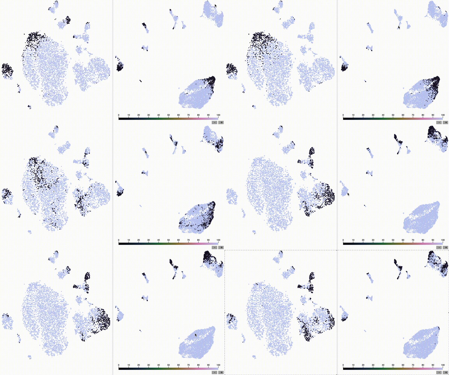
KFN sleepwalk, t-SNE
The k-farthest neighbors of a CyTOF dataset, visualized on a t-SNE map, are all over the place. Why? Because t-SNE isn't optimized to capture global information. The position of the islands relative to each other doesn't mean much. Keep that in mind when interpreting these embeddings. To run this on your own data, for whatever embedding algorithms you're doing, visit my knnsleepwalk project here: https://lnkd.in/eeqRBdSn

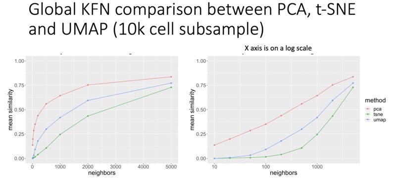
KFN overlap as a metric for evaluating global preservation for embeddings
Here's an interesting metric I developed to get at global structure preservation of high-dimensional data in a low-dimensional embedding: k-farthest neighbor overlap between high-d and embedding space. Result (in CyTOF data, so far): PCA is better than UMAP. UMAP is better than t-SNE. From my talk here: https://lnkd.in/eivsbAfE
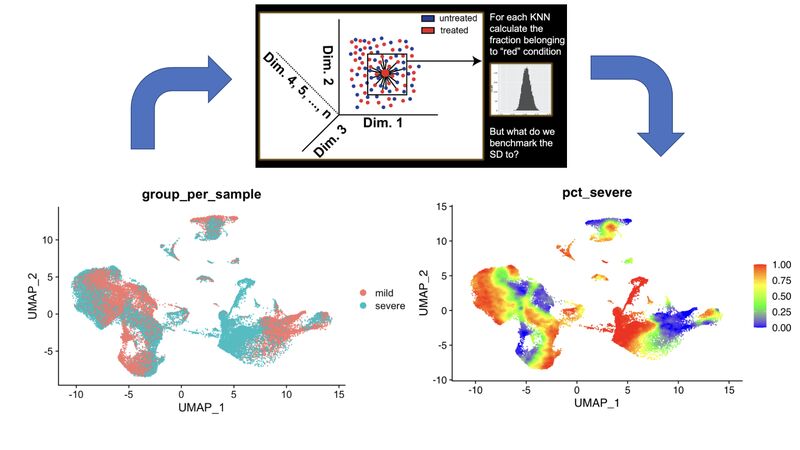
A KNN based solution to viewing data on a UMAP where one condition is "sitting on top of" the other
In my single-cell sequencing work, I sometimes come across visualizations where there are two conditions stacked onto a UMAP in two respective colors, where one is very much behind the other, making it of limited use.
A solution to this problem comes out of my thesis work on CyTOF data. Compute the k-nearest neighbors (KNN) of each cell, and then color the map by KNN percent belonging to condition 1. I have a pre-print and a BioConductor package around this, but in reality you just need a few lines of code, which I provide here: https://lnkd.in/eKkYub7b. Just CTRL+F for "RANN."
If you want a more in-depth look at this KNN-based solution and things you can do with it, go here: https://lnkd.in/eJYTj5s5
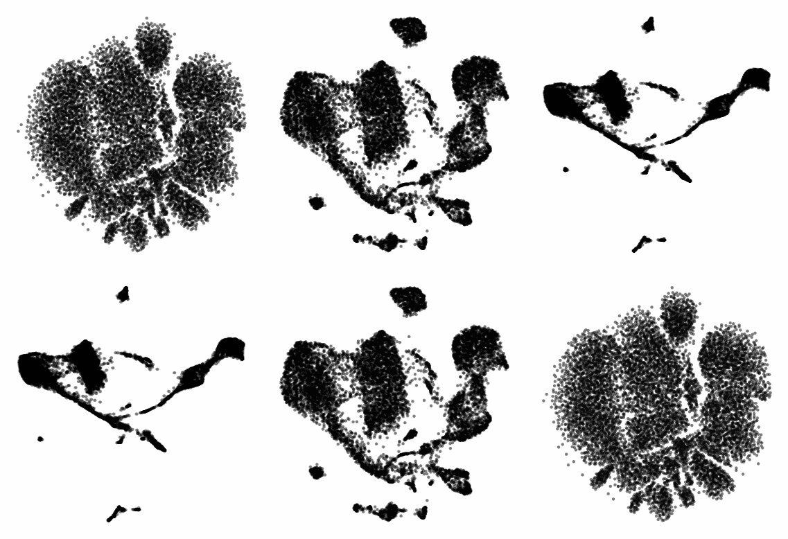
UMAP and t-SNE manipulation animations
Here, I ask various questions around the nature of t-SNE and UMAP, which are often well answered by manipulating the input and examining the output.
Following a cell's position across multiple t-SNE and UMAP runs
If you run t-SNE or UMAP multiple times, you can see the maps change. To properly use these tools, you need to run them more than once. Let me explain.
I ran 100 t-SNEs and 100 UMAPs on the same CyTOF dataset (Samusik bone marrow, 10,000 cells), tracking the position of a single cell across runs.
Here's what happened:
t-SNE: The cell formed a diffuse ring across runs, showing many plausible placements.
UMAP: The cell jumped between two distinct regions, showing more constraint.
Why this matters:
t-SNE has a very large solution space. The tool optimizes for local neighborhood structure, so the global structure can shift dramatically.
UMAP appears to be tighter, but still not deterministic.
Visual islands are stable (monocytes will have their own "island" throughout runs), but the total layout isn’t.
Key takeaway for researchers and team leads:
Run your dimensionality reduction multiple times.
Compare not just what islands form, but whether and how relative positions between islands change. Look for patterns that survive the shift.
As I've talked about in previous posts, t-SNE and UMAP are useful in terms of seeing the "forest in the trees," but they should not be taken as ground truth (I'll link some of my relevant work in the comments).
In future research: I’ll look at how relative island positioning changes when we control for global flips and rotations (something that you see a bit in the gifs below).
Seen weird variability in other tools? Leave a comment. I’d love to learn from your observations too.
I hope you all have a great day.
![]()
comment
A webinar I gave on the limits of dimensionality reduction analysis: https://watershed.bio/resources/the-limits-of-dimensionality-reduction-tools-for-single-cell-analysis
My KnnSleepwalk tool, which you all should use: https://github.com/tjburns08/KnnSleepwalk
t-SNE and UMAP exist on a spectrum
In reviewing the recent "Seeing data as t-SNE and UMAP do" paper, I found out that t-SNE and UMAP are on a spectrum. Let me explain:
The Berens Lab at Univesity of Tübingen, Germany developed a method called Contrastive Neighbor Embeddings (link in comments) that generalizes nonlinear dimensionality reduction algorithms on a spectrum between more local preservation (t-SNE like) to more global preservation (UMAP like).
Thus, rather than running t-SNE or UMAP, and so on, one can sample embeddings from the whole spectrum, which can be obtained by adjusting a particular tuning parameter. Accordingly, users can look at a handful of images across the spectrum and choose the right one.
The gif attached to this post is the flagship Samusik mouse bone marrow CyTOF dataset (technically Nikolay Samusik's analysis of Matt Spitzer's data) from the X-shift paper, that I ran through the t-SNE to UMAP spectrum tool.
While I have spent a lot of time focused on analyzing the preservation of local structure (the KNN preservation work you've seen from me), getting a feel for the global preservation is important, too, especially in datasets like this one where there are developmental trajectories.
In my experience, and also reported by the Berens Lab, there is a tradeoff between local and global preservation for these types of embeddings (KNN graph based), which makes it all the more important to have the whole spectrum in front of you.
I provide the code (in the comments) to make these images and gifs, and I encourage everyone to use this tool as well, rather than simply choosing t-SNE or UMAP or whatever is trendy and sticking with it. The more of the spectrum you see, the better intuition you'll get around the data.
Gif of running t-SNE over and over, ordered by image similarity
As requested, here are 100 t-SNE runs in a row for CyTOF data ordered by image similarity. Notice that there are pockets of stability in the island placement. It's not completely random, as it appeared in the previous post. I would not have realized this had I not done this extra ordering step.
How I did it: I took every plot image and made a pairwise image distance matrix using root mean square error as a metric. I then clustered the matrix as you would when viewing it as a heatmap. I then took the row names of the clustered matrix and set that as the new order for making the gif.

Gif of progressively adding noisy dimensions to t-SNE
If you have one or two bad markers in your panel (noise), does it completely ruin your t-SNE/UMAP visualizations? According to my analysis so far, no. I take whole blood CyTOF data (22 dimensions) and add extra dimensions of random normal distributions, running t-SNE after each new column has been added (I've done UMAP too). What I have found:
- A few dimensions of noise do not catastrophically affect the map. Lots of noise dimensions do.
- The embedding space shrinks with increased number of dimensions. You have to hold the xy ranges constant to see this.
- When you have many dimensions of noise, the map starts to look trajectory-like (look at the end of the gif), which could affect biological interpretation.

Gif of running t-SNE and UMAP over and over
Run t-SNE and UMAP on CyTOF data 100 times in a row. How much does the island placement for each map vary from the previous one? Notice that UMAP is quite a bit more stable. This could be the initialization, or the optimization function of UMAP, which has a "push distant cells away" component.

Gif of progressively adding noisy dimensions to UMAP
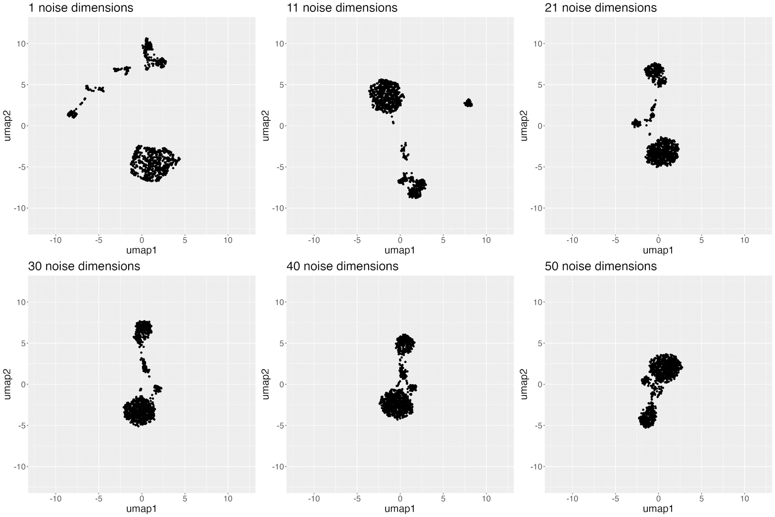
UMAP on noisy non-trajectory data looks like a trajectory. I add one noisy dimension to whole blood CyTOF data, run UMAP, add another noise dimension, run UMAP again, etc. The map starts to look like a trajectory around 30 added noisy dimensions (biologically, it's not a trajectory at all).
If you're looking at a UMAP of an unfamiliar biological dataset (eg. new technology), and it looks like a trajectory, be careful with the biological interpretation. It could just be noise.
Use my code and try it on your data here: https://lnkd.in/eD29nQaw
A relevant article I wrote on the Beauty is Truth Delusion that will get you in the right mindset: https://lnkd.in/ezeZV_Fj
A relevant interrogation of dimension reduction with lots of pictures here: https://lnkd.in/eivsbAfE
Teaching and learning bioinformatics
Some of my work involves teaching bioinformatics, especially to biologists who are currently learning. I am good at this in particular because I started out as a biologist and learned bioinformatics later in life. The posts here are reflections and insights in this direction.
Scanpy analysis intuition building app
Turn the knobs, see how the output changes.
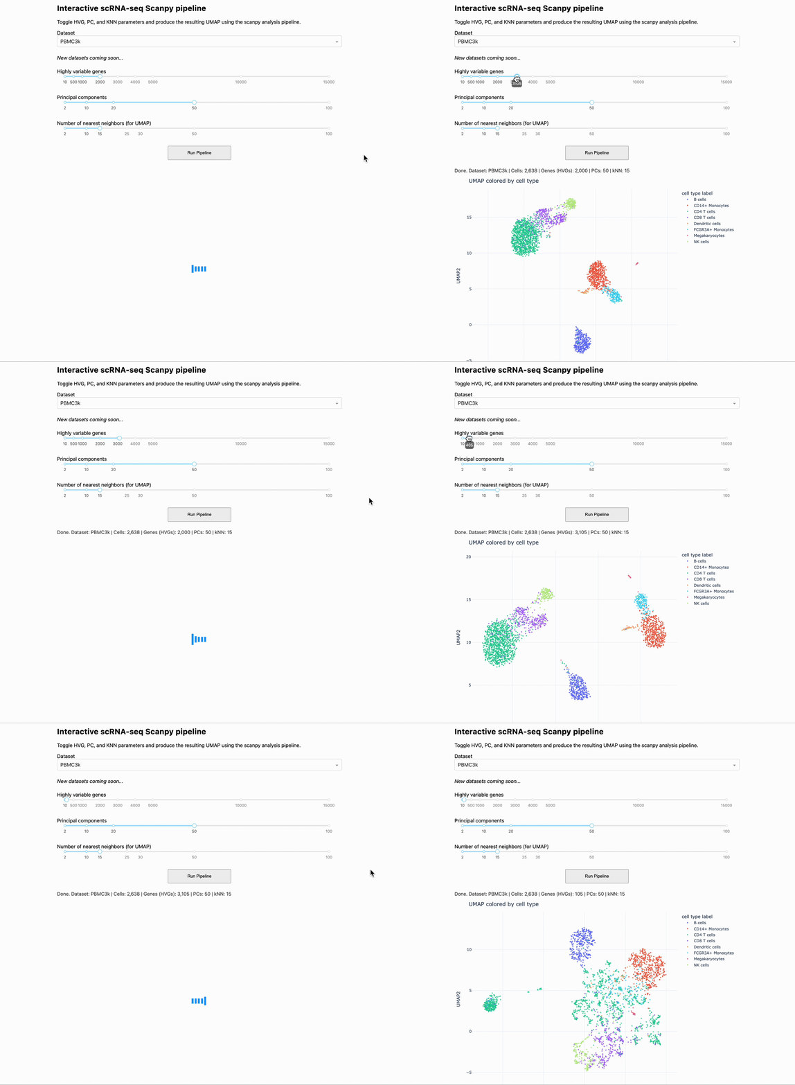
When you are analyzing single-cell and spatial data, you can gain intuition by changing the parameters of the pipeline, and seeing how the output changes. To help you to this end, we made a small app that allows you to change some of the critical settings in a given pipeline, and see how that affects downstream output.
The app runs the PBMC 3k dataset through a standard analysis pipeline via scanpy. The UI allows you to change the dataset, number of highly variable genes, number of PCs, and number of KNN for the UMAP. The output is a UMAP that is colored by the pre-made cell annotations. You can therefore look at how the shape of the UMAP changes, and how distinguished the annotations are (in optimal circumstances, they should be maximally separate).
One observation we made is that for this dataset, changing the number of highly variable genes produced modest visual changes, but not as substantial as I previously thought (with the exception of going down to a very small number, like 100). Knowing this kind of thing is important, per dataset. For example, it could be that for other data types going from 2000 to 5000 HVGs would produce very different results.
You have to try it yourself in order to see for yourself, and that's what this app is all about.
This is a "version 0" and there are many things that we would like to add down the line. One of them is the ability to drag and drop in your own dataset. This is a low hanging fruit. Things like coloring by cluster ID, with the choice of various clustering algorithms and their respective settings (e.g. Louvain, Leiden, k-means).
Additional downstream metrics would do well too, like how good the UMAP is (via our KnnSleepwalk tool), or things like a F1 score between pre-made cell annotations and new clusters. Later apps could tackle things like testing data integration methods across two flagship datasets.
To use the app, you simply have to clone the github repo, pip install the requirements.txt file, and run the "app" python script. This will produce a link you can open in your browser, and you are good to go.
We are currently in the process of building out front-end interfaces to the work we have done in the past and the work we are currently doing. We think that this will make our work more accessible and usable to a larger audience with fewer steps.
If you are a member of the single-cell and/or spatial community and have any requests for custom-tailored apps (or extensions of apps, modules I can build into existing SaaS products, etc, please let me know.
Link to the app is in the comments below. Credit to Arianna Aalami for fleshing out a lot of the code. Thank you, and I hope you all have a great day.
comment
The GitHub link to the project is here: https://github.com/ariannaaalami/interactive_scanpy_pipeline
I managed to host it on Plotly Cloud (I'm an early access member), though the link has been currently a bit wishy washy. I'll link it nonetheless: https://interactive-scanpy-pipeline.plotly.app/
How I went from biologist to biology-leveraged bioinformatician
Here is a post I wrote for biologists and team leaders about my journey from wet-lab biologist to biology-leveraged bioinformatician. In short, I think you can do it too, and if you're working in the life sciences, you SHOULD do it too. You can quickly get to a level where you can understand and communicate effectively with your comp bio team, something that is essential for any project that contains any -omics data. To summarize:
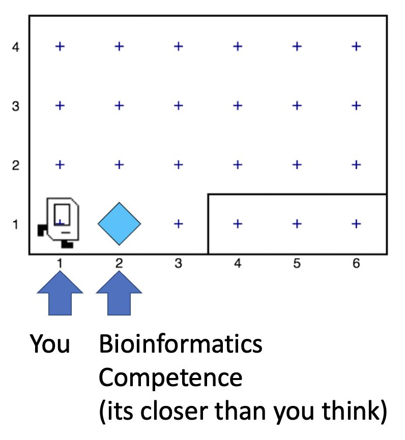
- I started with Karel the Robot (link in post). This is the illustration below. It's what every CS106A student at Stanford starts with. It teaches you a surprising amount of general programming principles that I still use today. Importantly, it makes coding less scary.
- I spent a lot of time just trying things (and still do). This was due to the fact that I was initially working with CyTOF data before there were many established best practices and high-level frameworks. Nassim Taleb calls this "convex tinkering" and in my experience, this is better than hand-waving. In the context of bioinformatics, when I try a thing, I am often either wrong or partially wrong about what I thought I was going to see.
- When I am completely stuck on a problem, I solve a simpler but related problem. This is a nice trick to keep the momentum going, and to get me into the flow state. The latter is something essential, if not sacred, to my workday.
Have a look here for more insights and depth: https://lnkd.in/eQ-2BvNn
Problem solving as a bottleneck to learning how to code
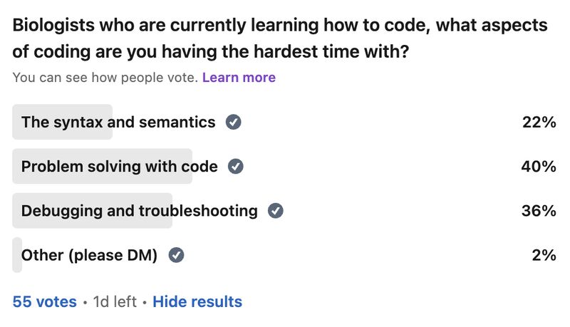
My survey has revealed that the act of problem solving is a bottleneck for biologists learning how to code. So let me give you a tool that has helped me in the problem solving process over the years, especially when I feel "paralyzed" in the face of a problem:
Simplify.
Sometimes it's simplifying the problem itself, and sometimes it's solving a simpler but related problem. The act of doing so allows you to get some "psychological momentum." What you don't want is to be paralyzed, and not know what to do next.
As an example, I like to tell the story of problem set 3 in CS106A: designing the arcade game Breakout using a Java graphics library. My problem was that even the act of decomposing the problem (standard practice) was stressful, because there were so many pieces that I didn't understand. It was overwhelming to consider everything at once.
So I asked myself, could I make a ball bounce around across the walls. No, too complicated. How about just the game window with nothing in it. Ok. That worked. How about the ball in the center of the screen, in place. Ok, that worked. How about if I could get the ball to move one pixel to the right and then stop? That worked too! Now I was getting some momentum.
It was in that way that I got to a point where I could do the classic problem decomposition and solve the rest of the problem.
So whatever you're trying to solve, try solving a simpler version of the problem, or try solving a simpler but related problem. Keep the momentum going.
More resources in the comments below.
Learning how to code has improved how I think
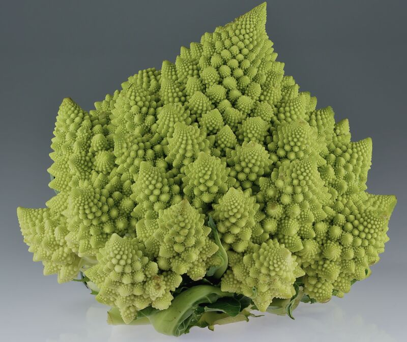
This image is romanesco broccoli. I came across it sophomore year in my dorm cafeteria. The pattern at play was amazing, but…hard to put into words. When I was learning how to code, I learned the word for the concept at hand: recursion. Learning how to code has given me many instances of this, where I can reason better about something that was otherwise hard to put into words.
In general, learning how to code has improved how I think. It has given me a new lens, the computational lens, through which I can see the world. I wrote and chiseled away at an article over the past year and three months on this topic, and I'm finally ready to share it with you. The article can be boiled down into three main points.
The first point is that in comparison to standard wet-lab biology, coding and bioinformatic analysis often involves the scientific method, sped up. A lab experiment used to take me on the order of hours to days, whereas computational experiments (eg. when debugging, analyzing data) take me on the order of seconds to minutes. Accordingly, you can get intuition around something really fast, as well as go through the process of being wrong, figuring out where you were wrong, and improving your thinking so you're not wrong about it again.
The second point is that computer science allows you to reason about and operate on topics that are otherwise difficult to put into words. An example of this is "levels of abstraction," where I show you what "hello world" looks like in python (not much stuff), C (a bit more stuff), and assembly (a whole lot of stuff), so you can appreciate the sheer volume of things that get swept under the rug when you write print("hello world") in python.
The third point is that in terms of "computational thinking," the computational lens is not meant to replace all other forms of thinking. It is meant to be added to your "latticework of mental models" to use the framing of the late Charlie Munger (link in comments). In other words, you want to be able to look at a problem through as many lenses as you can. I link more material about this in the article.
Overall, learning how to code takes time, so don't fret if you've moving forward more slowly than you'd like. This is normal. This said, I do offer a class to get biologists started with programming, with an in-person option and a virtual option. Any labs who are interested, please feel free to reach out. Otherwise, if you want quick (free) advice, feel free to reach out too.
The image is from the Wikipedia article on romanesco broccoli, by Ivar Leidus, licensed under CC BY-SA 4.0.
The article is here.
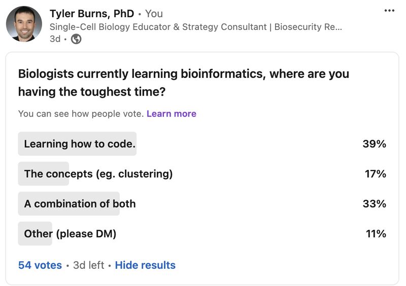
Biologists becoming bioinformaticians are having the hardest time learning how to code
My survey has already revealed that a large bottleneck for biologists learning bioinformatics is the act of learning how to code, even with plenty of online resources, bootcamps, LLMs, etc out there these days. Let me explain why I think this is the case, based on what I've seen and experienced.
For one to do bioinformatics effectively, one must learn how to think computationally. This generally means that one must know how to apply the basic principles of computer science to a problem, like abstraction, problem decomposition, and turning concepts into code. There's a great essay on this idea from 2006 by Jeannette M. Wing that I'll link in the comments.
To learn how to think computationally, I had to learn how to independently write code. What I mean by independently is that when faced with a computer science or bioinformatics problem, I would really struggle with it before looking for some sort of answer online (something that's easier now given ChatGPT, etc). It's the equivalent of doing the math problems in school without looking up the answer in the back of the book first. I still keep up this practice today, trying to independently think/work through a problem before I look at what others have done.
Coding is a learn-by-doing activity. It is not something that you're spoon-fed. You get better with every problem you solve. I started with very small problems and then I worked my way up. It's a lot of work, and it takes time. But proper guidance early on really helps.
One can get started with the foundations of computational thinking in a few weeks with a program called Karel the Robot. It's what every intro CS student at Stanford starts with. It's what I started with. It's what I have people I teach start with. It not only provides a solid foundation but also demystifies what coding and computational thinking is. The concepts and virtues (eg. patience) I learned with Karel the Robot I still use today, ten years later. I'll link a place to get started in the comments.
You can't simply become a code-fluent, computationally minded bioinformatician in a single short bootcamp. But you can develop the right foundations that allow you to effectively move yourself forward from that point on.
I remember what it feels like to be a wet-lab biologist and be totally overwhelmed with this stuff. As such, I have been teaching people how to learn bioinformatics from the standpoint of a wet-lab biologist. Luckily, my availability is going to open up again this summer, so any labs who are interested, please reach out.
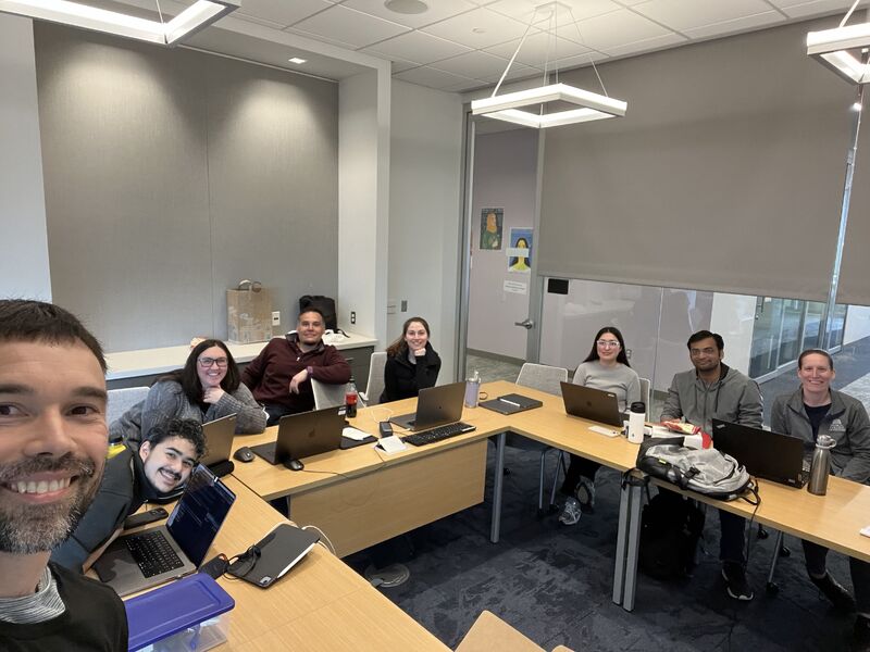
Recap on teaching engagement with Zamora Lab at MCW
After speaking with many labs last year, I determined (as many others have) that there is a lack of bioinformatics support in academia. Thus, many biologists are pressured to learn these skills on their own (as if they don't have enough on their plate already). Aside from the additional stress, this can lead to serious mistakes downstream. Anyone who knows about the replication crises in various fields should be concerned at this point.
The good news is, I have also determined that biologists are fully capable of learning these skills. They just need the right guidance. Thus, I have lots of respect for trained bioinformaticians who are going out of their way to teach this material to biologists, and I encourage all of us to teach when we can.
How to do it is a complex topic, and I don't think you can go from neophyte to bioinformatician in a few days. But I think providing the right foundations along with proper followup can go a long way. It did take me a long time to learn bioinformatics myself as a biologist, but it did not take long for me to have a solid foundation from which I could already start adding value.
I saw this first hand with the lab of Anthony Zamora this past week. I spent three days on site with them, and there is plenty of followup planned. If your lab needs training and/or advising, and your local bioinformaticians don't have bandwidth, please contact me. I wish you all the best.
Those who can do, do; those who have done, teach
I am tired of the phrase "those who can, do; those who can't, teach." So let me fix it for you. "Those who can, do; those who have done, teach." Three things come out of this:
- If you have experience in anything (which you do), teach it: Yes, there's a lot more educational content these days, but you are specialized in your own way. Just about everyone I know has something unique to say that has not been formalized or at least put in writing. My grandma had all kinds of wisdom that she sadly never wrote down. Thus, I aim to die with everything on paper.
- Education is becoming increasingly important: in my corner, from cancer biology to bioinformatics, everything is interdisciplinary now. You have physicians talking to biologists talking to engineers talking to computer scientists, each speaking a different "language" and trying to understand each other. One question I'm asking myself a lot these days: how can I teach in a few hours the mental models that have taken me 10,000 hours to really understand?
- Respect for educators: teaching is hard. Communication is hard. You have to figure out a way to operationalize things you may never have put into words. You have to remember what it's like to not know the thing, which may be a long time ago. You have to cater to different learning styles. I don't think teachers (especially in the US) get nearly the respect they deserve.
This can/can't do/teach dichotemy held me back for a long time. I have been in the single-cell world for 12 years now, and I do a lot more bioinformatics teaching now than I used to, borne out of all the experience at doing bioinformatics. It has way more impact, and I love every minute of it.
If you're a student, postdoc, tech, or scientist in academia or industry, DM me and I'll give you 15 minutes of free advice about single-cell bioinformatics, any sub-topic you want. Or just say hi. I have nothing to sell you. My paid teaching/training services go to the PIs and group leaders: if you want me to set up a more formal bioinformatics workshop or advisory role for your group/lab, DM me and we'll talk. Site visits are on the table.
If you know anyone who could use this post or my teaching/advice, please share it. I hope you all have a great day.

Journal club and related
Sometimes I read papers and like to talk about them.
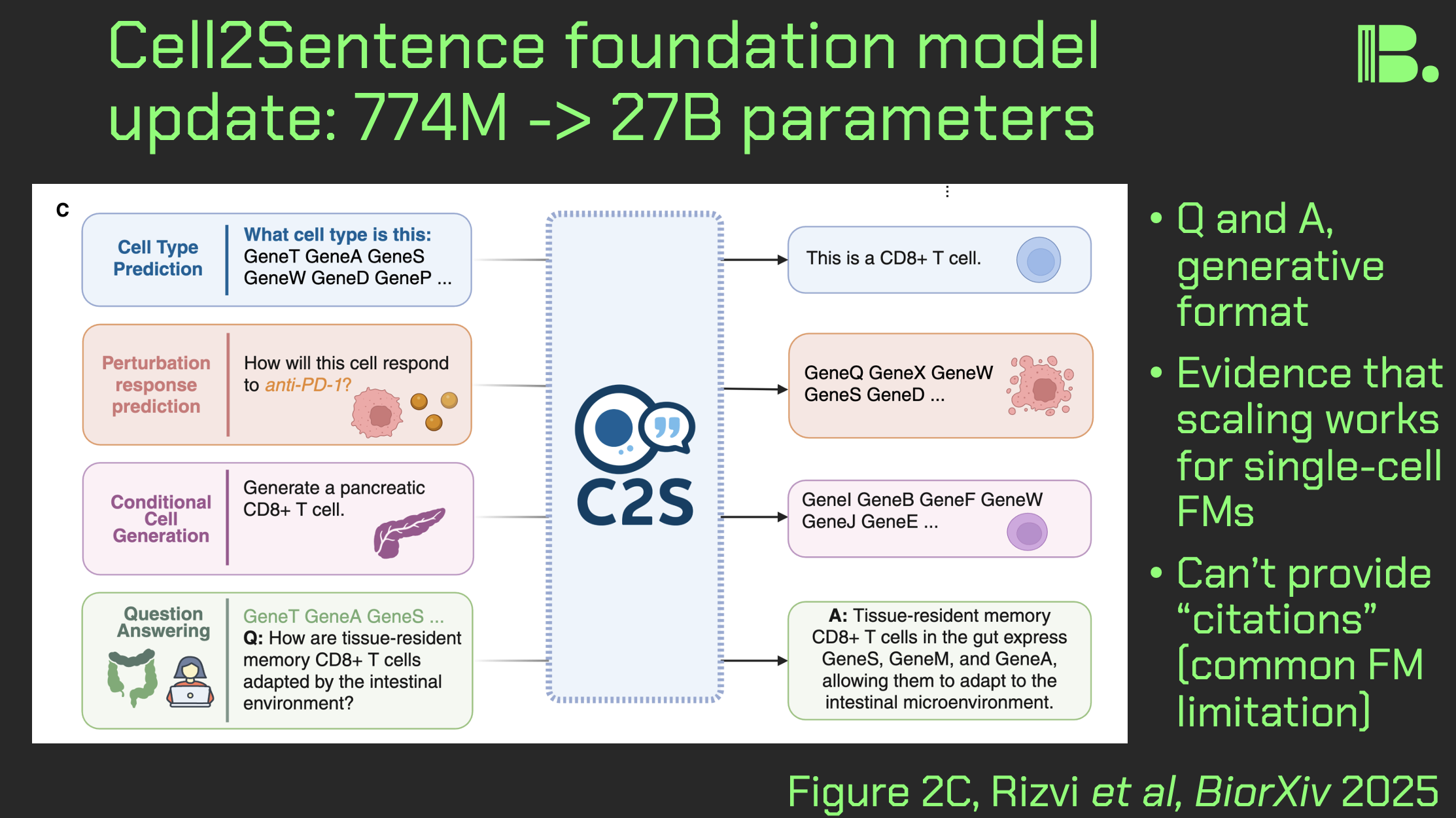
Cell2Sentence update: 27B parameters
As a followup to my earlier posts about single-cell foundation models, I wanted to do a post-length journal club on a recently updated cell2sentence (C2S) model, that now has 27B parameters, and now has some spatial capabilities. Here is what stands out and what it means for you:
Some spatial reasoning capabilities:
Figure 6 shows C2S being used to predict niche neighborhoods for CosMx data. CellPhoneDB and BioGRID interaction data were folded in, which gave an accuracy of 70% (to 55% if C2S alone). This is interesting, and it does make me wonder how far spatial reasoning can be pushed.
However, I also wonder whether it would just be easier to loop in a foundation model trained only on spatial data for spatial tasks rather than trying to make an everything model. I covered one such spatial model, KRONOS, last summer.
Querying, predictions, but no citations:
Figure 2C shows that this model in particular has cell embeddings (like UCE which I recently covered), but also has LLM querying capabilities. This is because part of the training process is converting single-cell data into long "sentences" consisting of a rank-ordered list of genes by expression, per cell. This gets mishmashed in with data from publications.
Figure 9 shows that this scaled-up model in particular was able to make a validated prediction about kinase inhibitor silmitasertib that anyone in pharma might want to take a look at.
This said, the frustrating thing is that the answers do not have "citations" back to the training data (such is how these things work). As a NotebookLM user, this kind of thing frustrates me. Maybe the model could at least have a post-hoc matching function that would pull forth datasets and abstracts from whence the answer most likely came.
Benchmarking AI models based on latent spaces of other AI models:
Such a matching function might having the output and the training data embedded in the latent space of some other model, and doing a nearest neighbor search. Such an idea shows up in the benchmarking section of the paper…
The authors have evaluation metrics in the paper, that actually require the latent space of other foundation models. One way to understand this, is to think of how you would determine how lexically close two sentences were to each other, perhaps in comparison to another pair of sentences. You'd throw these sentences into a BERT embedding (see my TED talk) and measure the physical distance between points in the embedding space.
This is called the BERTscore, and you can see it's use in Figure 4C and 4D, where they evaluate the "scaling" of the model.
The point is: you have an evaluation metric for AI models, which is really a distance function within an embedding space of another AI model. This is a clever idea, but I just hope that in 10 years we won't have evaluation metrics that consist of the latent space of another model, evaluated on the latent space of another model, all the way down.
Conclusion:
As I said in the KRONOS post four months ago, I am waiting for the possibility that foundation models have their "GPT-3 moment" where with enough scale, they are suddenly in every lab everywhere.
This said, it's pretty much impossible for me to evaluate every the quality of every dataset that goes into these models. So I intend to use these things as hypothesis generators, but also to stick with the old fashioned way of looking things up myself. A sort of barbell strategy between old and new.
Aside from that, the model is runnable on google collab (though I haven't gone beyond the starter code they give you), and you should try it. Thank you and I hope you all have a great day.
The pre-print is here: https://www.biorxiv.org/content/10.1101/2025.04.14.648850v2
Thoughts about ESSB 2025
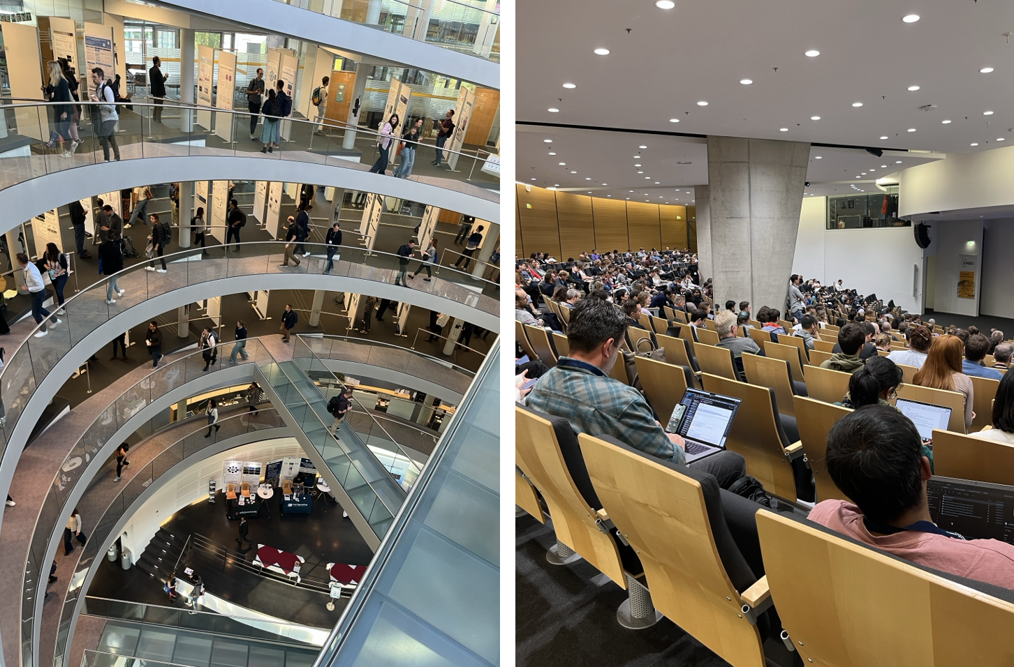
I had a great time at ESSB2025 in Heidelberg, where I caught up with and met great spatial bio researchers, and got up to speed on the bleeding edge of both wet lab and dry lab practices. A few things that stood out to me:
Very high -plex:
There was a talk that had an antibody panel of 1133 proteins. Up until this point, I had seen at most a few hundred. With my roots in CyTOF, I know how much work can go into building a panel of 30 antibodies, so I think antibody validation might be a bottleneck here unless we have robotic arms coupled to vision transformers doing 5-point titrations and such (now there's a startup idea).
Multiple modalities:
There was an interesting focus on metabolites. One direction was pure mass spec. This gets you a large number of readouts, but you don't yet get single-cell resolution. Another interesting strategy I saw was the construction of aptamer-oligo conjugates that bind to metabolites, that can in turn be sequenced. Think CITE-seq for metabolites.
Analysis, appearance versus reality:
One talk emphasized how hard it was to segment microglia in particular because of their weird shape. Thus, a lot of it was done manually. This is despite the fact that there is a perception that segmentation is a solved problem with all the AI developments. It is not.
From 2-D to 3-D:
There were a number of talks that went into 3-D imaging (e.g. making a bone clear so you can "fly through" it after you stain), and one where an interesting 2-D image observation needs a 3-D image as followup. There is a whole world of anlaysis problems to solve here when this comes to fruition, from new algorithms to data management. Might be worth doing some theoretical work here. And along those lines…
Math and human interpretability:
One talk was using topology to create human readable analysis outputs. This group has a "product market fit" at their institute right now because they were working out the theory behind a lot of the current issues (multiple modalities, etc) 5 years ago. This leads to both human-readable output, and interesting parameters that can be fed into foundation models and the like. So for the rest of us: what types of data are inevitable, and what can we do now to prepare for that? It will help to have mathematicians in your circles for this theoretical work.
Conclusion:
There is absolutely a gap between what you learn at conferences, versus what shows up on the open internet. In sum, this conference gave me a better impression as to what is going on in the spatial field than any papers or anything shared on social media has given me. I look forward to seeing how things develop between now and the next conference from the European Society for Spatial Biology (ESSB) e.V. in Barcelona.
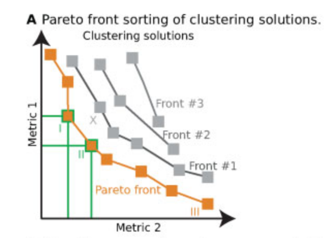
Pareto fronts for cluster benchmarking
In light of recent benchmarking work I've been doing, I was introduced to a paper that uses Pareto fronts to look at multiple metrics, rather than one at a time. This helped me think through some issues I've been dealing with in dimensionality reduction, where local and global preservation present as tradeoffs.
In short, Putri and colleagues (link in the comments) look at what the maximum possible scores are along these tradeoffs. This is the Pareto front (see figure 1a from the paper in the image below).
The authors use this type of analysis for cluster benchmarking. They look at FlowSOM, PhenoGraph, and their own method, ChronoClust. They look at the Pareto front of four evaluation metrics.
They note that their ChronoClust method underperforms, which shows that they are doing a critical evaluation, as opposed to trying to promote their own tool.
The bigger picture:
- If you're benchmarking and using metrics where there are trade-offs, consider using a Pareto front-based approach.
- You should probably be benchmarking your pipelines internally. At the minimum, look at what public benchmarking dataset most closely "maps" to your internal data, and look at the benchmarking reports for that dataset.
Thank you David Novak for bringing this paper to my attention.
I hope you all have a great day.
comment
Paper is here.
The KRONOS patch based spatial foundation model
If you do spatial, you know QC is a headache. There's a new spatial foundation model called KRONOS out this week that can help with that. I read the pre-print and spoke with the corresponding author. Here is what I found:
Quick overview:
This foundation model is a vision transformer (similar to the LLMs, but can "see") trained on high-parameter imaging datasets (e.g. Akoya CODEX). Specifically, it is trained on "patches" rather than cells: 47M patches, across 175 protein markers, across 8 imaging platforms. The interesting thing here is that operating at the patch level can bypass cell segmentation entirely. This helps avoid a lot of headache for the personnel involved, and allows for the capture of nuances (e.g. in neurons that are not perfectly segmented).
Deep dive:
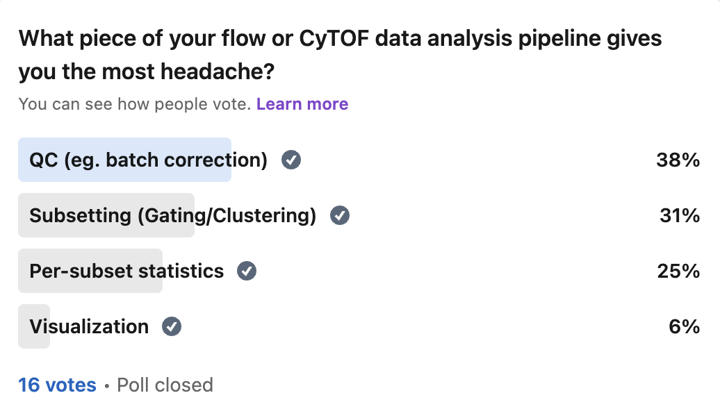
The part that I was drawn to was Figure 3G-I in the paper (see image), which shows the model detecting and flagging artifacts. These are problems with the image that would harm downstream analysis, like tissue folding, blurring, or signal saturation. This model can be inserted into the quality control section of a pipeline and assist in detecting these issues early on. My previous LinkedIn surveys on single-cell analysis suggest that my audience has much more "headache" around quality control than downstream analysis (and it's the same for me), so I think this is definitely for you.
Why I take this seriously:
While I have yet to use this model myself, I spoke with one of the corresponding authors Sizun Jiang directly about this, whom I have known since my grad school days. He told me that the model is becoming a mainstay in current analysis pipelines in the lab, and is being used to augment the analysis of previous datasets and ongoing studies. In other words, there is skin in the game here: the better the model, the better his lab's research output, which leads to better publications and more meaningful clinical discoveries, which leads to more grant funding and talent to work on these key questions, and so forth.
The big picture:
If you are a researcher or a leader, you should look into at least trying these models out, and getting a feel for how they work. Benchmark them to existing analysis pipelines. If you've seen my other posts on foundation models, you'll know that this field is growing fast in single-cell. Now they are being developed in spatial.
You'll also know my hypothesis that given the parameter size of the foundation models right now, they may still be equivalent to GPT-2 on the LLM side. Things like larger model architectures or richer training data (e.g. more tissue types, multi-omics) could lead to a "GPT-3 moment." So I would get familiar with these models before we hit this inflection point.
What I need from you:
Let me know what the most absolutely annoying aspects of spatial QC are for you. Be specific. If I'm going to use this model and similar for my spatial work, I want to direct it toward the nastiest issues and take it to its limits.

comment
The KRONOS pre-print is here: https://www.arxiv.org/pdf/2506.03373 The GitHub is here: https://github.com/mahmoodlab/KRONOS
Reproducibility of Jupyter notebooks from biomedical publications
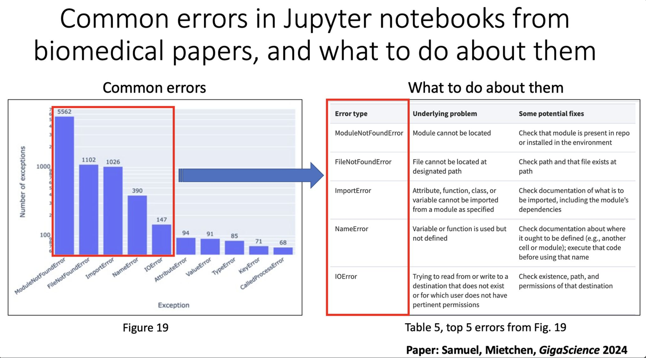
In light of recent work I am doing that requires me to reproduce results from GitHub repos associated with papers (eg. foundation models), I wanted to highlight a paper by Sheeba Samuel and Daniel Mietchen that discusses reproducibility of Jupyter notebooks associated with the biomedical literature (peer reviewed papers, not pre-prints). The results are nothing to be proud of.
The authors looked at 27,271 Jupyter notebooks across 2660 GitHub repos linked from 3467 publications.
Specifically, the authors looked at:
- 22,578 Jupyter notebooks written in python. Of these:
- 15,817 had dependencies declared. Of these:
- 10,388 had dependencies that could be installed successfully. Of these:
- 1203 notebooks ran without any errors. Of these:
- 879 produced results identical to those reported in the original notebook, and
- 324 produced results that differed from those reported in the original notebook
In other words, 5.3% of notebooks ran without errors, and 3.9% produced results identical to the paper.
One thing (of many) that the authors bring up, and what struck me here, is that the results suggest that the available code had little bearing on the peer review process. And perhaps it should have.
From a practical standpoint, I've assisted in peer review, and I understand that the reviewers simply don't have time to dig into the code themselves. So there should probably be ways to make this easier.
I think ensuring reproducibility of code in papers could be something that automated tools could do or help do down the line. The methods section of the paper is a testament to this. Given the current "agentic" direction AI is going, this would be an interesting use case to either aid in the peer review process, or be used by the authors themselves to ensure reproducibility at every step of the process.
I'll note, given that I use R heavily and therefore use R Markdowns moreso than Jupyter notebooks, I hypothesize that there will be similar issues here. But an important observation from the paper from Figure 19 (attached image, left side) is that the majority of problems were ModuleNotFoundError. This suggests that issues with dependencies cause a lot of the reproducibility problems, something that would generally not surprise python users. R is not without its problems in this regard, but this is especially notorious in python.
If you are a biologist interested in how to ensure reproducibility in your code, please let me know. My friends and I have been through enough of this that I have things to say. If enough are interested, I'll make a more in depth write-up.
Until then, be sure to use virtual environments (I use renv if in R), and in python be sure to run "pip freeze > requirements.txt."
The link to the paper is in the comments. You should read it. There are 30 figures and 5 tables. In the "implications" section they bring up nine talking points (and the peer review bit above is implication 2).
That's all for now. Happy new year everyone.
comment
The link to the paper is here: https://academic.oup.com/gigascience/article/doi/10.1093/gigascience/giad113/7516267#493978474
And thanks to Mike Leipold for finding this paper and sending it over.
Review on single cell foundation models
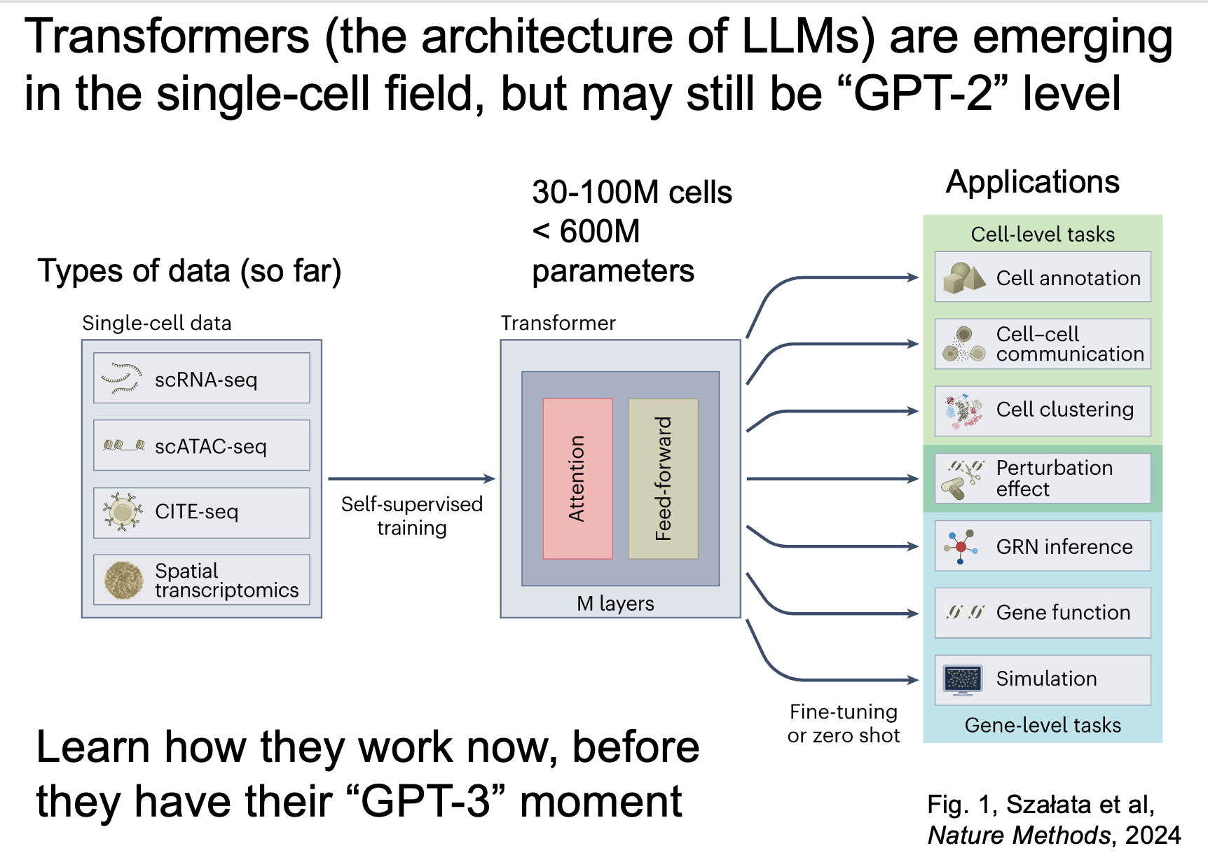
Transformer-based foundation models (the stuff of LLMs) are slowly working their way into the single-cell literature. Here is what to know and what to do about it.
For this post, I draw from a neutral review from Artur Szalata and colleagues (last author: Fabian Theis) on the topic, and additional time I have spent testing these models myself. Below are three main points from the paper, and my take on each of the points, followed by a take-home message to make all of this actionable.
These models are still quite small. Table 1 shows that most of the models reviewed were trained on 30-100 million cells, which translates to hundreds of millions of parameters. Transformer models in other fields are well into the hundreds of billions of parameters (GPT-3 was 175B).
My take: the single-cell models here might still be analogous to GPT-1/2, where they show some promise but the full potential is still down the road.
These models serve are multi-purpose tools, in that they have many applications. These include cell annotation, gene function prediction, perturbation prediction, and inferring gene regulatory networks, among others.
My take: once these models have their GPT-3/4 moment, there will be many new things for us to play with and integrate into our workflows.
There are applications that are still more suited for simpler solutions. An example of this was scTab, a non-transformer model that outperformed scGPT (a transformer model) in cross-organ cell type integration.
My take: from a practical standpoint, I try the simpler solutions first, but in this context, later models trained on more cells could prove to be superior. So I'm keeping tabs on this.
I remember when I got early access to GPT-3 in the fall of 2021 (a year before ChatGPT), experimenting with it quite a bit, and simply making sure I was familiar enough with it that I could rapidly adopt it if it got any better. Now, I am spending time working with some of these available foundation models to see what they can do in my hands.
You can get access to these models too by going to Chan-Zuckerberg Initiative's collection of census models for single-cell (link in comments). They provide links to the model pages and sample embeddings that the models produced.
The take home message for leaders and scientists:
Know how these models work, have some of these tools in your arsenal, and test what kinds of inputs they take and what kinds of outputs they can produce. Keep tabs on their developments. Take their results with a grain of salt, but know that they will get better. I assume that they will only improve from here, as the research around these models improve, and the number of parameters possible per model increase.
The review and a markdown of me interrogating one of these models is linked in the comments.
If any of you are currently tinkering at the interface between single-cell/spatial and transformer models, please let me know. I hope you all have a great day.
comment
The review by Artur Szalata and colleagues can be found here: https://pubmed.ncbi.nlm.nih.gov/39122952/
A page from CZI giving you starter code for a number of so-called "census models" which are essentially cells that have been run through transformer models, giving you access to the embedding: https://cellxgene.cziscience.com/census-models
Me interrogating the geometry of a foundation model embedding by trying to find its "center" and "outer edges" and realizing that UMAP does not quite capture this. https://tjburns08.github.io/human_universal_cell_embeddings.html
Cell segmentation size matters for spatial transcriptomics
For spatial transcriptomics data, cell segmentation size is critical. I recently read a 2024 preprint from Austin Hartman and Rahul Satija about benchmarking in-situ gene expression profiling methods (eg. 10x Xenium). There's a detail in here I was struck by:
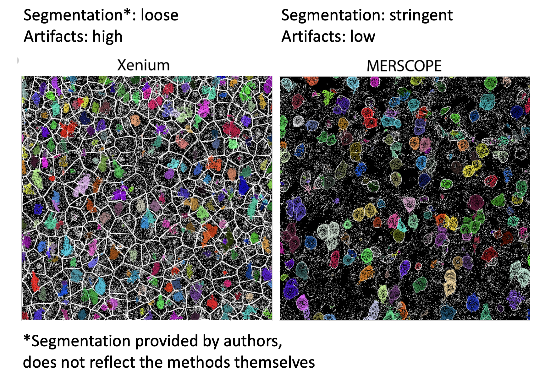
One of the issues with making the comparisons between spatial methods was that the default cell segmentation provided by the authors of the datasets used varied between stringent (only cell boundaries you're sure of, tightly demarcated, small), and not stringent (something of a Voronoi tessellation, with loose and large boundaries). This can be seen in the image below, which comes from Figure 3 (link in comments).
The differences in cell segmentation led to artifacts in gene expression, as measured by what they call the mutually exclusive co-expression rate (MECR). This is where genes that are biologically not expressed together in a cell are nonetheless both expressed. They had to re-segment the cells themselves in order to move forward with the benchmarking.
This means two things. The first is when you're comparing spatial datasets across methods (eg. Xenium vs MERSCOPE), you need to re-segment the cells with the same method and stringency first. The second is that you need to pay close attention to the stringency of cell segmentation when you're doing any sort of spatial analysis, as it has been shown that artifacts can show up in this step.
Do your biological conclusions change if you run the pipeline with loose vs stringent cell segmentation?
The bigger picture is that in bioinformatics (and data analysis at large), the devil is in the details. It's all the little things you have to do to make sure the data are ready for the clustering and whatever else you're going to do.
If you're in leadership, make sure your team is spending sufficient time on the early stages of data analysis (eg. QC, cell segmentation, batch effect finding, data integration). The "headache" steps that seem to delay the insight generation steps. As Marcus Aurelius said, the obstacle is the way.
If you're learning bioinformatics, spend as much time as you can really understanding the raw data. One way to do this is to try to analyze your data outside of any standard package, or take a page from molecular biology and KO (remove) a step in the pipeline and see what happens (eg. what happens to the clustering and UMAP if you don't log or asinh transform the data).
As the datasets and methods get more complicated, these little details will become more important. I hope you all have a great day.
Link to paper.
Data integration using CyCombine
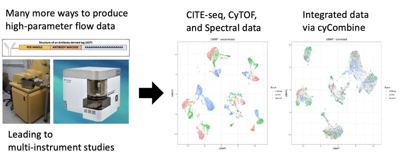
Single-cell protein data can take many forms: flow cytometry (spectral or otherwise), mass cytometry, CITE-seq, or protein-based imaging after cell segmentation. Not to mention the multitude of machines (eg. spectral cytometers from different companies, or CyTOF 2 vs CyTOF XT). It is inevitable that there will be a need and efforts to integrate these datasets across modalities to derive actionable insights.
Accordingly, the Single Cell Omics group at Technical University of Denmark (DTU) has solved this problem with a method they call cyCombine. With this method, they are able to integrate a CITE-seq, spectral flow, and CyTOF dataset. They spell it out in a markdown (link in comments) so you can try it yourself.
The UMAPs in the images show that the data, otherwise separate, now sit on top of each other. There are further metrics for evaluating the correction in the markdown (eg. earth mover's distance), and histogram visualizations. If I were using this, I'd want to try gating on the concatenated data, with the points in the biaxials colored by each method.
To sum things up, there is good work being done in this space, and we should be paying attention because this type of work is going to become much more important as high-dimensional cytometry and cytometry-like methods and instrument types increase.
Bridge integration
Leaders using single-cell tech: do you have data across multiple modalities (eg. flow/CyTOF and single-cell sequencing) that you want to combine? Are you making large cell "atlases" internally or externally? Then you should consider integrating these datasets with bridge integration, a new method that came out last year. How does it work?
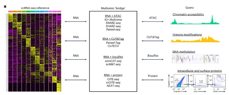
Say you have a CyTOF dataset, and a single-cell sequencing dataset. Both are PBMCs. If you have a CITE-seq PBMC dataset (both RNA and protein), then you can use that as a multiomic "bridge" to integrate the two datasets. This is one reason why getting your team to produce a CITE-seq dataset or two might be valuable in the long term.
The image attached is a schematic from Hao et al. (link in comments) that shows possible combinations of multimodal integration that go beyond RNA + protein. The method is available in Seurat (in other words, it's standardized and accessible for comp bio). Your team should look critically at figure 5 and S7 in the paper and the text that references it (the page immediately after the figure), as it shows a scRNA-seq + CyTOF integrated dataset using this method, with the text describing sanity checks.
Even if you don't use this method, you should note the emerging trend of integration across modalities, which goes along with the emergence of single-cell multi-omics. Importantly, the authors express interest in doing this with spatially resolved data. They specifically mention CODEX (paragraph 4, discussion section), suggesting that a CODEX + scRNA-seq integration might be a current PhD/Postdoc project in the lab.
Links to the paper and Seurat code in the comments below.
Flow/CyTOF users could take a page from the best practices in single-cell sequencing
Life science leaders using flow/mass cytometry: do you want to know where the best practices in data analysis will be in 3-5 years (if done right)? As a flow/CyTOF native, I've been looking to single-cell sequencing for this. Here are 3 things that I think this community has gotten right, that the flow/CyTOF world (that I’ve been part of since 2012) could really benefit from:
A dedicated open-source community with well-maintained packages.
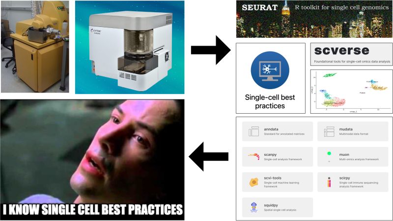
On the R side, Seurat is extremely useful, constantly evolving as new methods develop, and well-maintained by the Satija Lab. On the python side, there is scverse, which is a collection of tools that do various things from single-cell sequencing analysis (scanpy) to spatial (squidpy).
My recommendation: we model our ecosystem after scverse (bring it all together in one place) and our "end to end" packages after Seurat. Those working with ISAC and similar organizations should dedicate funding to dedicated individuals. I think with efforts like CyTOForum, the community is in place to do this kind of thing.
A focus on standards and benchmarking
There's a "single cell best practices" consortium that has a huge free jupyter book, showing you what to do with the scverse and how. Furthermore, there is a lot of benchmarking work happening, e.g., with the scib package from the Theis Lab, that allows you to do your own benchmarking for your data. Long-time flow/CyTOF users will remember the uncertainty around which clustering algorithm to use, that didn't clear up until Lukas Weber and Mark Robinson (from the sequencing world) did a benchmarking study and showed that it was FlowSOM all around and X-shift for rare cell detection.
My recommendation: we incentivize benchmarking studies (eg. the FlowCAP project). Especially given the advent of spectral flow, we are going to need an efficient way to redo or build on our prior work as the tools and data evolve.
Integration between commercial and open-source methods.
10x Genomics has a UI for its Xenium data. Then they have a page titled "Continuing your journey after Xenium analyzer" listing relevant open-source tools that can help you analyze your data further. Similarly, on the flow/CyTOF side, with Standard BioTools is promoting Bernd Bodenmiller Lab's HistoCat on their page as something to use beyond their UI for IMC data.
My recommendation: we build our commercial tools with our open-source ecosystem in mind. I think Omiq's modular design and ability to quickly integrate the latest open-source tools into its interface is a great example.
I'll acknowledge that there are differences between the fields that may impact what has and can get done, like open source community engagement levels, available funding, and the relationship between open-source and commercial solutions in either domain. However, seeing just how much the single-cell sequencing community got right, they can serve as a north star for how we build out our tools from here.
General data analysis
The data analysis related posts that I otherwise could not categorize.
Guest blog post: an introduction to LaminR
Hi friends, I wrote a guest post for Lamin on using the open-source LaminR package in an R workflow with the PBMC 3k dataset. The link is in the comments.
What drew me in was a familiar handoff problem: coming back to an analysis, or inheriting one from someone else, and not being fully sure what was done, in what order, or in which environment. I have some "scar tissue" here from my consulting projects over the years.
In the post, I walk through a standard single-cell workflow and show what LaminR stores along the way. What I found most interesting was the provenance side of it: being able to inspect the code, report, and environment tied to a data object later.
That feels increasingly important as datasets, tools, and teams get more complex (e.g. when some of your "colleagues" are OpenClaw agents).
Thanks to Luke Zappia, Robrecht Cannoodt, and Alex Wolf for collaborating on this.
LLM CyTOF clustering algorithm choices
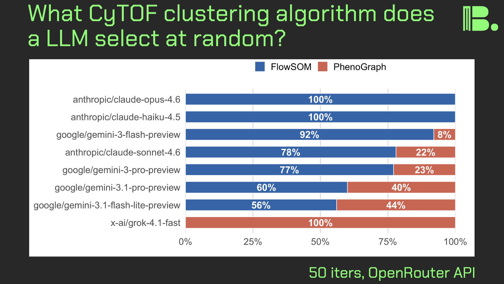
Hi friends, in light of recent LLM bioinformatics "design choice" experiments I've been doing, I asked a simpler question: if I prompt a LLM to output a randomly selected CyTOF clustering algorithm, what will the distribution look like, and will it vary between LLMs.
The experiment:
Here, I ran that prompt in a 50-iteration loop, where with each iteration, one CyTOF clustering algorthm was selected. Each iteration was a fresh instance with no memory of the previous iterations.
Observations:
Only FlowSOM or PhenoGraph were selected, suggesting a bias toward tools that are more often used, which might lead to exclusion of newer or more bespoke tools that might be fit for your task.
Antrhopic's models selected primarily FlowSOM, Google's tools selected a mix but still tilted slightly toward FlowSOM, and Grok4 choose exclusively PhenoGraph (did one of the FlowSOM authors tweet something mean about Elon?), suggesting that different LLMs have different "preferences."
Takeaways:
While there are plenty of followup experiments to do, I am posting this preliminary result today because it speaks to concrete actions for leaders and scientists alike.
If you are going to use AI assistance to code up some analysis pipeline, you should do two things:
- run the prompt more than once on the same model and look for differences in design choices
- run the same prompt on multiple models and look at per-model differences in design choices
Furthermore, you should do your research and look for newer or more bespoke tools that are suited for your task. This means you should have a bioinformatician grounded in first principles look at what you're doing.
Thanks and I hope you all have a great day.
comment
The report is here: https://tjburns08.github.io/cytof_llm_selection_experiment.html
LLM-generated CyTOF data properties
Hi friends, in light of recent experiments showing people "pulling data" from LLMs, I decided to see if I could pull the Samusik CyTOF dataset out of Claude. What I found was kinda weird.
Methods:
I ran Claude 4.6 Sonnet in a loop (using API access and a shell script), whereby at each iteration Claude, would pull out one cell with raw marker values "in the style of the Samusik CyTOF dataset." The instructions were minimal as a first pass. I then took the data and analyzed it alongside a 10,000 cell subsample of the actual Samusik dataset to look for differences.
The hypotheses were: 1) Claude pulls out exact marker values from the Samusik dataset. 2) Claude pulls out values that are convincingly similar to the Samusik dataset. 3) Claude pulls out data that look nothing like the Samusik dataset.
Results:
Hypothesis 3 ended up being correct. On a UMAP with concatenated data, the LLM data form their own island with except a few cells. The biaxials show effectively random bimodal distributions that do not resemble known cell subsets, suggesting that the "next token prediction" was not considering whatever markers had already been outputted.
But here's where it starts to get weird.
If we plot the marker means by the marker standard deviations for the Samusik and LLM datasets, the LLM marker data formed an upside down parabola. I realized you can get the same parabola if you simulate a Bernouli (on/off) process, indicating tight and similar per-marker distributions.
But then it got even weirder.
When I looked at the raw data distributions of the surface markers, I saw that on the "marker-negative" end, they were overwhelmingly decimals rounded to the tenths place. Specifically, 0.1, 0.2, 0.3, and 0.4 make up 39.5% of the dataset. 0.2 alone makes up 15% of the dataset!
One the upper end, we have values that are way too high. CD45 in the Samusik data maxes out in the hundreds. In the LLM data maxes out in the thousands. Furthermore, the distributions appear to be loosely bounded (e.g 1000-4000) and may be uniform. This brings up some fundamental questions around the statistics of AI-generated data.
Discussion:
The LLM generated data look nothing like the Samusik data, or CyTOF data. My interpretation is that, token by token, the LLM chose whether the marker was going to be positive or negative, and then there was some heuristic: negative is a tenths place decimal below 0.5, and positive is between 1000 and 4000 or similar.
Further prompt engineering could probably address these issues. Note that as soon as you ask it for more than one cell, it creates a python script and begins simulating numerically from distributions. The point here was to see what's inherent to the LLM's training data, which raised some fundamental questions around numerical distributions a LLM outputs.
The report is in the comments, which includes the prompt and all output, so you can try it yourself. Thank you and I hope you all have a great day.

comment
The report is here, so you can try this kind of thing yourself: https://tjburns08.github.io/samusik_llm_mishmash.html
Claude Code experiments for manual gating
Hi friends, here is what happens when I context engineer Claude Code to do manual gating for CyTOF data.
As you know, there has been interest in automated gating for quite some time, as manual gating can be quite laborious (with obvious human intervention for "harder" populations). To this end, I tested agentic AI systems with the task, and iteratively improved them each run by tweaking the context engineering.
So you all can pick up where I left off, here is what I found.
Methods:
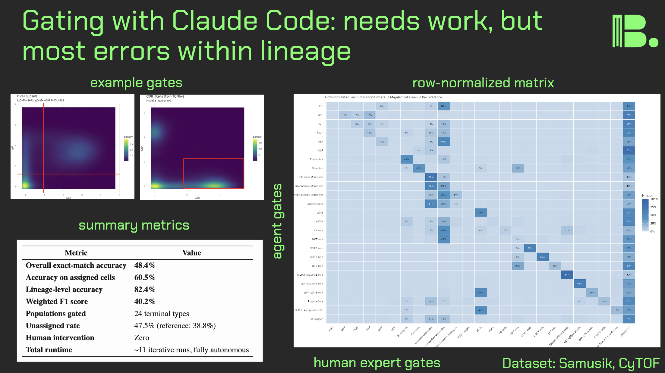
I used the Samusik01 dataset (around 80,000 mouse bone marrow cells run through CyTOF). This has an expert manual gating control built in that I was able to use for comparison.
I tried both ChatGPT codex and Claude Code, but later stuck with Claude Code because it was giving me much better results.
My "context engineering" was a series of documents in a directory that I "pointed" Claude Code to (e.g. please go to prompt[dot]md and follow everything there). Initially it was just a prompt, but later I added a pre-made gating strategy and a quality assurance document (e.g. do it again if >50% of cells are unlabeled) as well.
Results:
If we set the expert manual gates as ground truth, Claude Code got 1 in 2 correctly. If we look at mutually assigned cells (labeled by both the LLM and the human), its closer to 3 in 5. If we look at within-lineage accuracy of mutually assigned cells, it's over 4 in 5 (which makes sense: you wouldn't "oops" miscategorize a monocyte as pro-B cell).
Adding a quality assurance document that defined specific thresholds got Claude Code to work iteratively. In the final experiment, it iterated 11 times in a loop, adjusting thresholds.
If I add Figure S5 from the X-Shift paper (the visual gating strategy), we got another increase in accuracy. Note that Claude Code can read images, but it cannot yet read videos without breaking them down into a collage of frames (I tried).
There was per-population variance in how accurate the gates were, with lymphoid cells being gated more accurately than myeloid cells and stem/progenitors. This suggest population level tweaks that can be done.
The big picture, for decision makers:
These results are by no means perfect, but they show that there is a path. New models are coming that will in theory improve results, but we should optimize the context engineering now. Internal data will serve as a "moat" in this regard.
One future direction: currently, the gates are made in series in a giant R script. But if we were dealing with a real gating interface (e.g. a bespoke R script, or the API to a SAAS), then Claude Code might be able to adjust the gates in a more "natural" way.
The GitHub for the final experiment is in the comments. I hope you all have a great day.
comment
The GitHub to the most recent experiment is here: https://github.com/tjburns08/claude-cytof-gating
Agentic AI for analyzing CyTOF data
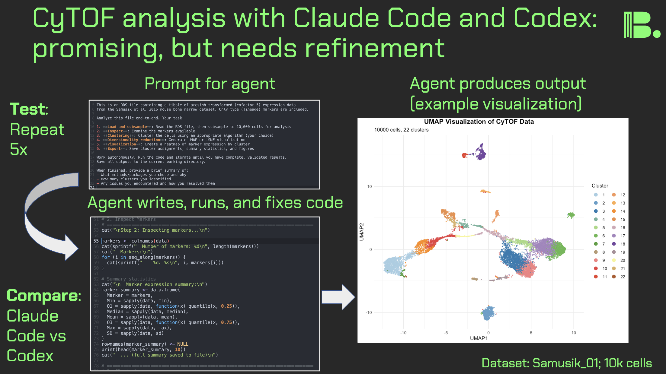
Hi friends, following my previous work on LLM design choices in CyTOF analysis, I re-ran the experiments with agentic coding tools: Claude Code and ChatGPT Codex Xhigh. I prompted each agent to create and execute a CyTOF analysis pipeline from scratch, five times per agent.
Key results:
Execution: All pipelines ran successfully for both agents.
Clustering: Claude Code favored FlowSOM (3/5) over kmeans (2/5). Codex was more varied: FlowSOM (2/5), kmeans (1/5), and PhenoGraph-like approaches via Seurat or igraph (2/5).
Dimensionality reduction: Both used UMAP exclusively, no t-SNE.
Output quality: Claude Code produced sensible UMAPs 5/5 times. Codex had one run that produced cluster IDs that looked like they were put in the blender on the UMAP, suggesting an undetected bug.
Other observations:
- Codex showed more defensive programming (e.g., TryCatch usage)
- Claude Code provides reasoning traces; Codex doesn't allow for that (though you can copy/paste from the command line interface to get this)
- Claude Code hits token limits much faster despite similar subscription pricing
Discussion:
It's promising that these agents can write, execute, and debug code on the fly. Claude Code made more domain-appropriate choices (FlowSOM, not forcing data into Seurat), but I was surprised either touched kmeans, rarely used in CyTOF literature outside (in theory) deliberate overclustering workflows like SPADE.
It's interesting that Codex implemented KNN graph + Louvain (essentially PhenoGraph) rather than using PhenoGraph directly.
Key limitation of this work: one-file dataset. Future work will test larger, more complex data, perhaps pushing agents toward the likes of CATALYST or Spectre. Open questions remain: can an agent discover batch effects unprompted, or flag that "something isn't right"?
The community might benefit from comprehensive context engineering documents for different CyTOF analysis scenarios. I'm working on this now.
For leaders: These agents aren't going anywhere. We need best practices now: prompting toward domain-specific strategies, detecting errors, and keeping human experts engaged where it matters.
Link to the full results in comments. If you're running similar experiments, I'd love to hear from you. Thank you and I hope you all have a great day.
comments
One potential use case for this would be through the CyTOF SAAS products directly (not going to name them, but you know the popular ones). It might be via API access (assuming we figure out the cybersecurity), or that the SAAS products themselves embed the agents directly into the software. Either way, this is something I would watch out for, for programmers and non-programmers alike.
The GitHub link to the project is here: https://github.com/tjburns08/cytof_agentic_prompting_experiments
Byte order matters when reading in fcs files
Fcs files, outputted by flow and mass cytometers, are typically read into R or Python for analysis. If you're going to do this without the likes of FlowCore, you need to take care to read the bytes in the DATA section the right way, or the matrix will be gibberish.
Multi-byte numbers (e.g. 32-bit ints) can be stored in computer memory in two ways, known as little-endian or big-endian (simplified explanation below). The key thing here is that some computers do it one way, and some do it the other. And it might be that the flow cytometry acquisition computer is incompatible with yours.
There is a flag in the TEXT section called $BYTEORD, that will tell you which it is.
$BYTEORD/1,2,3,4/ is little-endian. This is where the least significant byte would be stored first.
$BYTEORD/4,3,2,1/ is big-endian. This is where the most significant byte would be stored first.
Here, most significant means highest "place" value. So in decimal, the number 135, would have 1 as the most significant digit (the hundreds place), and 5 as the least significant digit (the ones place).
Let's keep it simplified with standard decimal, and say the number 135 had to be stored into memory into three boxes [ ][ ][ ]. In big-endian, it would be stored as [1][3][5], which makes intuitive sense. But little-endian would have it stored as [5][3][1]. So now if your computer picks up [1][3][5] stored in big-endian, and assumes its little-endian, it will read it it as 531. And so it is with your flow cytometery data matrices.
When you store multi-byte numbers into memory, via the likes of readBin() in R, you can specify the byte order as a function argument, as per the $BYTEORD flag in the fcs file.
I made a tutorial a few years ago where I learned of this topic (link in the comments below). If you follow it, you can convert a fcs file into a data matrix without any software packages.
The image associated with this post summarizes the binary reading step, where you select endian-ness, and what it looks like if you select the wrong one.
Why does this matter? Because at least in R, FlowCore::read.FCS(), is a bit of a choke point. It's incredibly useful and I'm grateful on behalf of the community to have it. But it's also a single point of failure. So it would behoove you to know how to read in your fcs files independently, just in case something were to happen to it or its dependencies (and the python programmers among you will know what I'm talking about).
I'm revisiting this now due to a low level project I'm currently working on, but I think that any bioinformatician should know their craft one level of abstraction deeper than what is required of them. It pays dividends long term.
Leaders, look for these choke points in your workflows and prepare for the worst, just in case.
Thank you, and I hope you all have a great day.
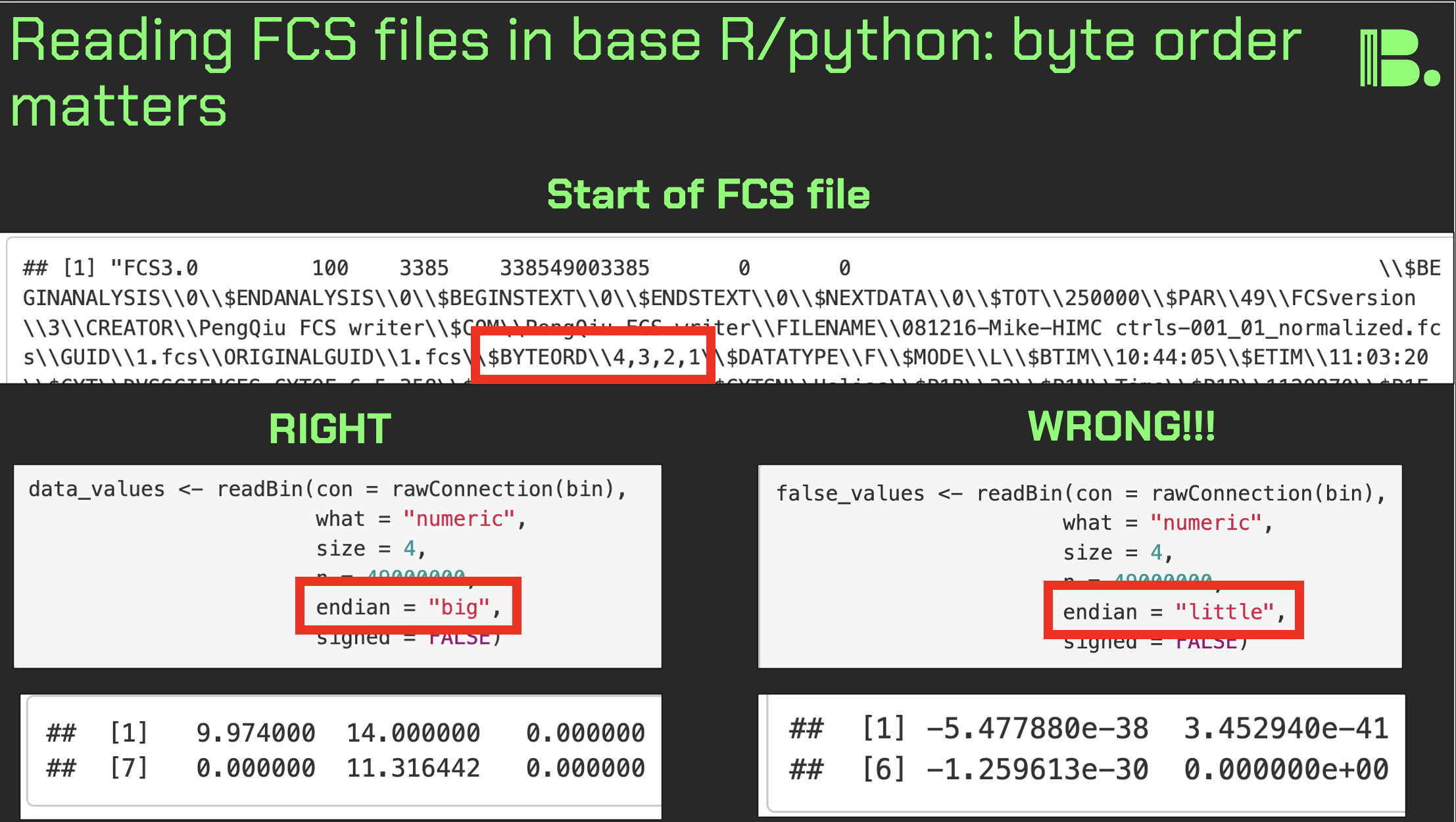
Louvain versus Leiden cluster stability in Seurat
You may have noticed the emergence of Leiden clustering (as opposed to Louvain clustering) a few years ago in single-cell analysis. If you are using Seurat, be careful if you decide to transition…
Louvain and Leiden clustering are both community detection algorithms on (in Seurat's particular case) a shared nearest neighbor graph of your data. The Leiden algorithm, in 2019, added additional refinements upon the shoulders of Louvain. In theory, making the switch could improve your clustering schemes.
But in practice…
When I switched from Seurat's implementation of Louvain to Leiden using the default settings of the classic Guided Clustering Tutorial on the PBMC 3k dataset, across 20 random seeds, Leiden did not detect the platelets that Louvain easily detects.
This suggested that the given clustering parameters worked for Louvain, but needed to be re-tweaked for Leiden.
The image below is this initial output, with cluster centroids being visualized in a gif across the 20 runs, a visual way I developed to assess cluster stability (hence the jiggling of the yellow dots).
Accordingly, when I increased the resolution, Leiden detected the platelets, but the cluster stability got worse in the T cells.
Lowering the number of nearest neighbors from the default 20 to 10 also got Leiden to detect the platelets with decent stability, but I also got an extra cluster in the CD4 T compartment, similar to the one that "flickers" in on the left panel below. Note that the extra cluster is not a bug, just the result of that particular setting, which may well be a defensible subset.
So there is still a bit of tweaking left to do on my end. And I'd expect you'll have to do the same on your end.
In short, if you switch from Louvain to Leiden specifically in Seurat, don't assume that you can use the same default parameters for both.
In contrast, Scanpy's clustering is Leiden-centric, so its defaults may work better with Leiden than with Louvain.
And more generally speaking, never assume the default parameters are the right ones, for whatever you're doing!
Thank you and I hope you all have a great day.
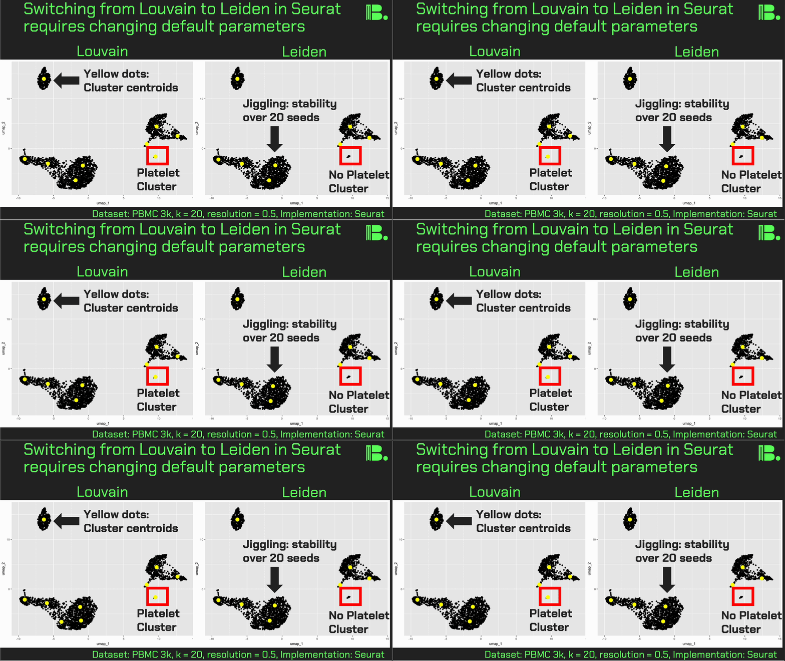
LLM make-it-better experiment for UMAP plotting
Can you use LLM's to create self-refactoring code? Here, I broadly asked a LLM to take six lines of R code plotting a UMAP and iteratively "make it better." What I found was that the number of lines of code go way up, but the plot itself does not change much.
I hypothesized going in that at least density would be added, but rather the simple aesthetics around the points, background, and labeling changed, and the dots got much smaller.
I note that in later experiments I attempted to spell out categories of refactoring it could choose from, and in doing so it made density (at iteration 9). When I explicitly told the LLM to "be creative" it produced code that did not run.
All of this to say that even with a frontier model (Claude 4.5 Sonnet), the "taste" to determine what "better" is, is not there by default. Clever prompt engineering is needed here at baseline. Perhaps a bundle of examples of useful plots in figures of relevant papers, for example.
Immediate action items for research teams integrating AI into their workflows:
- Audit any LLM-generated code for overengineering. Consider providing examples of non-overengineered code in your prompts.
- Carefully design and test refactoring prompts to be shared across the org. Look at the GitHubs for "Claude skills" as motivation.
If you are experimenting with "dynamic" code like this, please don't hesitate to reach out. A lot of experiments in this direction can be done with shell scripting of LLM API calls.
Thank you and I hope you all have a great day.
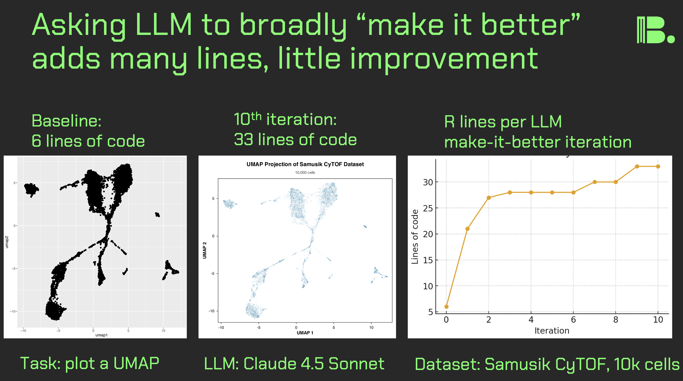
LLM-based CyTOF analysis pipeline design choices
To gauge LLM progress in my domain, I prompted 4 models 10 times each to generate CyTOF analysis pipelines, keeping prompts vague to assess baseline rigor and design choices.
Method:
- I ran a shell script that would loop through the same prompt over and over for a given model, producing a new output txt file with each run that had the LLM answer accordingly.
- The models I used: GPT-5, Grok4, Gemini-2.5-Pro, Claude 4.5 Sonnet. These were accessed through the OpenRouter API.
- The prompt I used was as follows: "Please produce a CyTOF analysis pipeline for one file."
- I extracted packages used in each run to create binary matrix (package x run). See image below.
- I read through each output myself, thousands of lines of code, for expert subjective interpretation.
- I had Claude 4.5 Sonnet critique select outputs, to find flaws that I might have missed.
Results:
- Grok4 output was heavily flawed. The others were decent.
- The best outputs were good "skeletons" of pipelines. A human-in-the-loop piece missing was the paranoid sanity checks that happen at every step (e.g printing and visualizing every possible thing, trying different hyperparameters).
- R was almost always chosen. Grok4 chose Python twice, but outputs were useless (eg. hallucinated packages).
- CATALYST was frequently chosen, but newer tools like Spectre were absent. This plus references to FlowJo/Cytobank but not CellEngine/OMIQ suggest older training data bias.
- FlowSOM was preferred for clustering, PhenoGraph was mentioned occasionally.
- Some manual gating attempts were included (e.g. for DNA, viability), but seemed overengineered. There was minimal commentary around "hey, you should just do this piece in a GUI, it's way easier."
Discussion:
- Broad prompt for one file was a good first pass to assess default choices. Next step: multiple files, real projects with panel info.
- I did not attempt to run any of the code myself. The outputs are linked in the comments for those who want to do this.
- Claude's output-critique also hallucinated, once "reading" nonexistent code from an incomplete prompt. Be vigilant with these tools.
For leaders: pay attention to context engineering
The heterogeneity of the design choices and the other flaws uncovered suggest a need for context engineering. A good prompt may be several pages long and include:
- Both high-level structure and nit picky details of exactly what is needed.
- Examples of pipelines that were viable in the past, and examples of flawed pipelines and other failure modes relevant to the project.
- Internal data, trade secrets, and so forth (if you have a model running locally). This will become more relevant as open-weight models get more powerful.
- Lots and lots of print statements and visualizations.
- LLM "critic" passes that are designed to find flaws in whatever output was given.
- Human experts that can validate each piece.
Please let me know if you have questions/comments. I hope you all have a great day.
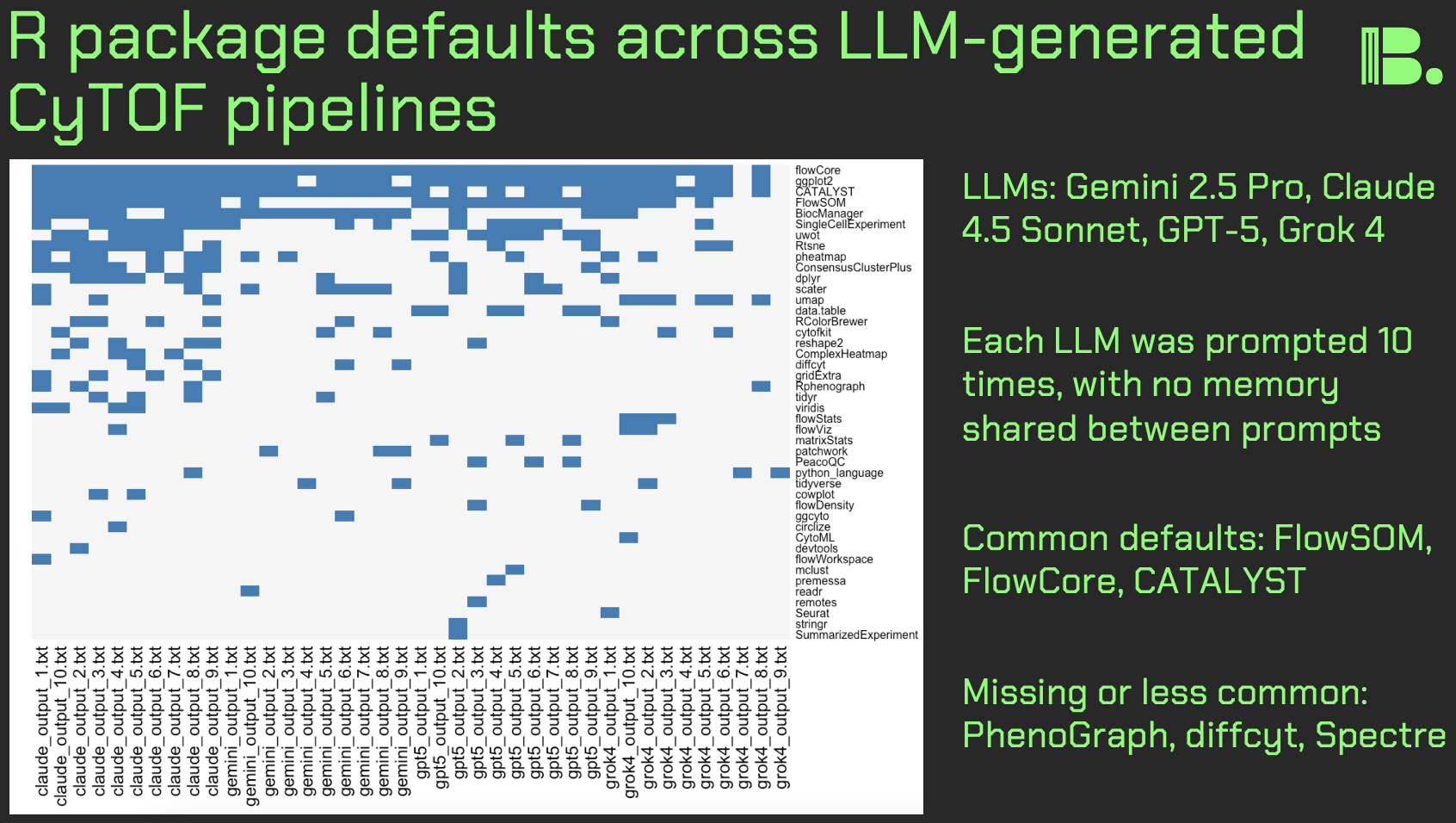
Doing single-cell sequencing analysis in OMIQ
Hack: you can run scRNA-seq data inside OMIQ. This gives you cytometry-grade visualization capabilities and analysis tools (e.g. FlowSOM, OptSNE), otherwise difficult or not available in Seurat/Scanpy.
What I did:
This morning, inspired by an OMIQ tutorial video that Eric Haas made, I figured out how to upload the pbmc3k dataset into OMIQ, software that is originally designed for flow/mass cytometry. I then tested OMIQ's capabilities on the dataset.
How I did it:
- I ran the the Seurat object through the standard analysis up to PCA.
- I combined the gene expression (scale.data) and the PCs into a single matrix. You have to transpose the gene expression data so the features are columns and the cell ID is rows (this is standard flow cytometry format).
- I outputted this as a csv, which I could then upload into OMIQ.
What I found:
- Through OMIQ, I was able to try flow cytometry methods on the pbmc3k dataset, including FlowSOM clustering, and OptSNE and EmbedSOM with dimensionality reduction.
- I was also able to utilize OMIQ's figure builder, which does a good job producing publication or pitch deck-ready plots.
- There was an occasional lag between clicking and something happening, perhaps because OMIQ is not designed to handle csv files of this type.
Takeaways for leaders and research teams:
- Cytometry platforms like OMIQ can be used in single-cell sequencing workflows.
- If nothing else, you can use this as a visualization front end, and keep Seurat/Scanpy for the rest.
Disclaimer:
I used OMIQ as an example here because of my familiarity with it, but for other tools like it, the same concept will likely apply.
Thank you and I hope you all have a great day.
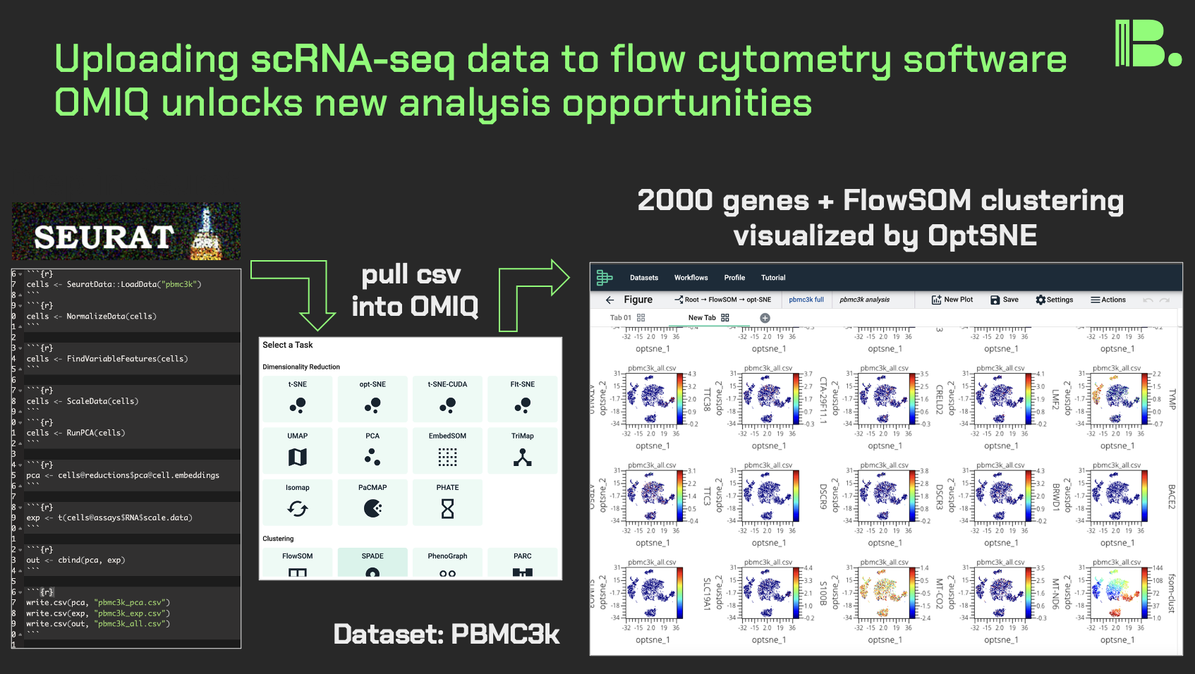
comment
The opposite is also possible, running flow/mass cytometry data in Seurat. If you want to see how I was able to do that, please look at my R Markdown here: https://tjburns08.github.io/run_cytof_with_seurat.html
A review of CyteType: LLM-based annotator
In light of the recent work I have been doing on LLM-based annotation, I wanted to highlight a package I tried that does this quite well: CyteType. Two things really stand out 1) No need for user API key, and 2) the structure is agentic.
On the first point:
While this package does API calls to at least GPT-4o-mini (and many others, if you read the code base), it does not require the user to produce an API key because the author Parashar Dhapola takes care of all of that for you under the hood. This means you don't have to add however much money to (for example) OpenAI, which you drain with each call.
It takes a deep understanding of computational infrastructure to engineer this and have the confidence that you will be able to front the cost of all of your users.
On the second point:
If you study the figure in the Python version's README (shown in my image below, linked in the comments), you can start to understand what "agentic AI for biology" might look like under the hood. Here, you have an annotator, a reviewer, and a summarizer, feedback loops between them, and context engineering for each step.
This "multiple pre-prompted LLMs" concept is currently missing from ChatGPT's public facing interface. However, as per CyteType and tools like it, the agentic layer is inevitable, so I would study it now while the agents are relatively simple.
If you're a researcher:
Try this package on your single-cell data. The barrier to entry is literally copy/paste the code into your pipelines. Bonus points: try it on flow/CyTOF data (which I don't think it was designed for, but you can stuff CyTOF data into a Seurat object so it's compatible…I've done it).
If you're a director or research lead:
Study the structure of the tool, and start thinking about LLMs in terms of flow charts, where a ChatGPT call is a single node. This will allow you to catch the agentic AI wave as it arrives, and think about what kinds of designs you want your team to implement across your pipelines.
Thank you Parashar for producing this tool for the community. Link to the python and R versions of the tool is in the comments below. I hope you all have a great day.
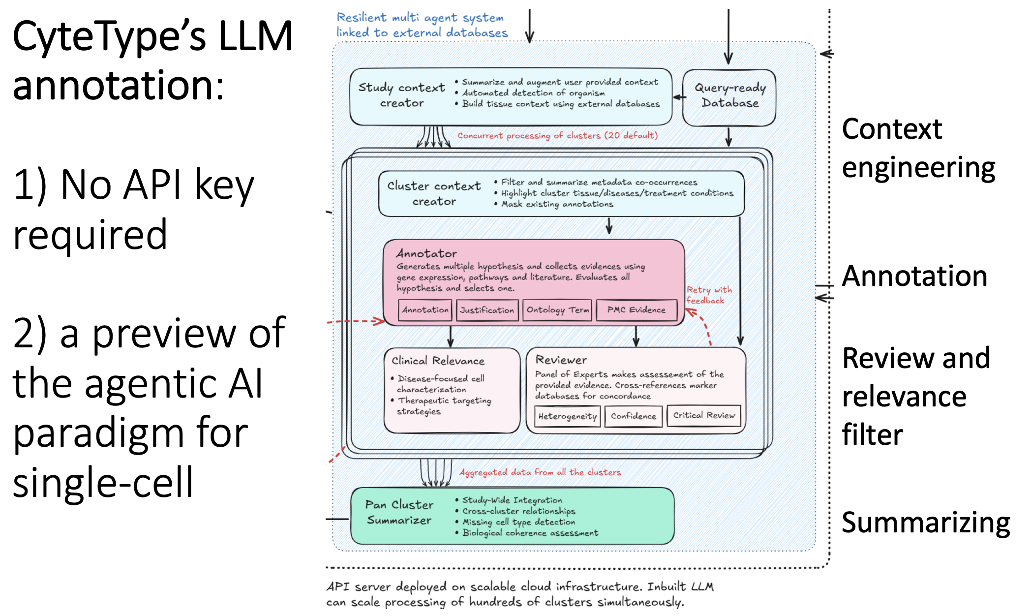
comment
The python package is here: https://github.com/NygenAnalytics/CyteType The R version (CyteTypeR) is here: https://github.com/NygenAnalytics/CyteTypeR
A map of 10,000 LLM-generated microbiome questions
In light of recent work on LLM-generated random numbers, I decided to get LLMs to randomly generate biology research questions, to determine just how random they are. I used a field that is both relevant for my domain of single-cell, and is of primary interest to my intern Arianna Aalami, who intends to pursue a PhD down the line: the microbiome.
What we did:
- We prompted Gemini 2.5 flash lite ~10,000 times: "Please generate a random research question about the microbiome. Output only the question. No extra stuff."
- We embedded the questions into a BERT-like model, which converts each question into a point in high-dimensional space. We ran UMAP on that. Questions similar to each other in context are near to each other on the map.
- We clustered the map, and then used the same LLM to annotate the clusters (in the form of meta-questions), and then made an interactive plotly visualization of the map.
What we found:
- The questions clustered into very particular categories. Some were oddly specific: questions around the relationship between the microbiome and metastatic melanoma, for example. Our hypothesis is that the results are pointing to types of studies that are in the model's training data. This is similar to how the number 42 might show up more often when it's generating "random" numbers.
- Some categories were rather unexpected: there was a whole cluster on the microbiome of migratory birds, or astronauts in space.
- Expected categories, like IBS/IBD, were present but they did not take up as much of the output as Arianna and I thought they would.
Why it matters:
- Just as LLMs have favorite "random" numbers, Gemini 2.5 flash lite has favorite microbiome questions.
- If you need help brainstorming in your domain, then it might help to get a LLM to do a "brain dump" of thousands of questions, and then map them as we did, to organize them in a human-readable format.
Followup work:
- Comparing different models. Grok4 produced quite a few duplicates in the few tests I ran, for example.
- Doing this "research question dump" across research domains. Microbiome might be much more broad, given that it intersects with many other fields. Other fields might be more constrained.
- Trying different clustering methods to uncover more nuanced patterns in our embedding.
- Trying different prompting styles that might produce different sets of answers.
The output from the image and the code used to produce it can be found in the comments. If you want to chat more about this kind of thing, please feel free to reach out.
If you're a microbiome professor looking for a talented PhD candidate, then please reach out to me or directly to Arianna.
Thank you and I hope you all have a great day.
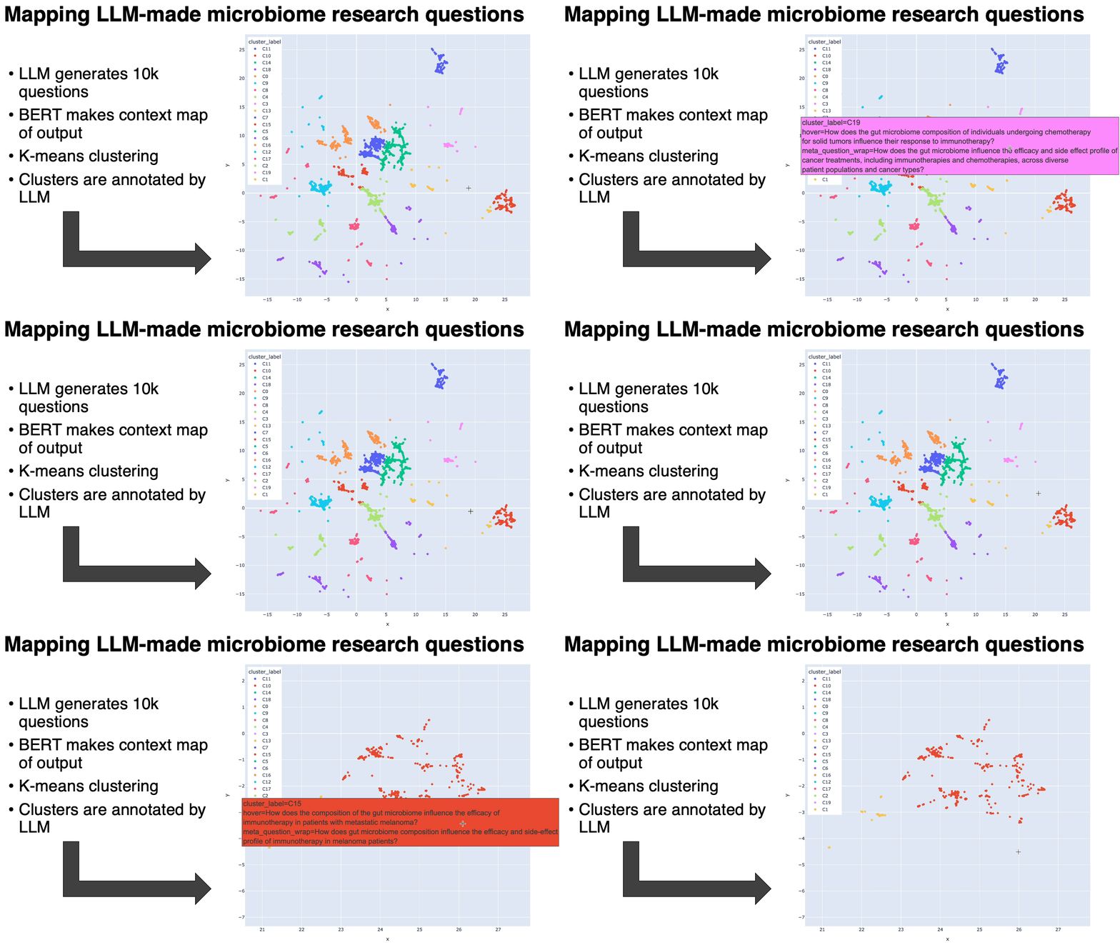
comment
Jupyter notebook is here: https://tjburns08.github.io/LLM_microbiome_questions.html Html output for microbiome is here: https://tjburns08.github.io/umap_questions_with_mq.html
The use of LLMs to help interpret PCA loadings
Friends, leaders, and scientists: how often do you actually use the PCA loadings that come for free in your single-cell and spatial analysis pipelines? Here, we have developed a lightweight pipeline that feeds these loadings (gene lists relevant to each principal component) into a reasoning LLM, to give you a biological interpretation. You can think of this as a supplement to GO/GSEA.
How it works:
Each principal component outputs a set of genes. When you feed these into a LLM, which can be automated via API use and scripting (see comments), it gives you its best guess as to what a given PC axis is "splitting" phenotypically.
Results:
As a sanity check, PC1 splits the monocytes from the lymphocytes. But in the picture, you can see that PC9 and its loadings separate out the dendritic cells, and the LLM helped us confirm this. Our report (link in comments) shows that higher-up PCs provide loadings that confirm but might also transcend demarcated cluster boundaries.
The bottom line for scientists:
Reasoning LLMs have given you an opportunity to fully utilize the PCA loadings that you automatically have in any given single-cell or spatial analysis pipeline, which could potentially give you phenotypic information that goes beyond the standard per-cluster DEG analysis.
The bottom line for leaders:
This is part of a bigger concept of how the use of AI might help us do biological interpretation of otherwise overwhelming output. At the least, this kind of thing is a nice supplement to the longstanding GO and pathway analysis.
Have your comp bio team use the attached markdown to add automated reasoning LLM querying to your data analysis pipelines. PCA loadings are a very low hanging fruit, so start there.
Where to find more:
The markdown is in the comments below, along with a report that shows you everything the model outputted with respect to loadings 1 to 10, including experiments where we run the same list through the model to see if the output changes.
Please let me know if you have any questions or comments. Feel free to DM me. Let me know if you need help setting this up, or if you are doing similar things in your lab/organization.
Thank you to my intern Arianna Aalami for driving this project (think of her as the first author and me as the last author).
To the rest of you, thank you and I hope you all have a great day.
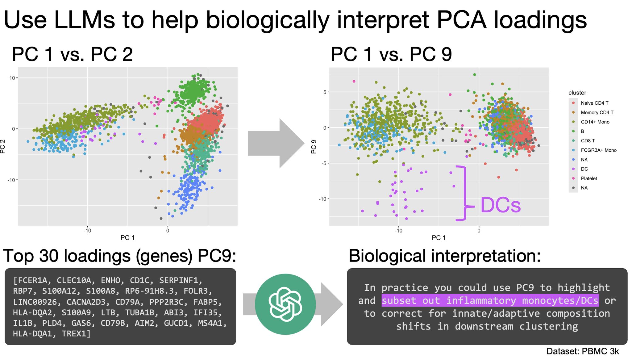
comment
The markdown that allows you to do it on your end, so long as you have an OpenAI API key, is here: https://tjburns08.github.io/BLSC_PCA_loading_LLMs_final.html The report of what we found is here: https://tjburns08.github.io/blsc_pc_loadings_by_llm_interpretation.pdf
The need for wet lab and dry lab integration
Case study: an issue with a bulk sequencing analysis project was quickly found and fixed because of the understanding that "the cell type in question does not behave like that." I can't emphasize this enough: you need bioinformaticians who have wet-lab experience.
Aside from finding and fixing issues in the analysis, the "bigger picture" understanding you get serves as a "relevance filter" that sculpts the direction of the project, and how it is communicated (so the client doesn't end up with a bunch of hairball networks that don't clearly answer their biological questions).
One tactic you can put your team through today: read papers associated with the data. Oftentimes, projects are continuations of previous work that has already been published. Sounds obvious, but there is a difference between knowing something and doing something.
Credit to Christine Nguyen, PhD for sharing this tactic. She has used it successfully over many years working at multiple bioinformatics core facilities, and it has saved her a lot of headache.
If you are recruiting, look for people who are cross-trained. This is hard to do. You have to screen for depth on both sides. I am doing this now.
If you are a PI/leader who needs this type of analysis, DM me. If you are a cross-trained bioinformatician, let's talk.
Thank you and I hope you all have a great day.

Cells at the boundary of two clusters
Ever wonder if a "boundary" cell in a clustering scheme really fits its assigned cluster, versus the adjacent cluster? Below is one straightforward approach to identify these boundary cells in your data.
The problem:
A lot of our clustering tools assume that a cell assigned to a cluster is for sure in that cluster. But anyone who has worked with PBMC scRNA seq data knows that there are populations (e.g. CD4 T cells) that are difficult to subset, and therefore hard cut-offs might not be accurate. Same goes for trajectory data. So we need to scrutinize the cells at the boundary regions between clusters.
My solution:
For each cell, I took it and its four nearest neighbors in PC space (not UMAP space), took their assigned clusters, and computed the Shannon entropy of that. This gives us a value of 0 if they belong to the same cluster and a higher value when the neighborhood is mixed.
What you can do with this:
- A visual QC: Visualize the high-entropy boundary regions directly with e.g. UMAP (see image below).
- Better downstream analysis: Use the entropy values to down-weight cells in (for example) a ML classifier.
- Cluster purity score: Use the mean value of each cluster's per-cell entropy scores (see markdown linked in comments) to determine which clusters need more scrutiny.
Ideas that this builds off of:
Spot Entropy (Søren Helweg Dam, PhD thesis 2025), ROGUE (Liu et al. 2020) and LISI (Korsunsky et al. 2019). See details in comments.
The bottom line:
Take my code from the R Markdown attached in the comments to determine which cells in your single-cell or spatial data need a second look.
If there are any similar things you do for your data (e.g. cluster silhouette score), let me know in the comments or via DM.
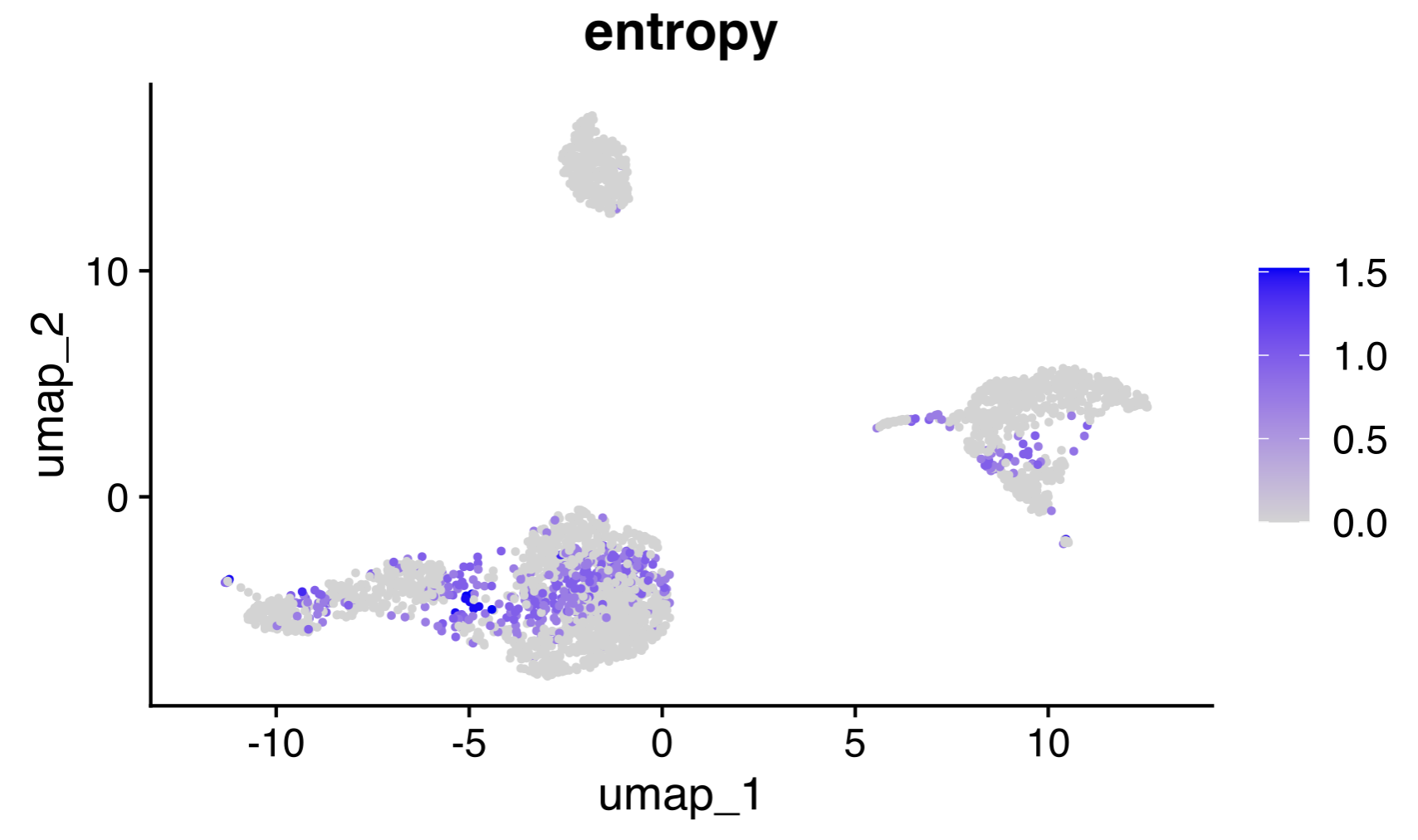
comment
My longer report, containing code you can use: https://tjburns08.github.io/soft_clustering.html
Details on pre-existing methods:
- Spot entropy, Soren Helweg Dam PhD thesis, 2025: a similar KNN-based entropy tool is used for consensus clustering of spatial datasets (the method that inspired this post).
- ROGUE, Baolin Liu et al, Nat. Comm, 2020: uses entropy of gene expression in a cluster (rather than cluster IDs of KNN) to develop a cluster purity score.
- LISI/Harmony, Korsunsky et al, Nat. Meth, 2019: a similar KNN "diversity" index used in the context of benchmarking data integration methods (and could in theory be used here).
A related topic worth reading about: Soft clustering (aka fuzzy clustering). This is where cells are not assigned to a single cluster, but rather have a "membership-ness" score for every cluster. This is done in practice using tools like Gaussian mixture models.
Neighbor graphs in spatial analysis
Spatial -omics analysis is complicated. But there is a powerful concept that unifies many seemingly unrelated methods: neighbor graphs. A neighbor graph simply connects cells to their closest neighbors— either based on similarity of gene/protein expression profiles or on physical proximity. If you grasp this idea, you'll quickly gain intuition across key steps like integration, clustering, niche finding, and dimensionality reduction.
Here is how neighbor graphs underpin a typical spatial analysis pipeline:
Integration:
You might be integrating multiple datasets early on. While there are many ways to do this, one of them, called weighted nearest neighbor analysis, or wnn, uses a knn graph of multimodal datasets to predict the "weights" of each modality (eg. RNA vs protein), to determine how each modality should influence cell similarity.
Clustering:
At some point, you cluster the data. To do this, you make a knn graph, and then do what is known as community detection (which regions of the graph are more connected and which regions are less connected), and assign clusters accordingly. You may have seen the words "Louvain" or "Leiden" in the tutorials. That is what this is.
Niche finding:
After you annotate the cells (e.g. labeling B cells, T cells, etc), you generally want to look for spatial "niches" that contain enrichment of specific cell types. To do this, you now make a neighbor graph of physical spatial coordinates so that each node is a cell label. You then do permutation tests (comparing to a randomized neighbor graph) to add statistical rigor.
Dimensionality reduction:
And finally, just about every single-cell publication has a t-SNE or UMAP these days. How do those work? To massively simplify, both methods take the cells, make respective constructs that are similar to a neighbor graph, and produce a 2D layout that preserves each cell's local relationships by minimizing an information theoretic "loss" (KL divergence for t-SNE, cross-entropy for UMAP) compared to the high-dimensional coordinates.
If you want to prove all of this for yourself, just go through Giotto's code base and search for terms like knn, neighbor, graph, and delaunay (see image below), and/or go to the original Giotto paper (link in comments) and search for "neighborhood network."
What does this mean for leaders and researchers alike?
Neighbor graphs help tie a lot of spatial analysis together. They are not the only thing you have to know, but you should get in the habit of finding these through lines and doubling down on them. This will allow you to both move fast and really understand what is happening under the hood.
If you want to talk to me more about any of this stuff, just send a DM. If you've been doing this a while and there are some other deep through lines you like (e.g. Fourier transform), please mention them in the comments. Otherwise, I hope you have a great day.
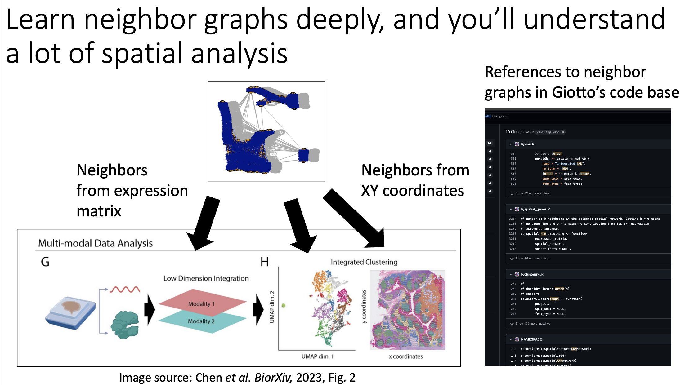
comment
Giotto paper is here: https://genomebiology.biomedcentral.com/articles/10.1186/s13059-021-02286-2 Giotto suite paper is here: https://www.biorxiv.org/content/10.1101/2023.11.26.568752v1.full.pdf
Cluster stability as an evaluation metric for your clustering scheme's performance on single-cell data
Cluster stability as an evaluation metric for your clustering scheme's performance on single-cell data:
Here, I took the PBMC 3k dataset (from scRNA seq), and clustered it using the standard KNN graph-based clustering in Seurat with the default parameters (done on the top 10 principal components, not the UMAP). But then I did it multiple times over multiple random seeds. I then computed the centroids of each clustering and visualized them in UMAP plots. I then strung these together to run as an animation, which you can see in the image below.
I define cluster stability as the amount the clusters "move around" in subsequent clusterings. While I stop at the animations for this post, this metric can in turn be quantified using information theory metrics.
Here, we can see that the CD4 T cell subclusters are less stable than the rest of the clusters in the dataset. We already know that the T cells are harder to cluster for scRNA seq data, as compared to having data from an antibody panel (CITE-seq or flow/CyTOF), so this serves as a sanity check.
If you have a new data modality, or you're testing some new clustering algorithm, or you're simply optimizing whatever existing clustering scheme you've got, it might help to run it many times just to see whether the clusters are stable, or whether some clusters are more stable than others. This will help you optimize your clustering scheme and make sure that the populations that you end up selecting are not arbitrary.
Take home message for bioinformaticians:
Here is an evaluation metric (code is in the comments) that allows you to be a bit more sure about whatever clustering algorithm you are running on whatever dataset, to allow you to distinguish signal from noise and make you more confident with respect to what you end up using in downstream steps.
Take home message for leaders:
As the adage goes, what can be measured can be managed. For your research team, you want to be able to pepper in as many of these evaluation metrics as you can into your workflows. You already know that it helps if they are quantitative, but here I show that it helps if they are visual. The code in the comments will allow your team to produce these animations for your respective projects.
If you want to chat with me more about this kind of thing, feel free to send me a DM. Otherwise, I hope you got something out of this post and I wish you a great rest of the day.
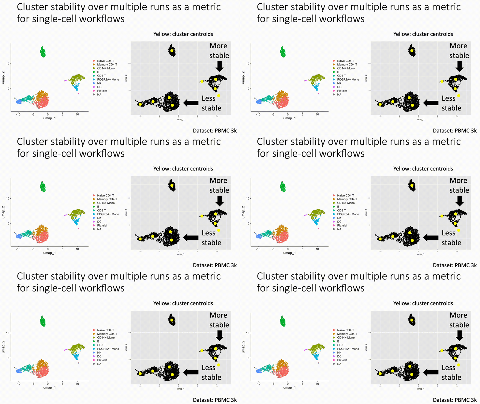
comment
Code and data can be found here: https://tjburns08.github.io/seurat_pbmc_cluster_stability.html
Searchbot and prompt scripting
In light of OpenAI's Deep Research, I updated my command line chatbot to include internet search. Armed with this feature, you can see a meta-level of prompt engineering involving "social networks" of chatbots, which I am calling prompt scripting. And you can do it today…
At the simplest level, you have a chatbot that has a prompt. It outputs something, and its output gets fed into one or more chatbots that are pre-prompted to do a thing. The network of however many bots produce some final output in service of a higher goal.
You can do this by making a shell script, and storing the chatbot outputs as bash strings. If you know how to code, and can think algorithmically, this will serve you well here.
The simplest example is a newsletter producer (see the image):
Step 1: prompt a searchbot to give you research notes and sources around (for example) the latest updates in single-cell foundation models in the past 3 months.
Step 2: take the output from Step 1, and feed it into a reasoning model (eg. DeepSeek R1, or o3-mini-high) along with a prompt to produce a newsletter that contains footnotes and citations.
You can make this infinitely more complex. I have workflows where I pass a research prompt to searchbots that are pre-prompted to specialize in a particular sub-topic, all of which pass their output into a final report-producing bot, for example. You can have additional bots that take in the report and do something with it, or multiple "layers" of research bots. The possibilities are endless.
Again, you can do this today. Just go to my writeup (link in the comments). The code and instructions are spelled out. You need to sign up for perplexity and OpenRouter, and get respective API keys. At which point you can start to "play."
Finally, a prediction:
If you've ever used visual workflow tools like OMIQ or Scratch, I think this is what ChatGPT is going to look like down the line. Where you have a flowchart, where each node is a LLM that has a particular prompt, that passes output to other nodes, which are LLMs with a particular prompt. Have a look at LangGraph Studio if you want to see what I'm talking about.
One low hanging fruit here is UIs like this specific to your domain (for me: flow/CyTOF, single-cell and spatial). I can imagine a community where people share their agentic workflows that solve problems specific to their domain, or companies that have some complex workflow as part of their "moat."
So go build it, and tell me about it.
And to the rest of you, reach out if you need help configuring the tool or want to chat about related topics.
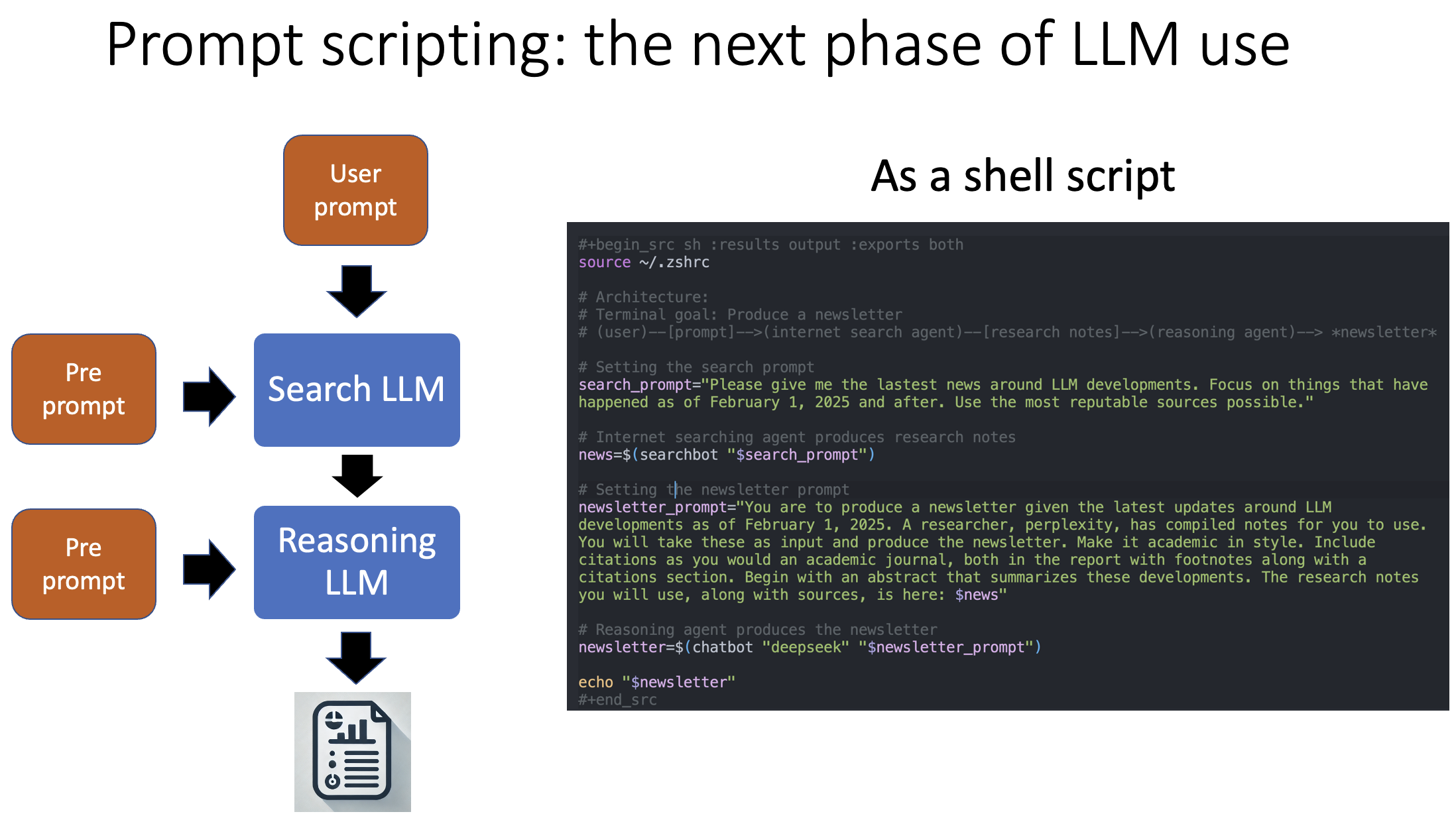
comment
The writeup on how to do this can be found here: https://tjburns08.github.io/command_line_writeup.html
LLM based cell annotation pipeline in Seurat
In light of recent work on LLM-based single-cell annotation, I created a R function for you that allows you to integrate this into your workflow, and makes explicit how it works, so you can be empowered to develop things like this on your end without relying on high-level interfaces…
The LLM:
I use OpenRouter, which gives me API access to the likes of GPT's, Claude, and DeepSeek without being locked into one vendor. You can use any of these if you use my tool. My function converts each cluster's output from Seurat's FindAllMarkers() into a string, which gets combined with a prompt fed into the LLM, per cluster. The output is a vector of annotated cell populations.
Results:
In this experiment, I used Claude 3.5 Sonnet on the back end. This tool was able to annotate the PBMC 3k dataset accurately, with errors involving depth of classification (eg. stopping at CD4 T, and not choosing naive or memory). Running the tool multiple times revealed wording changes (eg. CD4 T vs CD4+ T) but not changes in population guess.
Discussion:
Complexity of data: The PBMC datasets are simple and well-trodden. It is likely that LLM use will trip up in weird ways when we start looking at more complex data, like developmental trajectories or cancer.
Sophistication of model: Claude 3.5 Sonnet is a relatively good model at the time of writing, but we note that if this function trips up on more complex data, the user can switch to DeepSeek R1 or any of the other reasoning models for testing. Accuracy will likely get better as the models become more sophisticated. A future direction here is fine-tuning a model or using a model fine-tuned for the task of cell annotation (see my posts on foundation models).
Prompt engineering: The prompt is relatively straightforward, and there is room to play around with the prompt itself. One simple example might be to provide a document of examples of annotated cell types and what genes they express, directly as a pre-prompt. Such a document is increasingly more possible now, given all the single-cell "atlases" that are being constructed.
Try it yourself:
Use my tool (or similar ones). To use it, just get an OpenRouter API key. The rest is simply copying and pasting a block of code. Battle test it on your "real world data." Let me know where the model trips up. This will allow me and others working on similar things to figure out how to improve these things down the line.
Doing similar project on your end? Reach out. Plenty of people are talking about LLMs but few are actually doing work on them, and I would like to know who you are.
The R markdown with the respective code is linked in the comments. Have fun with it.
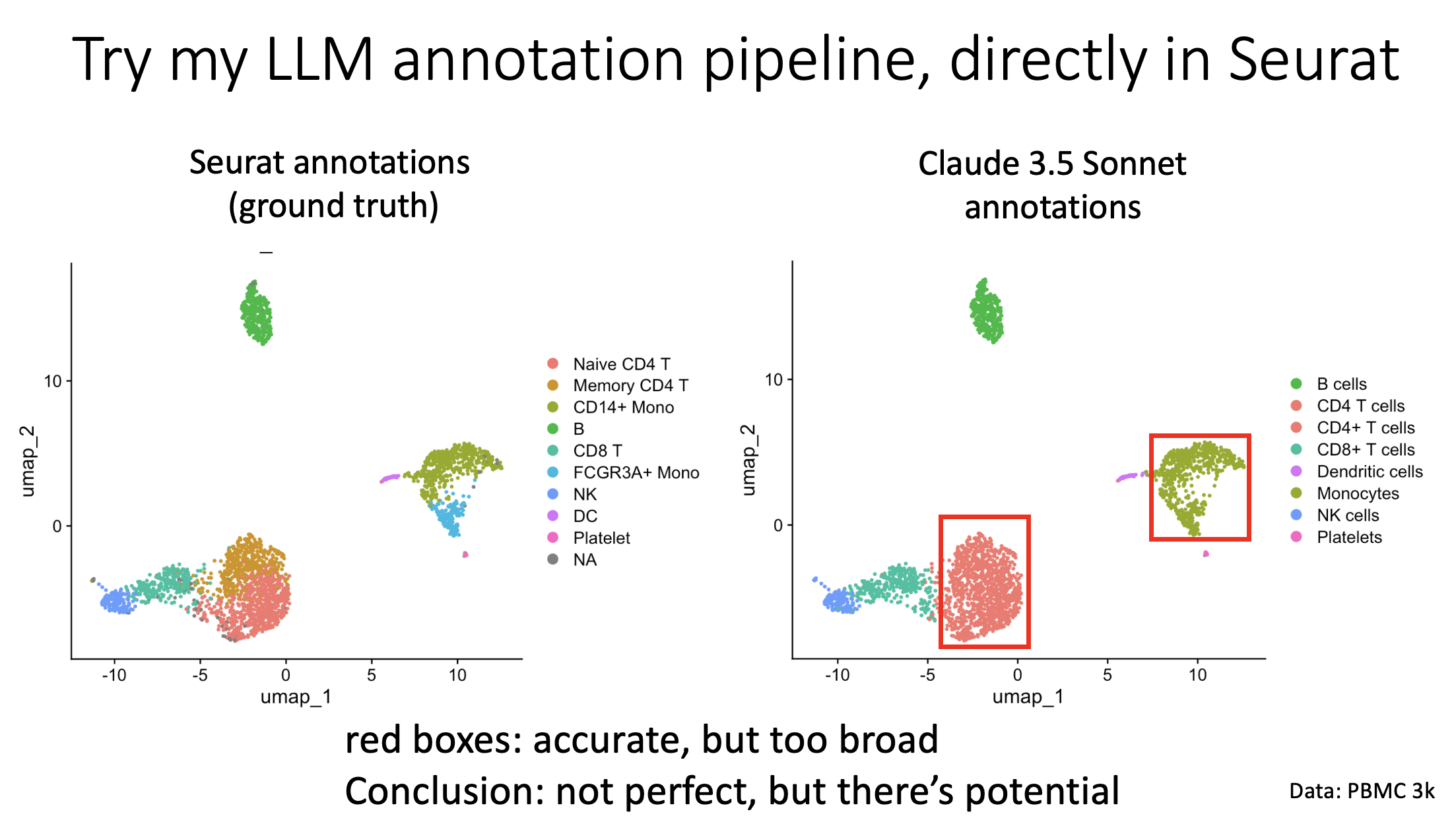
comment
The markdown can be found here, which has everything you need to get started: https://tjburns08.github.io/llm_annotate_pbmc3k.html
The GitHub to the project can be found here: https://github.com/tjburns08/llm_single_cell_annotation
GSEA context map
If GSEA leaves you with firehose of GO and pathway terms that are hard to navigate, I've developed a free solution you can use that organizes and visualizes them by context, so you know what to do with them. Here is how it works:
The challenge:
GSEA (the category of tools that includes g:Profiler and the Broad's GSEA) produces a long list of terms that make it hard to see the "forest in the trees."
My approach:
- Context mapping: I take the list of terms and feed them into a language embedding model, similar to BERT. This groups the terms spatially, so terms that are similar to each other in context are physically near each other in space.
- Clustering and automated annotation: I then cluster the terms and use a LLM (directly in R) to annotate each cluster with an overarching theme derived from its constituent terms.
- Interactive visualization: Finally, I produce a UMAP embedding from the results, and make it interactive such that you can hover over the data points and get the info you need.
Observations:
- Groupings make sense: you can do a sanity check right on the interface to see that terms are grouping together in the map by context (eg. brain development).
- LLM annotations make sense: I note however that they are not spot-on for every single term within a cluster, suggesting that increasing the resolution to the clustering might be a good idea.
Considerations and limitations:
- LLM output is slightly different each time: This is mainly the wording of the same underlying idea. As an example, one cluster was "Neurological and sensory system development" in one run, and "Developmental neurobiology" in another run. This goes back to my hypothesis that upping the resolution of the clusters will improve performance. Nonetheless, you should run the annotation step multiple times to check the consistency of the LLM output. I provide code for that accordingly.
- My workflow preferences: I generally threshold by p-value, starting stringent and then loosening up. I also prefer pathway terms over GO terms.
Bottom line, for bioinformaticians and data scientists:
Read this markdown if you want to produce sensible visuals with the firehose of GO and pathway terms that you get asked to provide. From a technical standpoint, read this markdown if you want to:
- learn how to run a LLM directly in R
- annotate clusters with it
- run python in R
- produce natural language embeddings
- produce interactive maps
Bottom line, for leaders:
- Utilizing recent developments in AI/ML to organize GSEA output (and any text-based output, broadly speaking) will allow you to see the big picture, save time on decision making, and make sure you don't miss anything.
The R markdown guide is linked in the comments below. Please let me know if you have questions or comments. Feel free to DM me.
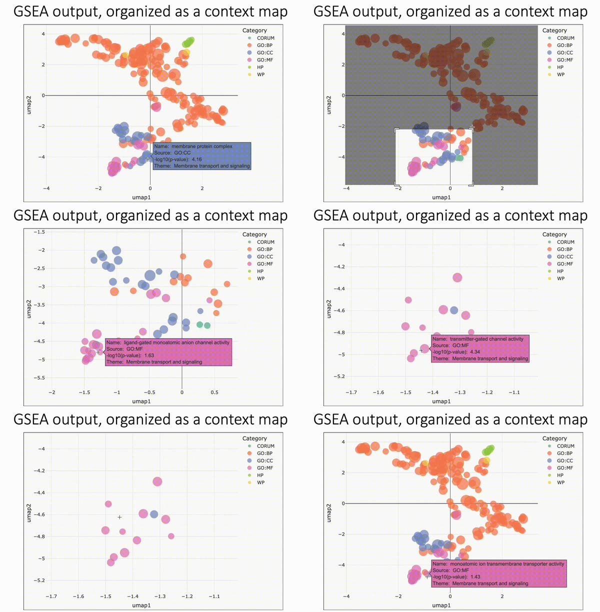
comment
The markdown is here: https://tjburns08.github.io/run_gprofiler_and_embed.html
How I built a LLM chatbot
When doing exploratory data analysis for clients, I have to take very rigorous notes at every step, typically done with literate programming (eg. R Markdown, Jupyter notebook). Accordingly, I built out a way to run and record LLM queries and answers directly within my notebooks. Let me explain…
Why track LLM interactions?
When I am exploring a new dataset, I often will have questions around capabilities of specific packages, or how to do a thing in a specific language (eg. running plotly in R, which I typically do in python). I use LLMs for this, which frequently exposes me to new tools, packages, ways of structuring code, and so forth.
Because my analytical "flow state" can last for several hours, I want a record of exactly what I asked and what the model suggested at any given point. This helps me in terms of reproducibility, not only with respect to code, but also in terms of capturing my thought processes and the LLM feedback in the moment. Rather than flipping between interfaces, I'd much rather see the text, code, and LLM queries all in one notebook.
If down the line I'm sharing work with colleagues and collaborators, then I can include the LLM queries and responses as well, so they can understand how certain ideas and decisions took shape, if they were influenced by the LLM's suggestions. By bundling the conversation with my code and results, everyone has a complete picture of how we arrived at the final outcome.
How I did it:
Accordingly, I created a command line LLM caller that can be run by typing "chatbot" "your-llm-here" "your-prompt-here" in the command line. I use this primarily in literate programming environments (R Studio, Jupyter notebook, Org Mode) where I run a shell code block and type a query.
See the comments for a writeup exactly how to set this up on your end. Note that you'll be able to use Deepseek R1 if you do it like this.
On responsible LLM usage:
This is part of a bigger discussion around how we should responsibly use LLMs in our work. For me, what is important is tracking exactly how I was using them at exactly what step in my work, and exactly what output it gave me.
In terms of when I use them, my general litmus test is: if brain activity stays the same or goes up, I'm using them right. If brain activity goes down, I am using them wrong.
Note that unless you run these things fully locally, you should not put any proprietary information in here. This is not a problem for me, because I'm using them primarily to "expand my horizons" with respect to the analysis I already do. So it's more of a teacher than anything.
The bottom line
For the sake of keeping track of LLM use, you should have the ability to call and run LLMs directly from your jupyter notebooks or R markdowns, so you can see exactly how you were using them at all times.
Give it a shot, and message me if you need help setting it up. If you are integrating LLMs into your work in a unique way, let me know. I hope you all have a great day.
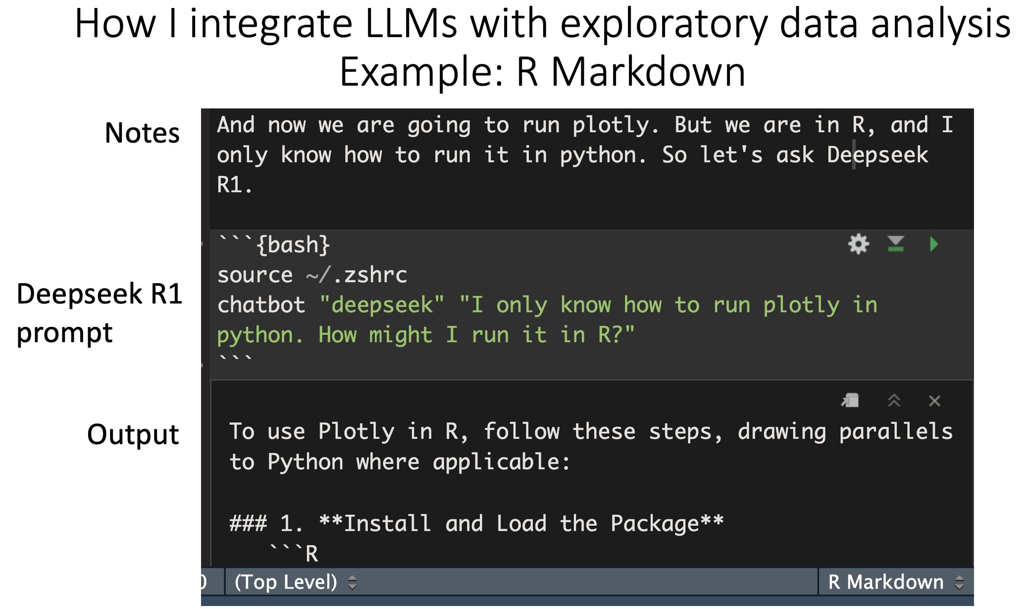
comment
The writeup can be found here: https://tjburns08.github.io/command_line_writeup.html
Comparing Color Palettes for scRNA-seq Data Visualization: The Case for Viridis as a Default
TL;DR: use the viridis color palette for your single-cell data to improve interpretability and colorblind accessibility. Flip through the 3-slide carousel for visuals. Longer post…
It was brought to my attention in a previous post I made, that the "jet" color palette (blue -> red) often used for coloring t-SNE and UMAP plots can exaggerate differences in marker values, and is not colorblind friendly.
In the R markdown linked in the comments, I compare the Jet, Seurat default, and Viridis palettes in terms of balance and colorblind friendliness. The report includes both color spectrum comparisons and UMAP plots colored using each palette, along with colorblind simulations.
The first image in the carousel shows the spectra in side by side comparisons. The second and third images show representative UMAPs colored in the three palettes along with their colorblind simulations.
Observations:
- Jet: abrupt color transitions exaggerate small differences in marker expression if they occur at these transition points. Colorblind simulations keep these transitions and make the palette overall very unbalanced.
- Seurat default: smooth transitions and colorblind friendly, but limited resolution due to fewer colors being used.
- Viridis: smooth transitions and colorblind friendly, but with higher resolution due to more colors. This resolution is at least partially preserved in the colorblind simulations.
Based on these observations, I recommend that researchers and leaders consider using viridis (or palettes in the viridis family) as defaults for your papers, posters, talks, pitch decks, and so forth.
By doing so, we can enhance interpretability, inclusivity, and data literacy across academic and industry settings.
Please see the comments for a talk given at SciPy in 2015 from the creators of the viridis color palette. They do a great job introducing the viewer to the first principles of color theory, from the photons to the neurons. They use that in turn to explain the development of viridis.
Bottom line: use viridis to improve clarity and inclusivity in your single-cell data visualizations.
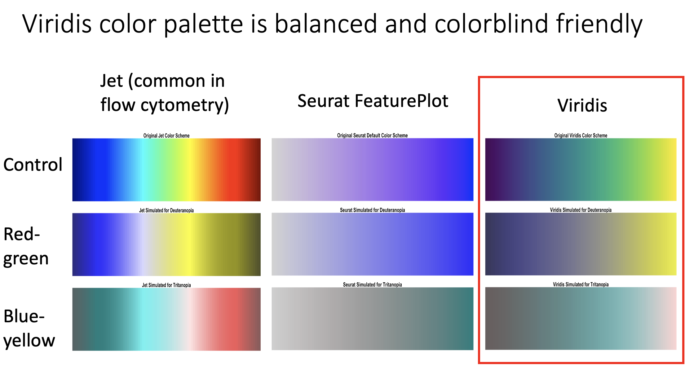
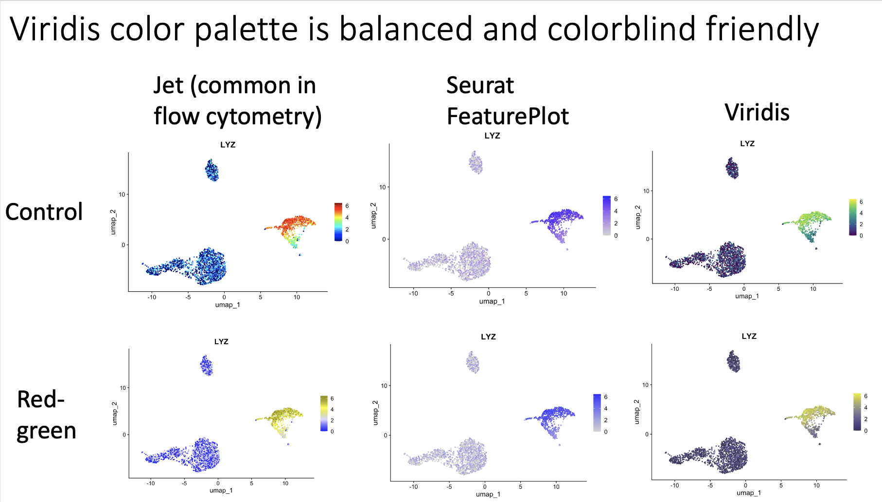
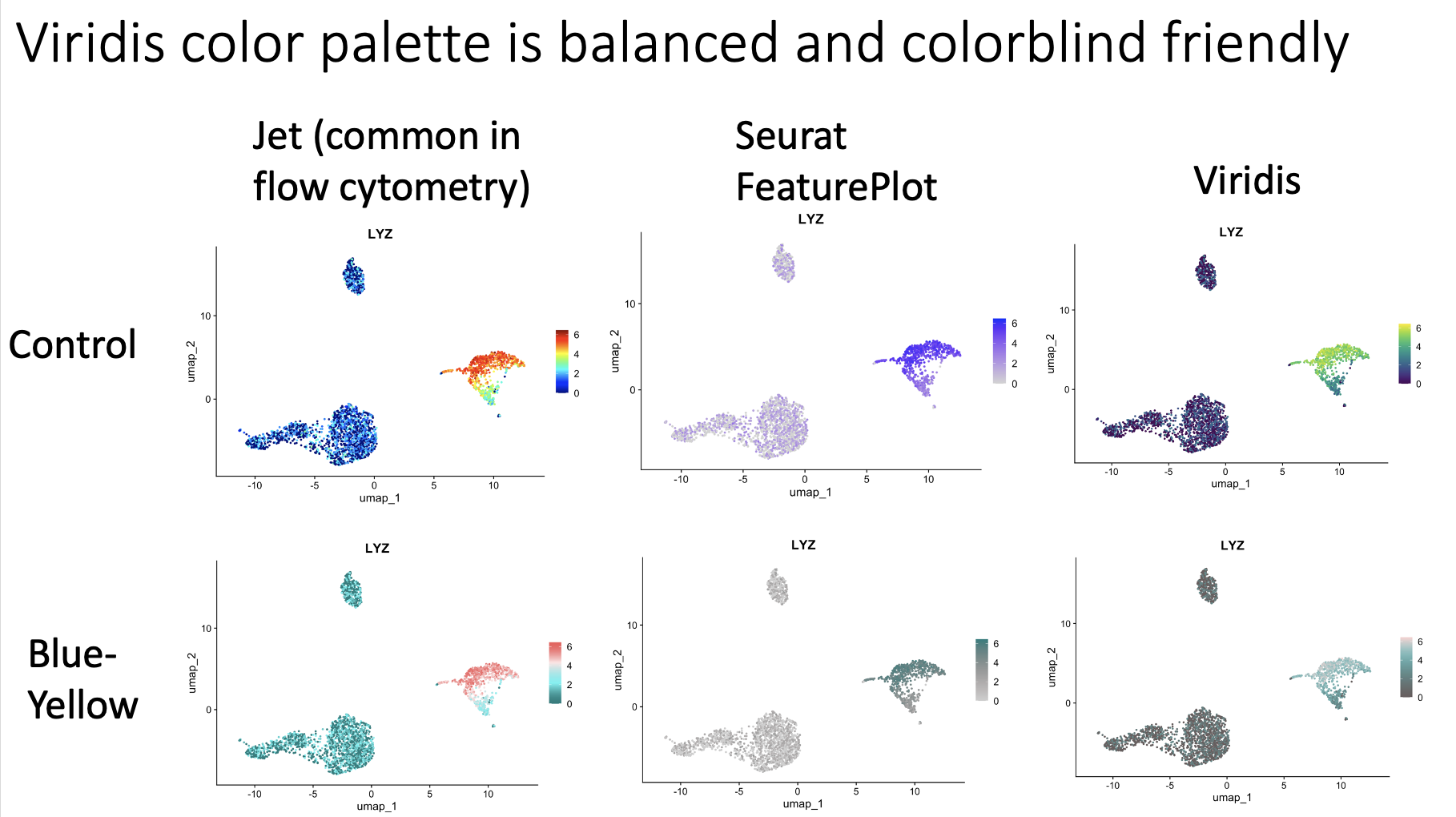
comment
My markdown is here: https://tjburns08.github.io/case_for_viridis.html
A video by the creators of the viridis palette is here: https://www.youtube.com/watch?v=xAoljeRJ3lU
Thank you to Asier Antoranz for making me aware of this video, and therefore inspiring this post. This truly shows the value of posting content to social media.
Cytobank color palette for Seurat's FeaturePlot
Flow/CyTOF users who are now doing single-cell sequencing analysis: I created the blue-to-red color palette (eg. used in FlowJo, Cytobank, OMIQ, etc) for Seurat's FeaturePlot function, which otherwise defaults to gray-to-purple.
Back in the early 2010s, when I was first coloring t-SNE maps for CyTOF data, I got used to a color palette that the main SAAS company in the space, Cytobank, was using. It's basically blue -> cyan -> green -> yellow -> orange -> red.
Anyway, here is a R Markdown (linked in the comments) that has the code to use this color palette for FeaturePlot, but also some code that allows you to replicate the FeaturePlot function with the "Cytobank palette" independent of Seurat. The image is example output.
Feel free to steal the code and do whatever you want with it. I hope you all have a great day.
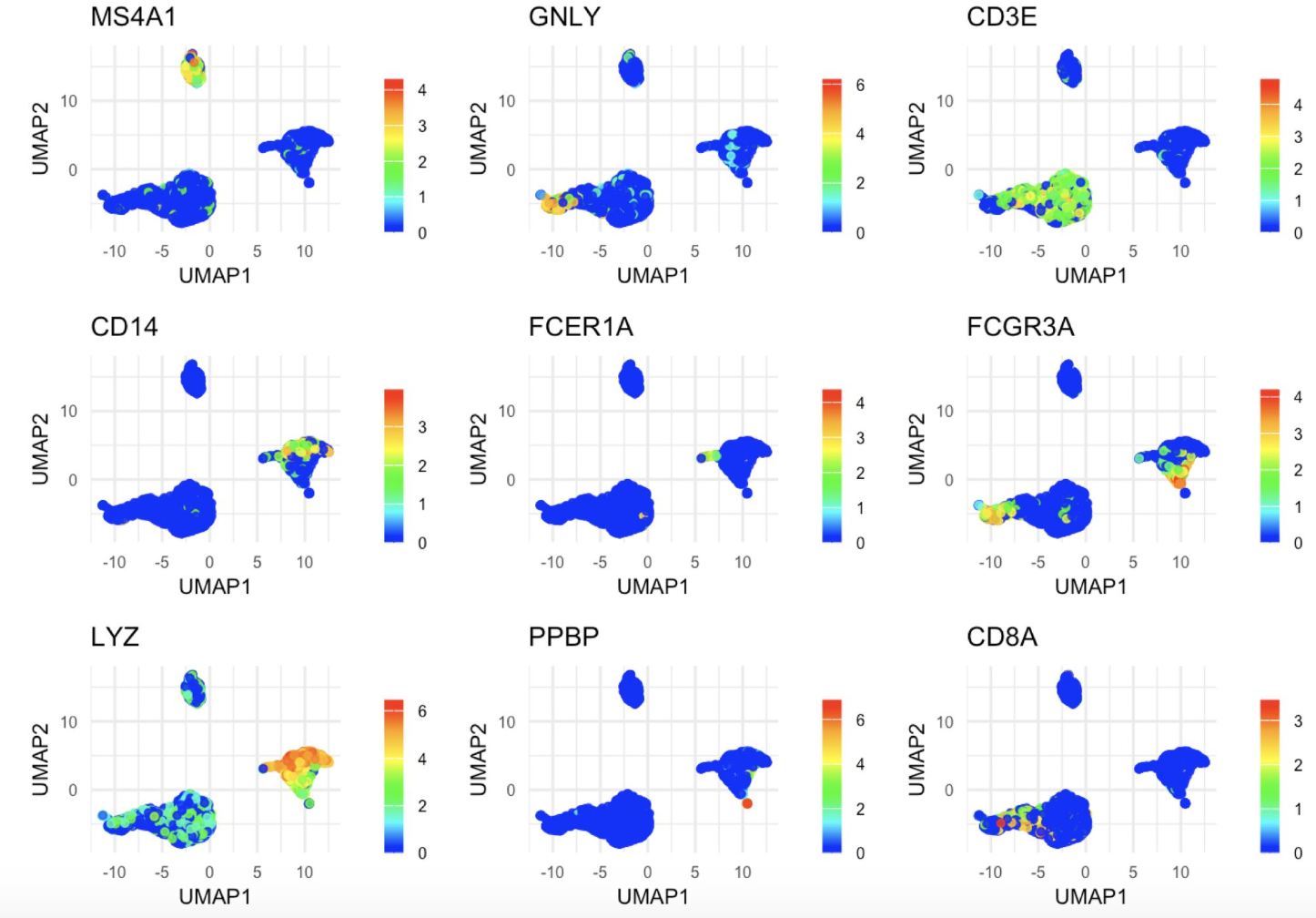
comment
The markdown is here: https://tjburns08.github.io/rainbow_feature_plot.html
Don't use top n variable genes for AI foundation models
In a standard scRNA-seq analysis pipeline, you select the top ~2000 variable genes for downstream analysis (eg. clustering). However, my recent experiment suggests that you should not do this for foundation models. Here is what I did…
The Universal Cell Embeddings (UCE) foundation model, part of a bigger "virtual cell" initiative, takes a raw cells x counts matrix as input and outputs a 1280 dimensional vector that contains biological meaning as output. This is then used for downstream analysis.
The power here is that you get the same vectors every time. There is no fine-tuning of the model. So you can make comparisons with any datasets that have never been run through the model, and therefore do things like annotate, given metadata cells from other datasets.
As I said in a previous post, this can take a long time if you're running it locally. One hypothesis, inspired by one of the comments, was that I could put in an abbreviated dataset of only variable genes, and get a faster result without sacrificing accuracy - a good thing when computational resources are limited.
Experimental design:
I ran the following 3 datasets through UCE.
- The full dataset (positive control).
- The dataset containing the most variable genes (experimental).
- The dataset containing a random selection of genes (negative control).
My results:
I found that the dataset containing the most variable genes did not have the same level of cell type separation compared to the full dataset, with the negative control performing worse than both of them. This can be seen by assessing PCA space of the concatenated data (image below). Further quantification via Shannon entropy (to measure diversity) confirms this (see my jupyter notebook in the comments).
What this means for you:
This suggests that for UCE, and perhaps for other foundation models (geneformer, scGPT), you should run the full dataset through it to get the best results, and the typical practice of only selecting variable genes may not apply to the use of foundation models.
Zooming out:
There has been an uptick in people asking me questions around AI as it relates to single-cell in the past few weeks (perhaps because I'm posting about it). Even if you're a natural skeptic (like me), you should at least be familiar with them, because like the black boxes before it (eg. t-SNE/UMAP), these tools don't appear to be going anywhere. And they do indeed have potential to accelerate our workflows.
If you are doing work in this space, or interested in doing work in this space, please let me know.
A jupyter notebook showing my work is linked in the comments. I hope you all have a great day.
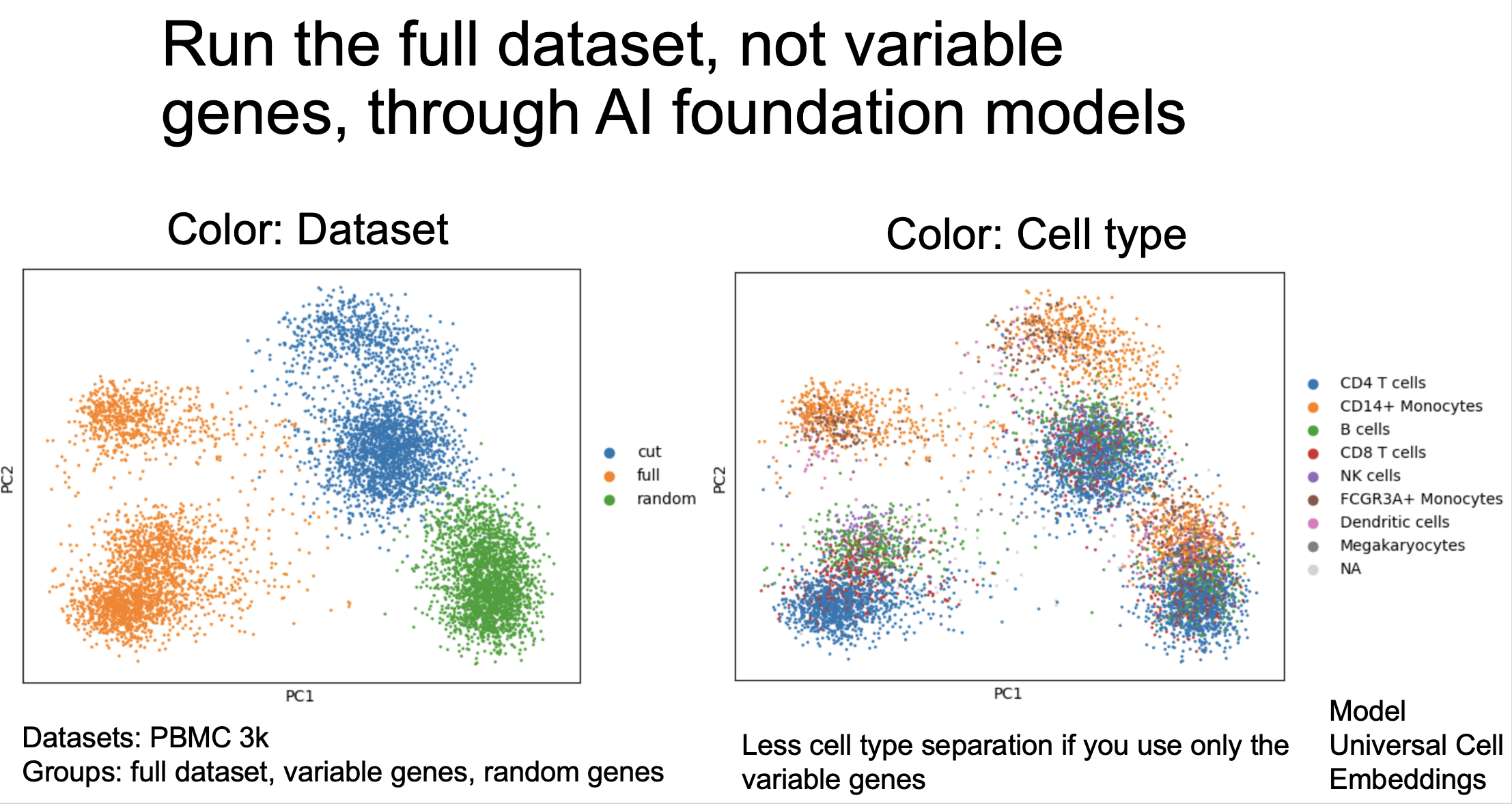
comment
Jupyter notebook detailing my work: https://tjburns08.github.io/compare_full_vs_filtered_uce.html
Universal Cell Embeddings: https://www.biorxiv.org/content/10.1101/2023.11.28.568918v1
Note: a pre-processing step in the UCE pipeline reduced the 1838 genes I took out in the experiment and control groups down to 1529 and 538 genes respectively. The 528 genes is fine because this is a negative control…we are trying to get a situation where there is no cell separation. The 1529 genes (rather than around 1800) is a bit less than I'd otherwise use, and it is up to the reader to determine (and ideally experiment with their data) whether an additional 200-300 genes on the lower end of "most variable" would really bring it up to the standard of the full dataset.
Test drive of single-cell AI foundation model
I test drove a single-cell AI foundation model with scRNA-seq data, so you don't have to. The punchline: it was good enough that I think you should familiarize yourself with these models. Here are the details…
What I did:
The Universal Cell Embeddings (UCE) transformer-based foundation model takes the raw count matrix of scRNA-seq data, and outputs a 1280 dimensional vector per cell that is biologically meaningful (I know…black box). Importantly, there is no standard pre-processing (find variable genes, normalizing, scaling, take the first n principal components). Just the raw counts as input.
I ran the flagship "PBMC 3k" dataset, along with a "PBMC 10k" dataset that they had as a default, through the 33-layer transformer model (there also a 4 layer option). On my laptop (14 inch MacBook Pro), these were essentially overnight runs. I tried running them through the day, but it slowed my computer down.
Observations:
- Similar output to the old way: If we take the 1280 dimensional embeddings and visualize them with UMAP, the output looks similar to what I would otherwise see if I made a UMAP from the top n principal components of pre-processed data, per dataset. This suggests that the model is capturing similar information to what one would otherwise get from the standard Seurat/Scanpy pipelines.
No direct data integration, but UMAP makes it look worse: When I concatenated the datasets and placed them onto the same UMAP (without integration), each dataset was on different sides of UMAP space, suggesting that the model didn't "grok" integration.
However, when I ran my KNN Sleepwalk tool on the UMAPs to look at the difference between UMAP space and high-dimensional model space, I found that the two datasets were much closer to each other than UMAP suggested. In other words, UMAP was exaggerating the space between them (see the image below).
- Not integrated, but aligned in PCA space: Further analysis in PCA space (see my jupyter notebook, very bottom) suggests that the two outputs are shaped such that you could literally "slide" one dataset onto the other.
The big picture:
The UCE model is the first model in the larger Virtual Cell initiative (link in comments), backed by the likes of Steve Quake, Aviv Regev, Stanford, and Chan-Zuckerberg Initiative. So there will be lots of resources directed at improving these models down the line.
I see a future where traditional pipelines and AI foundation models are run in parallel. This "barbell strategy" of old and new, combining standard approaches with AI pipelines, ensures we gain new insights without depending on black boxes.
A major hurdle here will be a speed-up. I had a hard enough time with 13,000 cells across two files. Real-world projects can be much larger.
In short, I would get familiar with these models now, before they start showing up in papers.
See my jupyter notebook detailing my work in the comments.
I hope you all have a great day.

comment
My jupyter notebook: https://tjburns08.github.io/explore_uce_output_3k_10k.html
My KNN Sleepwalk package: https://github.com/tjburns08/KnnSleepwalk
Virtual Cell Initiative: https://arxiv.org/abs/2409.11654
Universal Cell Embeddings: https://www.biorxiv.org/content/10.1101/2023.11.28.568918v1
Sometimes the simple solution is good enough
In bioinformatics, sometimes the simple solution is good enough.
In a spatial transcriptomics project I'm on, I was researching tools for deconvoluting Visium data to get "pseudo-cell" info out of the "spots." Accordingly, pseudo-cells are inferred from transcriptomic profiles within Visium spots, which typically capture multiple cells. Deconvolution methods help break down these mixed profiles within the spots to estimate gene expression at a more granular, pseudo-cell level per spot.
In a benchmarking study to this end from the lab of Yvan Saeys, one thing stood out that I (and they) found interesting:
Of the 12 methods that were analyzed, a simple regression, known as non-negative least squares (NNLS) did better than almost half of these specialized spatial deconvolution tools in at least one metric, and did better than 1/3 of the methods in a composite score (see image below, which comes from Figure 2 of the paper).
The point I want to bring up here is that in some contexts the simple, rapidly implementable method, even if sub-optimal, is good enough. If you hypothetically had the first Visium dataset in human history and had to figure out a way to deconvolute it, this study shows that you would get pretty far just by running NNLS.
As another example you've seen if you follow my content, I got pretty far using k-nearest neighbors (KNN) to both quantitatively and visually benchmark nonlinear dimensionality reduction tools (before this topic was mainstream). There are many more methods out there to that end, but KNN is intuitive and easy to implement, so tools like this are a good place to start.
The take home message for leaders:
Agile decision making: when you're doing a first pass at something and/or when you're truly in the wild west (no one has written the book on what you're doing), a simple approach will get you insights more quickly, which will inform your next steps.
Resource (e.g. time) management: in projects with many moving parts, doing the most easily implementable things first will allow for a better handle on the problem space. This will help to determine if more sophisticated and time-consuming methods might be necessary down the line.
The take home message for scientists:
Momentum: in my experience, taking any action that moves the project forward, even if it's suboptimal, gives you psychological momentum (motivation) that moves you and the team forward. This is especially important for problems that are hard and intimidating. Just start somewhere.
The paper is linked in the comments, if you want to have a closer look. If I had to "benchmark" the benchmarking studies I've seen, the ones from the Saeys Lab are as good as they get.
I hope you all have a great day.
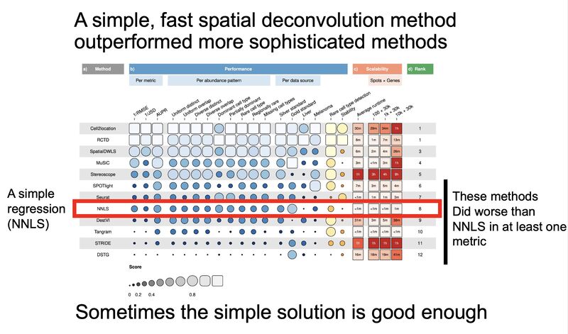
comment
The spatial deconvolution benchmarking paper: https://elifesciences.org/articles/88431
Build automation with user paranoia in mind
Plenty of people are talking about automation as the future of bioinformatics. This is fine, but there is one additional piece that leaders need to be aware of, to produce winning next-gen solutions: the user's paranoia.
A lot of the bioinformatics work I've done in the last 8 years has involved paranoia management, both for myself and for my clients. In other words, every last little piece of the workflow has checks and visual components to make sure there are no issues with the data and/or the algorithms (and believe me, issues come up). This is especially important when your analysis has any sort of novel component (data, tools used, etc).
There appears to be a push toward a "single button solution," be it auto-gating for flow/mass cytometry, or one-and-done cell segmentation in imaging. This is ok, but if you want buy-in from biologists, and especially clinicians (you do the data analysis wrong, bad things happen to sick people), you better have lots of "checks" at every step, both numeric and visual, so we can go through every last little piece of the analysis and look for things that could go wrong.
So embrace the paranoia of the users, learn about it, and speak to it as you build out the next generation of tools. We will thank you in the end.
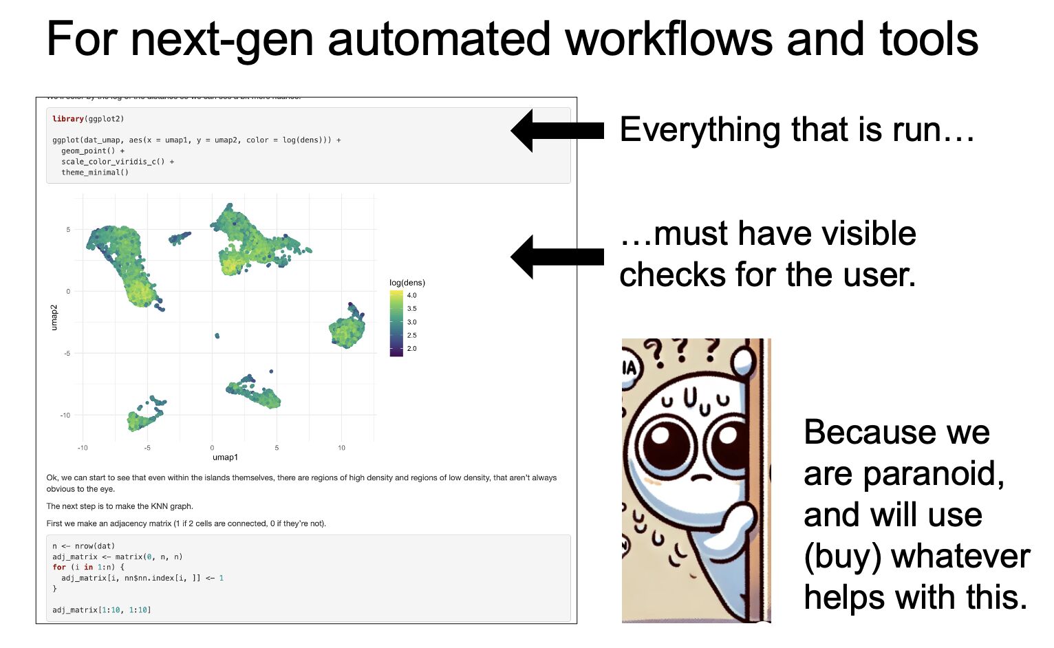
comment
I think that the spotlight on paranoia in my post resonates with a broader field, that may become increasingly relevant: explainable AI (XAI).
In section 2.3.1 of a 2024 review by Longo and colleagues (https://www.sciencedirect.com/science/article/pii/S1566253524000794), highlighting the current challenges in XAI, paranoia is a subtext in the following life sciences related passage:
"The inferences produced by AI-based systems, such as Clinical Decision Support Systems, are often used by doctors and clinicians to inform decision-making, communicate diagnoses to patients, and choose treatment decisions. However, it is essential to adequately trust an AI-supported medical decision, as, for example, a wrong diagnosis can significantly impact patients."
(there is some paranoia that comes with getting clinical work right)
"In this regard, understanding AI-supported decisions can help to calibrate trust and reliance. For this reason, many XAI methods such as LIME, SHAP, and Anchors have been applied in Electronic Medical Records, COVID-19 identification, chronic kidney disease, and fungal or bloodstream infections"
(XAI methods serve as a number of visible checks to mitigate paranoia by identifying issues when AI is being used)
Cluster stability visualization
When you cluster your single-cell data, do you run it multiple times to check for consistency? You should. This is part of an important topic called cluster stability. Let me explain.
The attached gif is FlowSOM clustering of CyTOF whole blood data, with 20 and 40 consensus clusters selected side by side, run 50 times. These are visualized on a UMAP. The cluster centroids from the UMAP visualization are computed and shown as yellow spots.
You'll notice that there are some instances where the centroids are relatively stable (especially in the 20 cluster case). There are other instances where they move, appear, disappear, and so on.
The practical takeaway I get from this is that if you're running FlowSOM or similar clustering algorithms where you choose the number of clusters, you should aim to over-cluster rather than trying to get the perfect number of clusters. You can always merge similar clusters later.
Furthermore, it helps to know which clusters are static versus which are moving around, in order to know whether a small "rare" cluster you found is a fluke that showed up one time in 50, or whether it keeps showing up.
The data and code for creating this gif is linked in the comments. I just got started on this project, and there is still some work to be done. Future directions include running this on clustering algorithms where the number of clusters are actually computed rather than chosen, like PhenoGraph. If we find that these clusters are moving around all over the place, then it will be worth doing a one-over on relevant clustering strategy.
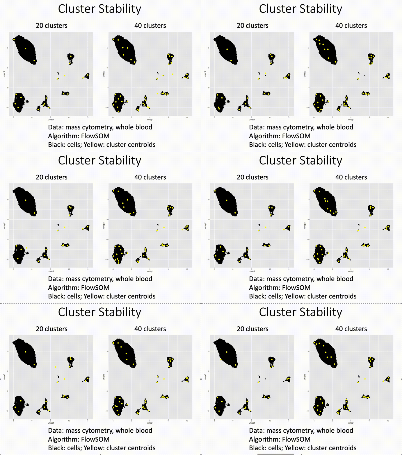
GigaSOM: FlowSOM in Julia for larger datasets
Facing challenges with analyzing large flow and mass cytometry datasets?
As datasets grow, the need for faster and more efficient tools becomes paramount. If you're looking to run FlowSOM clustering on more cells faster, consider exploring GigaSOM in the Julia programming language:
🚀 It clustered 1.1 billion cells in just under 25 minutes (EmbedSOM image below).
🖥️ Achieved on a relatively small (256 core) compute cluster.
While I haven't done a side-by-side comparison with this exact dataset on this size compute cluster in R, my experience with Julia has been promising. It combines the ease of R and Python with the speed of a lower-level language.
Thank you Abhishek Koladiya, PhD for introducing me to this innovative package.
Dive deeper into the details with the paper and package homepage: https://lnkd.in/e9-Bdk3Y
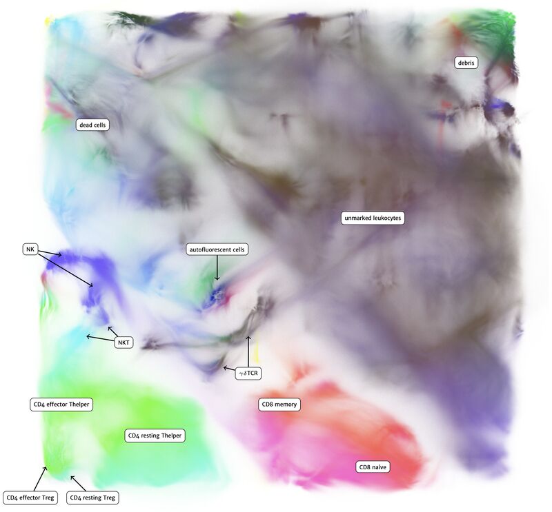
How X-shift works
I wanted to highlight a clustering method specialized in rare subset detection that in my opinion is under-explored with respect to newer, high dimensional data types (eg. single cell sequencing, high-dimensional imaging, spectral flow). It's called X-Shift, written by Nikolay Samusik.
For biologists and directors, if you have any projects that involve the detection of rare cell subsets, then X-shift should be on your radar. X-shift was determined to be the best method for rare cell subset detection, in a 2016 clustering method benchmarking study (the one that put FlowSOM on the map). The paper is linked in the markdown below.
Why isn't X-shift all over the place? The method is computationally expensive (eg. high run-times), and runs in Java, not the more common R or Python (yet), making it more difficult to integrate into existing single-cell pipelines. Thus, the method is not as widely utilized and explored as it otherwise would and should be.
How does it work? The method is based on mean-shift clustering. For each cell, move in the direction of higher density until you get to a peak. That peak is your cluster.
For bioinformaticians (and anyone else interested in going deep), I created a massively simplified, hyper-tailored, and highly visual version of X-shift in R, to ground your intuition in how it works. You can see the method in action, code and all, in this markdown: https://lnkd.in/e_mSEzm3. In the markdown, I include links to the X-shift paper, benchmarking study, and X-shift software.
Thank you for your attention, and I hope you all have a great day.
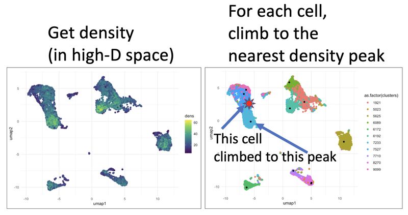
Single-cell sequencing analysis: don't forget to integrate your data
The following is a warning for biologists, bioinformaticians, and leaders of research teams, especially those moving from a flow/CyTOF background into single-cell sequencing. Please study the concept of data integration.
Flow and CyTOF users know to cluster on "type" markers (eg. surface), and never on "state" markers (eg. phospho-proteins). However, making this distinction is not possible for scRNA seq data. Thus, we have to rely on data integration, which is a way of algorithmically "aligning" data across multiple conditions.
Here, I show how integration is done, but my main point is to show what the data look like when they're not integrated. Failure to integrate the data can lead to false conclusions, and a whole lot of wasted time and effort.
For biologists and leaders of research teams, please study these pictures. You need to know what un-integrated data look like so you can have intuition around what is a novel cell subset and what is a technical artifact.
For bioinformaticians and those interested in going deeper, the vignette is here: https://lnkd.in/eRJE57i5. I hope you all have a great day.
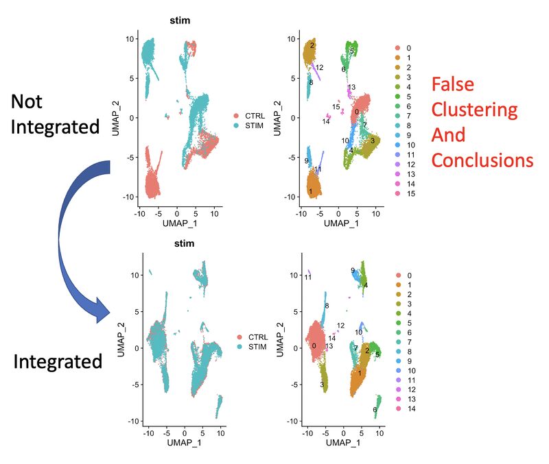
Pictures of different data transforms for CyTOF
CyTOF users: we use the asinh transform, but is that the only one that works? How does the scale argument influence the data transformation? Here is an interrogation of CyTOF data transformed in many different ways: https://lnkd.in/eRgYXzkm
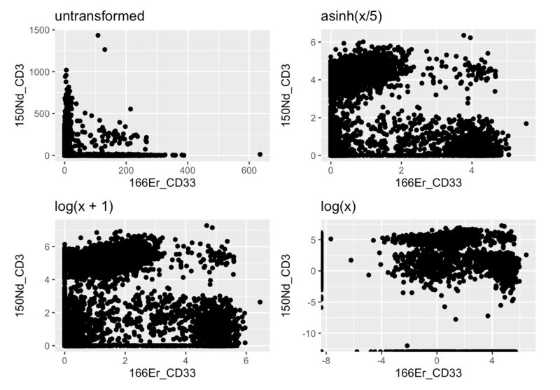
What happens when you run SPADE on random input
Flow cytometry and CyTOF users: here is a SPADE tree produced from 30 dimensions of random noise. It still looks beautiful, but conveys no truth. This is an example of the beauty is truth delusion, and its behind every bioinformatic corner waiting to pounce. Read more here: https://lnkd.in/ezeZV_Fj
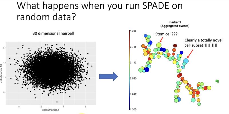
Two surveys side by side, 11 months apart on LLM usage (April 2023, March 2024)
As per my two polls placed 11 months apart, most people in the flow/CyTOF community are interested in but not using or experimenting with LLMs in their work, both now and one year ago. Between last year and now, more people appear to be actively using LLMs.
I have not come across any work using LLMs particularly with flow/CyTOF data analysis (comment or DM me if you have), though I have seen a few papers using them in single-cell sequencing analysis, suggesting that flow/CyTOF might be next. Here is an example study reviewing seven different single-cell LLMs: https://lnkd.in/dTCxxEf5
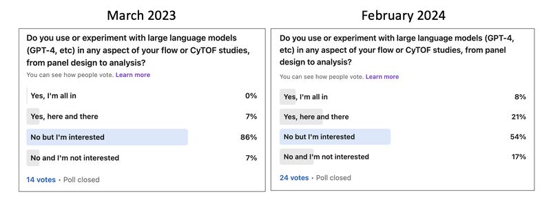
Survey March 2024, most are not using but are interested in autogating
Automated gating (autogating) has been a topic of discussion for many years, but more recently I'm seeing it in the major flow/cytof analysis SaaS products, and I'm hearing of users requesting it more often. So I am interested in knowing whether it is becoming a standard part of people's workflows, whether there's simply more interest, or whether most people are not interested and there is a selection bias in what I'm seeing. Thank you to everyone who takes the time to answer.
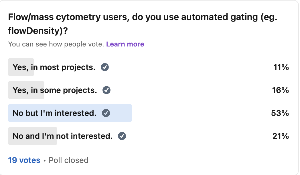
Bibliometrics
Trends in the literature. There is a lot going on here, and very few people actually studying this. Given the replication crises that are emerging in various fields, it is probably a good idea that more people pay attention to analyzing the literature itself in the single-cell field.
Keeping ahead of the single-cell foundation model literature with GitHub's "awesome" page
Keeping ahead of the single-cell foundation model literature, using GitHub's "awesome" pages:
Foundation models are AI models that, after being trained on a large amount of relevant data, can serve as a "swiss army knife" to perform a number of tasks (eg. cell type annotation).
Accordingly, these are creating a bit of a buzz in single-cell and spatial analysis, and people should have a thumb on what is going on in this space. But like any popular emerging field, it can be hard to stay on top of all the new work…
For those interested in keeping up with progress in foundation models, look no further than GitHub's "awesome" pages. This one (link in comments), called awesome-foundation-model-single-cell-papers, contains lists of papers in the following categories:
- foundation model evaluation for single-cell
- foundation models for single-cell (includes spatial papers like nicheformer)
- foundation models for genetic perturbation
- foundation models for pathology
The papers are ordered in each category, with the most recent papers being at the top.
In essence, there are many more papers in this domain than I previously appreciated. I started with scGPT and moved to Universal Cell Embeddings, which I have posted about on here previously. Others in my network are using geneformer. There were a handful of others in the benchmarking efforts I saw.
But on this page, I counted 78 papers that go back to 2022.
A simple CTRL+F for "review" revealed only two papers. Additional context in the titles reveal two more review-like papers, bringing the upper limit to 4. This would suggest that review articles would be a low hanging fruit for those publishing in this space.
A caution:
Like any field that is "hot," along with all the imperfections we know about in terms of publication (replication crisis, the jupyter notebook issue that I posted about recently), the work here needs to be taken with a grain of salt.
What I'm doing right now:
First, I am trying to understand these models from first principles (more in the comments).
What has helped me is the simple act of running these models on my data to see what actually is used as input and what comes out. I will link to some of that work in the comments. Otherwise I would visit this page every once in a while to get an idea for where this is going. This will become easier as UIs start to allow for low-code/no-code use. If you want a taste of this from an adjacent domain, do a google search for "AlphaFold Server."
Things like supervised label transfer between datasets are being discussed in my circles, a direct application of these foundation models. So like UMAP, I don't think this is going away any time soon.
Thank you to Jiayuan Ding (user JiayuanDing100), the creator and maintainer of this GitHub page.
In short, foundation models are rapidly developing in single-cell genomics. If you’re exploring these or plan to publish a review, let me know. I’d love to learn about new work or collaborate.
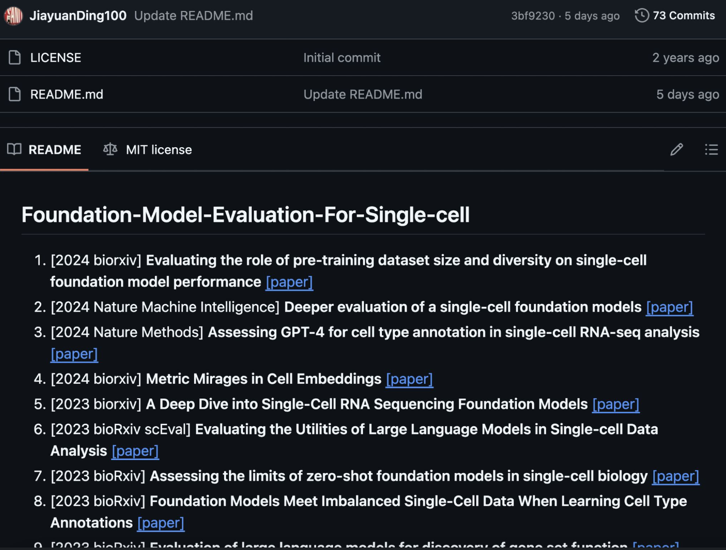
comment
The GitHub page: https://github.com/OmicsML/awesome-foundation-model-single-cell-papers?tab=readme-ov-file
My use of the UCE foundation model: https://tjburns08.github.io/explore_uce_output_3k_10k.html
In terms of first principles, a longer post is warrented (we have exceeded the character limit). But to start:
- What is going in?
- What is the transformer doing?
- What is coming out?
There are a handful of concepts here that intersect with stuff any single-cell researcher would already know. For instance, the output is often a high-dimensional embedding. So things like the curse of dimensionality, distance metrics, dimensionality reduction and its limits, and so forth are relevant here too. If you've ever used BERT (as opposed to a GPT), you have a leg up too.
IMC vs CyTOF publication rates: surprised IMC is taking off so fast
If we put 2008 as the first CyTOF paper (from Scott Tanner, before Garry Nolan), CyTOF hit 100 publications in 2017, or 9 years. If we put 2014 as the first Imaging Mass Cytometry (IMC) paper, then IMC reached 100 publications in 2022, or 8 years.
For some reason, I didn't think IMC was taking off as fast, but that might be because I witnessed the increase in CyTOF popularity while in the Nolan Lab.
Some notes:
- I filter out STAR protocols papers because of a keyword issue that makes flow cytometry papers show up. Thanks to Mike Leipold for pointing this out.
- I have no idea why the CyTOF publication rate stays at 100 for 2017 and 2018 before increasing again.
- Here is the code so you can do it for your own searches: https://lnkd.in/eBwU_EE9
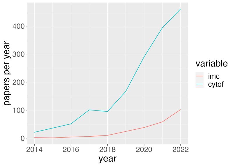
Surprisingly few spectral flow cytometry publications despite all the buzz around it
Spectral flow cytometry is trending in my circles, but this isn't reflected in the publication trends (yet). My analysis puts the spectral publication rate per year closer to that of CITE-seq than CyTOF. I (probably a lot of us) predict a spike in a few years. Until then, pre-print and relevant social media trends might be more informative.
If you want to see the search terms I used and/or use the code I've written for your own trend analysis, please go to the project repo here: https://lnkd.in/eBwU_EE9.
If you want to know more about the project, please visit my Medium article (2018) here: https://lnkd.in/d6KCi4E
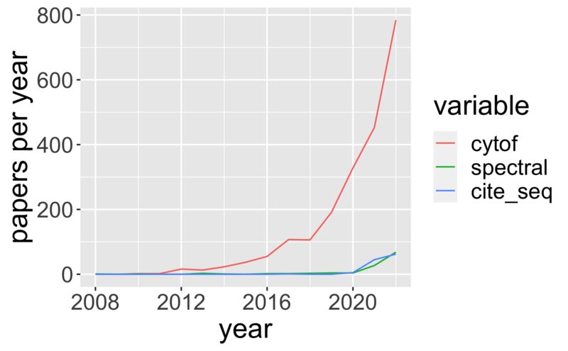
My fear that single-cell is in a replication crisis
Interesting article shared by Ming "Tommy" Tang, showing that a re-analysis of a cancer microbiome paper leads to different results. My fear right now is that we are in the middle of a replication crisis, across many bioinformatics-dependent domains. What do we do about it?
Education: all of us who can analyze data know a little corner of it better than the rest of us. We all have something to teach. It's not necessarily about turning biologists and leaders into bioinformaticians. Not everyone wants that. It's more about bioinformatic literacy. Knowing the concepts. Knowing the lingo. Having intuition.
Funding and policy: I am disheartened by the number of labs that are underserved in bioinformatics. Plenty of labs need a FTE bioinformatician and are stuck borrowing the one in the adjacent lab for a few hours here and there. Why? Is it due to underestimating how much grant funding will be needed for bioinformatics, for a given project? Is it due to limits as to how much a grant agency will fund bioinformatics needs for a given project? This is more of an open question on my end, but I think it's worth getting into. (This is a sensitive topic, so feel free to DM me about this one).
Skepticism: At the beginning of grad school, we would read old seminal papers in our fields and spend an hour picking them apart. This was easier to do when it was western blots. Now, who has the time to look critically at the complex methods, the code and raw data (if these are even provided, see anything posted by Mike Leipold)? This includes the reviewers. I'm hoping that a bit more bioinformatic literacy will allow us to do this better.
In short, this is a complicated problem space, with a lot hinging on it. But I hope the three things above serve as a good starting point.
Word embeddings and social media scraping
Branching from my work on t-SNE and UMAP is treating anything from single words to whole paragraphs as spatial coordinates. It's the side of large language models that is less often talked about at the time of writing . Anyway, from the spatial representations of various things, from tweets to sentences in journal entries, you can do some interesting analysis. I'll note that a lot of my work here has been cut short because it is getting harder to scrape social media now.
Spatial embedding of CNN vs FoxNews vs AP using BERT, viewing on UMAP
Ever wonder what regions of "news space" are more CNN-heavy or more FoxNews-heavy? It turns out that you can get at this by using large language models to convert news article titles into spatial coordinates. I did this for a mix of CNN, Fox, and AP news articles from their respective twitter handles, but you do this analysis for any source.
While I thought that each little subregion of the map (topic) would have a CNN and a Fox cluster, with AP somewhere in the middle, it turns out that Fox really doubles down on particular topics (eg. politics). Yellow in the image corresponds to Fox-heavy regions. Even AP has its its little pockets. Have a look yourself. The article title pops up with every point you hover over. If you don't like to see code, just scroll to the bottom where the plots are. Go here: https://lnkd.in/eHG3w4Ef
Technical explanation for those who care: I used the sentence-transformers python library to convert each article into a 768 dimensional vector. I kept within a particular date range and randomly sub-sampled until the number of articles were equal across the three sources. I then found the K-nearest neighbors (KNN) of each data point in the high-dimensional space. I then calculated various measures, from per-KNN fraction CNN/Fox/AP to per-KNN Shannon Entropy. I then did UMAP on the data and colored the UMAP by the KNN measures that I did.
If you have any particular use cases, or need help getting this working on your side, just let me know.
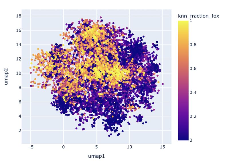
Original post around making tweet embeddings: the scrolling problem
I've been trying to reduce the scrolling I do in my life. For example, I check the news every day with a "map view" (below) I created using an AI language model (all-mpnet-base-v2) and UMAP.
Points on the map are tweets (article titles) from the accounts of various news sources, accessible by a dropdown menu (top). Similar articles by context are grouped near each other on the map. Larger points have more likes. Color corresponds to how recent the tweet is. Clicking on a point gives you access to the hyperlink (bottom). I really hope this helps you too!
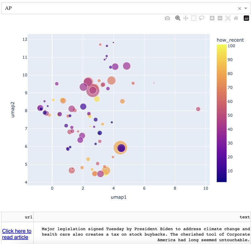
Recap after writing 1 million words in my journal over 15 years, parsing it with AI
I recently hit a milestone in my personal journal: one million words over 15 years. To review it all, I embedded each paragraph into what I call "thought space."
I found four key words that seem to partition the majority of thought space: business, science, family, and philosophy (see picture). The term "health" in turn bridged these four terms. The data suggest that at least when I sit down to write, health is on my mind, through whichever of the aforementioned lenses. I can confirm that health is at or near the top of my general value system. Everything is done with health in mind, for myself and for those close to me.
Attached is a write-up on my tech-enabled journal review, which contains code and links to a repo for anyone who wants to run this on their own writing. Otherwise, if you don't keep a journal, you should start one. It is a gift that keeps on giving.
The write-up can be found here: https://lnkd.in/dFuq8wYY
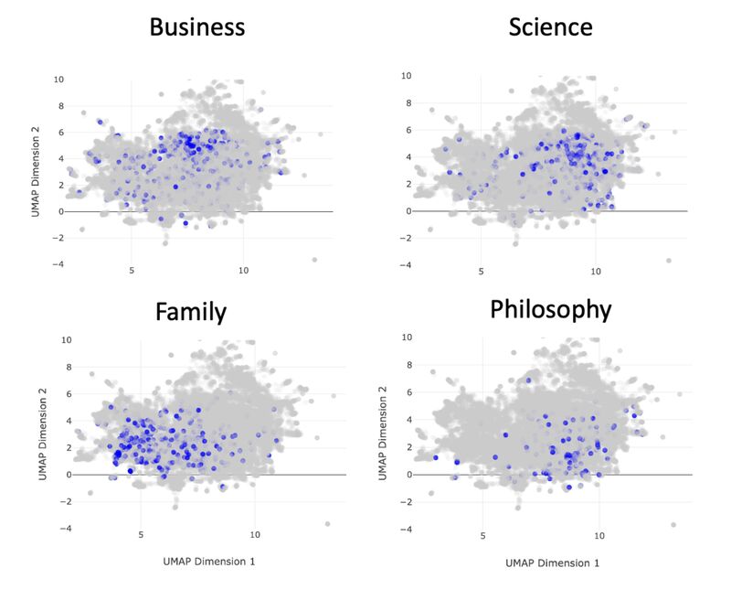
Retweet to like ratio of single-cell sequencing tweets
The retweet-to-like ratio matters for getting value out of twitter for your niche, to the point where you might be able to draw manual gates on the likes x retweets biaxials. For single-cell sequencing related tweets, I find three regions:
- High retweets/likes: open academic student and postdoc positions
- Medium retweets/likes: papers, projects, data
- Low retweets/likes: memes, status updates
Knowing this can save you time whether you're looking for a new position, or trying to find the latest impactful papers. This is a work in progress, and things might differ by subject (eg. CyTOF, microbiome, AI).
If you're curating tweets for your particular niche, I recommend looking at the retweets and likes biaxial (note the log scale) to determine the regions that give you the most value.
In a way, it's no different than gating on FSC x SSC or DNA x eventlength.
If you want to see and look at the tweets in the biaxial yourself (the tweet shows up when you hover the cursor over each point), please go here: https://lnkd.in/erUtFUtu
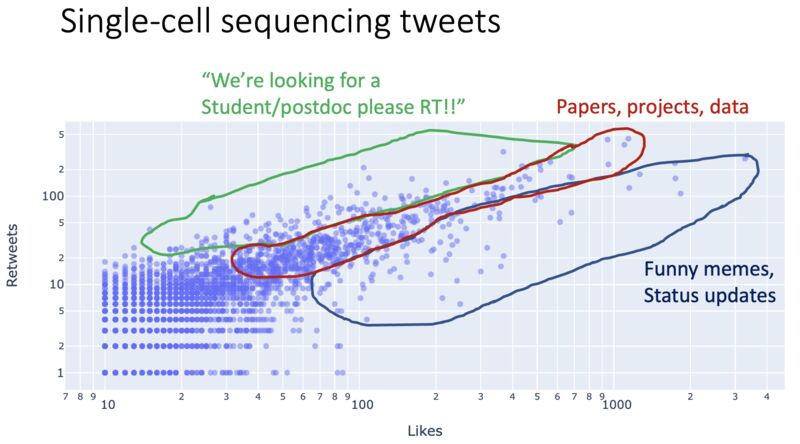
On my TEDx Basel talk
My TEDx Basel talk is now out! Here are a few key takeaways:
If you ever struggle with being emotionally hi-jacked by and/or addicted to the infinite scroll of your feeds (including LinkedIn), you're not alone. I note that my ADHD brain is especially vulnerable, and this can perhaps be said of a huge number of other neurodivergencies.
The infinite scroll is not the only way we can take in information. It may be optimally profitable (especially with the AI recommendation algorithms), but I show in some of the software that I've developed, that there are other ways.
None of this is going to just go away, unless perhaps it is replaced by something even more addictive. I think better ways to take in information and connect with each other will come from a community-driven, open-sourced effort. It needs to be optimized toward something other than attention and profit.
Thank you to everyone at TEDxBasel for giving me the opportunity to give this talk, and coaching me through the process. I'm a much better speaker now thanks to you, especially my coaches Cinzia Donato and Beril Esendal. Also leaders/coaches Beatriz Graça, Joanna Duda, Sara Laudato, and Smitha Rose Kariapuram, and everyone else who volunteered to make the event happen.
Thank you to my fellow speakers who provided feedback and support through the process. We did it, and you all were amazing! This includes Jo Filshie Browning, Bert te Wildt, Ben Meyer, Flavio Donato, Daniele Diana, Marcel Barelli, Reto Odermatt, and Mary Meaney.
The video is here: https://lnkd.in/eFPgrJ2V I'll link the projects I talk about in the comments.
Other
Anything else I could not categorize.
Panel design for Xenium assays
In flow/mass cytometry, we spend a lot of time on panel design. It turns out if you're going to run a spatial transcriptomic assay (e.g. Xenium), panel design is critical too. Let me explain…
The following information comes from a trusted colleague who runs a high-volume Xenium core, and has seen a lot. My general interest in this comes from an increase in spatial work (and the pain points therein) that has come my way recently.
As a preliminary step, it helps to have prior annotated scRNA seq analysis on hand. This can inform what genes you select in the Xenium panels. Accordingly, you have to select markers that can confidently distinguish between cell types/clusters.
If you want to do exploratory work, then something like Visium might be a better idea, given that it covers closer to the whole transcriptome. The downside here, of course, is you don't get the single-cell resolution. I've been helping with a project for almost a year involving trying to get "pseudo-cell" info out of each of the spots. In other words, Xenium has its place.
Anyway, the emphasis on panel design might be changing in the near future due to a Xenium 5000-plex assay that recently came out, presumably because enough people were complaining about the low-plex (300-500 genes) that you'd otherwise get from Xenium at default. I am not familiar with all the methods in the space, but I would guess that others are going to be moving in this direction too.
Assuming the higher-plex assays produce high-quality data, this points to a future where you have a few more markers to play around with.
But until this is widespread and widely validated, I would budget some time into carefully designing your Xenium panels (and panels for related methods), and doing the necessary preliminary experiments (scRNA-seq) accordingly.
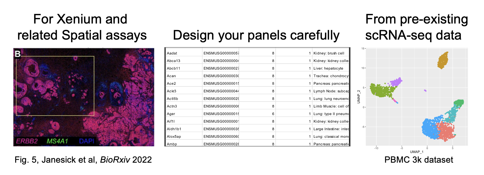
Three pointers for doing self employed consulting in the life sciences
The following is for my friends from academia who are in a tough work and/or financial situation. I was living on the paycheck at the end of grad school (2016), when I started doing bioinformatics consulting on the side. This got me out of my financial woes. I kept this up after graduation until I transitioned to full-time self-employed consulting starting in 2018. I haven't stopped, and you can do it too. Here are three things that have kept me in business the past several years.
A robust network of people who like and trust you.
My first engagement came from a conversation I overheard from a former lab-mate, whose company was looking for consultants. My second engagement was through a colleague and close friend of mine. Many subsequent engagements have been through connections, and/or previous clients who know and trust my work.
A high standard of excellence.
Many of my clients are re-signs, meaning I've worked with them before. Every once in a while, I'll get an email from an old client who has a new problem that I'm a fit to solve. Many of my other clients are long-term engagements, and in non-employment work when they can cut you at any time with a few days warning, long-term only happens when you do good work.
Give, give, give.
I was on a sales call once, where I essentially solved the problem on the call so they didn't need to pay me. They came back a few months later with paid work. This also goes with passing around leads (prospective clients). If I know I can't do what's needed, I often know who can. It's not about how much I can make, it's about how much I can give.
I don't expect three bullet points on a LinkedIn post to lead to my friends suddenly becoming consultants…it's a long process. Rather, I'd like everyone (especially in academia) to know that this alternative path is possible, either a few hours a week to make ends meet, or as a full-time endeavor. Accordingly, if you orient toward this path as early as you can, then perhaps you'll get an opportunity down the line that can cascade into something bigger.
(image is some old notes I found from back in the day)
